XaiJu
BlaiseCorvin
BlaiseCorvin

patreon


Engineering Ludus covers (semifinal)

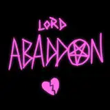
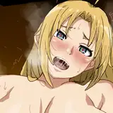
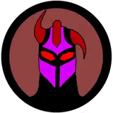
So we decided to go with two different cover variations. Neither are completely done yet, they will be refined and the type may change, but this is pretty close.

Thoughts?

Right now we're thinking about using the darker one as a promo, and the lighter one as the book.

Engineering Ludus covers (semifinal) Engineering Ludus covers (semifinal)

Comments

J B is wrong! The white one is amazing 😜! It’s eye catching and unique and just plain looks good!

Drew Risch

The white with silhouette is very good. I also think it establishes sort of a style for future books. Or even like delvers universe books by other authors if you wanted to establish that. As a one off it is beautiful too. I would do that as the primary eye grabber, since it’s a cool style that sets it apart

Cameron C

Now that I’m looking at it again, I think it might be cool to put a small boarder around the edge of the light one. Something fairly simple like swirly lines or maybe runic/fantasy language text? Regardless, the lighter one is way cooler than the darker one in my opinion, and you should use it for your cover for sure. Edit: Another border option that might look cool would be weathered edges, like an old map.

Drew Risch

Woooow, the white background one with just their silhouette is amazing! I’d say drop the jungle background other than their silhouette and stick with that one! Very cool! Tl;dr: The lighter one is amazing!

Drew Risch

I think the darker one is easier to see what it's about. The bright one, there's some 'noise' (a tall, thin 'y' shaped green doodad for instance) around Gazra-tam's spear. Might I suggest a thin border outlining each of the 2 figures? I suspect it'd help better define the characters and avoid some of the shape-confusion. Alternately a stronger contrasting background might help. I'd also suggest making Gazra-tam's tail a line not a loop on the darker image - leave it hanging out there, not looping back and having the end disappear in her body. Perhaps something like https://images.app.goo.gl/P2spBvc7c6g1R9Nv6 or https://images.app.goo.gl/P8VaTVAtzSrZQQu8A - up & curved, not fluffed - curious, alert, not frightened or aggressive. Assuming Mo'hali body language is like terran cats, 'course. I like both, just my critique.

J B


More Creators