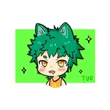
гӮ«гғ–гғҲгғ гӮ·гҒ®ж–№гҒ гҒ‘гҒ«иүІжұәгӮҒгҒ®и©ігҒ—гҒ„гғЎгӮӨгӮӯгғігӮ°гҒ§гҒҷпјҒ з”»еғҸгҒ®дёӢгҒӢгӮүй ҶгҒ«йҖІиЎҢгҒ—гҒҰгҒҫгҒҷгҖӮ гғўгғҺгӮҜгғӯгҒ®гғ©гғ•гҒ«гӮӨгғЎгғјгӮёгҒ—гҒҰгҒ„гӮӢиүІгӮ’гӮ°гғ©гғҮгғјгӮ·гғ§гғігғһгғғгғ—гҒ§гғ¬гӮӨгғӨгғјеҠ№жһңгӮ’гӮӘгғјгғҗгғјгғ¬гӮӨгҒ§д№—гҒӣгҒҫгҒҷгҖӮ д»ҠеӣһгҒҜжө·гҒӘгҒ®гҒ§еӢҝи«–йқ’гҒ§гҒҷгҖӮгҒқгҒ“гҒӢгӮүдҪ“гҒӘгҒ©еҗ„йғЁеҲҶгҒ®иүІгӮ’гғ¬гӮӨгғӨгғјеҠ№жһңгӮҪгғ•гғҲгғ©гӮӨгғҲгҒӘгҒ©гҒ§гҒ©гӮ“гҒ©гӮ“д№—гҒӣгҒҰгҒ„гҒҚгҒҫгҒҷгҖӮ гҒ§еҮәжқҘгҒҹгҒ®гҒҢ2жһҡзӣ®гҒ§гҒҷгҖӮ гҒЎгӮҮгҒЈгҒЁгҒ“гӮҢгҒҳгӮғжҡ—гҒ„гҒӘгҒӮгҒЁжҖқгҒЈгҒҹгҒ®гҒ§е…ЁдҪ“гӮ’жҳҺгӮӢгҒҸгҒ—гҒҫгҒ—гҒҹгҖӮ иүІе‘ігҒҢйқ’гҒҷгҒҺгҒҰиҗҪгҒЎзқҖгҒӢгҒӘгҒ„гҒ®гҒ§иөӨгҒҝгӮ’д№—гҒӣгҒҰе®ҢжҲҗгҖӮ еғ•гҒҜгӮ„гҒЈгҒұгӮҠйқ’зі»гҒ®иүІгӮҲгӮҠиөӨгҒҝгҒ®гҒӮгӮӢиүІгҒҢеҘҪгҒҚгҒӘгӮ“гҒ гҒӘгҒҒгҒЁгҒӨгҒҸгҒҘгҒҸж„ҹгҒҳгҒҫгҒ—гҒҹпҪ— жіЎгӮ’еҠ гҒҲгҒҰгҖҒй»„иүІгҒ®йӯҡгӮ’гӮўгӮҜгӮ»гғігғҲгҒ«е…ҘгӮҢгҒҫгҒ—гҒҹгҖӮ йқ’гҒЁй»„иүІгҒҜгҒЁгҒЈгҒҰгӮӮзӣёжҖ§гҒҢиүҜгҒ„пјҒ жңҖиҝ‘гҒ®зөөгҒЁзөұдёҖж„ҹгӮ’еҮәгҒҷгҒҹгӮҒгҒ«дёҰгҒ№гҒӘгҒҢгӮүдҪңжҘӯгҒҷгӮӢгҒ®гҒ§гҒҷгҒҢгҖҒд»ҠеӣһгҒ®гӮӨгғ©гӮ№гғҲгҒҜеҪұгҒҢеӨ§гҒҚгҒҸиҗҪгҒЎгҒҰгҒӘгҒ„гҒӣгҒ„гҒӢдёҰгҒ№гҒҰгҒҝгӮӢгҒЁжҳҺгӮӢгҒҷгҒҺгҒҰжө®гҒ„гҒҰгҒ—гҒҫгҒЈгҒҰгӮӢгҒ®гҒ§гӮӮгҒҶгҒЎгӮҮгҒЈгҒЁиӘҝж•ҙгҒҷгӮӢгҒӢгӮӮгҒ—гӮҢгҒҫгҒӣгӮ“гҖӮ гҒ§гӮӮгҒ“гҒ®жҳҺгӮӢгҒҸжҘҪгҒ—гҒқгҒҶгҒӘж„ҹгҒҳж°—гҒ«е…ҘгҒЈгҒҰгҒҫгҒҷпјҒд№…гҖ…гҒ«гғқгғғгғ—гҒӘзөөгҒҢеҮәжқҘгҒқгҒҶгҒ§гҒҷ(гғ»Пүгғ») -------------------------------------------------------------------------------------- гҖҢSea favouritesгҖҚColor decision It is detailed making of the color decision only for the beetle! We will proceed in order from the bottom of the image. Put the color you are imagining in monochrome rough with the gradation map and lay the layer effect in overlay. This time it's blue, of course. From there, the color of each part such as the body layer is gradually loaded with layer effect soft light etc. The second piece made with. I thought that it was dark with this a little, so I made the whole image brighter. Because the color is too blue and I feel uneasy, complete with redness. After all I felt difficult to follow that I like reddish colors over blue series. haha Add bubbles and accented yellow fish. Blue and yellow are very compatible! Working while aligning to draw a sense of unity with recent paintings, this illustration may not have fallen shadows much because it is too bright and it may be adjusted a little because it is too bright. But I like this bright and fun feeling! It seems that a pop picture can be made after a long time :) вҖ»I am using google translation.