We'll be correcting illustrations submitted through the official KawaiiSensei line!
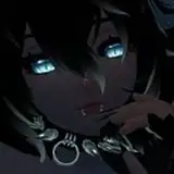
This time it's this illustration!

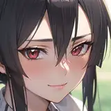
It's a lovely illustration of cherry blossoms and a schoolgirl!
------------- Author's comment -------------
I am having a hard time understanding the way the light hits the body, the composition, the movement of the body, etc...
------------------------------------------------
Overall, I guess you could say that I completed the work while worrying about it.
What should we pay attention to when we place a person in a large size like this?
In this article, I would like to introduce one "theory of composition"!

The situations, compositions, and light sources are well thought out.
The expressions on the people's faces are detailed and attractive.
In particular, the branches of the cherry blossoms serve to guide the viewer's gaze to the face, and the detailed drawing is a key point that greatly enhances the overall perfection of the picture!
The detailed drawing is also a key point that greatly raises the overall level of perfection!
If you have trouble with the composition, choose "the part you want to show the most.
If you have a picture like this with a large figure and a calm pose, you should choose a simple face to show the most.
I think what you want people to see the most is simply the face.
The amount of detail in the face and its surroundings shows that the artist has put a lot of thought into the face and its surroundings.
The amount of drawing is enough to draw the viewer's attention to the face.
However, the main subject (the face) is too far away from the edge of the picture, which makes it a little difficult to see.
If you are not particular about it, put the object you want to show in the center.

I moved it a little to the lower right.
I think this alone has made it easier to draw the eye to the face.
We will proceed with the detailed corrections with this arrangement.


I separated the hand and the cherry blossom a little. Do not pile complicated shapes on top of each other!
The width of the sailor collar looked different on the left and right sides, so I adjusted them to make them look the same width.
The skirt is not the point I wanted to show, and it is difficult to add wrinkles and other facial expressions, so I kept it simple.
The branches of trees sometimes grow downward, but the thin branches at the end of them basically grow upward.

Your face and hair are so unquestionable that I just tresed them as they are!


I thought you did a terrific job of simplifying the shadow on the head and giving it a big curve!
Let's take the other parts of the body in large chunks and add large simplified shadows!
Then add or subtract small shadows, and you will have less confusion.

Simplified completion.
This is what it looks like when you add cherry blossoms.
That concludes the corrections for this issue.
We hope you will use this as a reference when you draw illustrations with people as the main subject.
Please look forward to the next installment!
shopping_for_noobs
2023-03-03 12:19:16 +0000 UTC