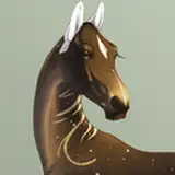
Pic 1 is the gradient, surprisingly the final coloring stuck pretty close to it, I might try two-tone gradients and see what kind of results come from them.
Pic 2 is defining a few different color zones while staying in the red-green palette. The mane is a slight yellow shift, and the gradients in the arms are more clearly defined so that red is in areas with more translucent skin. Because the red is the "dark" color in this scheme, and I wanted the nails to be distinct, I made them a light color similar to the mane.
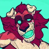
Pic 3 is rendering out contours, usually I pick a purple or blue tone for general shadows but because everything was so warm it looked odd. I instead stuck with the red, and kept it as a shadow on all greens. The yellowish mane got a slightly orange shadow, and you can see how that addition really communicates the change in direction of the contour in the fur. It goes from an upward facing plane in the yellow to a downward facing plane in the orange. There are small patches carved out too, this is to break up the form and provide visual interest. I also added a pretty intense aqua color in all areas of cast shadow, which is another way of introducing new colors without making it a part of the actual character's design.
Pic 3 is the final colors, remember what I said about usually using blue/purple as shadow? In this case I added blue in as a highlight/bounce light instead, still where those shadows would generally be. It adds a certain energy to the scheme and is a much less committed version of "color vibration." Along with that I finished the refining, added the background, gave it a texture, gave the character a similarly colored outline (intense and saturated to capture the energy of the pose/expression), and added a tiny glow in a layer on top of the lineart to the eye.
M Scott
2022-11-27 22:18:54 +0000 UTCDaoShishi
2022-11-27 21:00:43 +0000 UTC