Just keep swimming
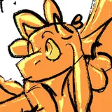
Pic 1 is the sketch, all I knew going into this character was "hunch" and "angular", this was an impulsive design on stream. What you may notice are the varying line thicknesses, thicker lines are the first core shapes I placed (jaw, arm, leg) and thinner lines are inspired by the shapes of the thicker lines.
Pic 2 is an example of a refined sketch, which is another pass over the initial sketch. In theory you could have an infinite number of refined sketches or only one, both options would serve the purpose of narrowing down your final lines. I used the refined sketch to establish texture zones like the underbelly and algae backside, as well as effects like the water dripping.
Pic 3 is the very beginning of lineart. Imo a lot of "good" lineart comes from the variation of thick and thin line, you can think about shadows when placing it. Everything we can see in the visible light spectrum is a result of shadows; if the world were pure photons we would exist in that white void squidward and all the alones were in. Shadows create depth, and depth creates interesting lineart. If a cube in a 3D space is most strongly lit from above, the downward facing plane will have the most intense shadows. It makes sense to place your darkest lines around that plane, and lighter lines on opposite planes, such as upward facing ones being hit by direct light. Areas that are recessed also usually receive less light than other surfaces, as the surrounding structure will block most direct light. Notice this happening on some of the bulbs along the back fin design, and around the eyes.
Pic 4 is a checkpoint where the majority of the lines are placed, barring the tail and pp. The lack of these two components drastically changes the "feel" of the character, he looks very heavy and brutish, which can work elsewhere but wasn't my goal with this character. This is also prior to a crop, I usually like to draw the character anywhere on the screen and crop in on then once I have all my outer boundaries set and spacing figured out.
Pic 5 is overhauled lineart with the tail and pp added. Those two parts change the appearance of the character, to me he appears lighter and more nimble, like a fish would be. I try to balance these two features in every character and make them complimentary to one another. They form a sort of through-line in the pelvis and proper placement can make or break the flow of the lower body.
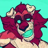
Pic 6 is post finishing touches, outline, and fill/gradient. This guy got a green treatment because I'm weakest in that color zone, I'll write that up next.
Peanut
2022-11-21 02:03:40 +0000 UTCM Scott
2022-11-19 21:48:34 +0000 UTCDaoShishi
2022-11-19 17:33:54 +0000 UTC