Alright it's color time
Pic 1 is the base color that will end up influencing every other choice I make. It's a solid fill here, and from this point I'll start to assign color zones.
Pic 2 is "flats". Not everything is colored in, but you can see how all the swirl hair is one distinct color, his underbelly is another distinct color, and the collar (an accessory) is orange to compliment his blue scheme. You'll see in subsequent pics that I slightly shifted all of his colors towards green, as he was a touch too dark for my liking, but I didn't want to change the value too much.
Pic 3 is the before-pic in a closeup comparison of how I begin to indicate forms with color.
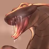
Pic 4 is the after-pic, which is a series of six or so lines that are a darker, warmer color than the fur placed in such a way that form is implied. There are two lines that define his obliques, straight right of his belly button. The coloring conforms to these lines, and it ends up indicating the change of direction of the oblique. Also notice how large the brush is, I'm able to cover a lot of ground very quickly and I can return to any area with a smaller brush for additional detailing later if I choose.
Pic 5 is another before-pic of the head, and a good area to show how meddling colors creates a harmony in design. I've pulled the hair color into the chin and muzzle, and intensified it for the eye and teeth.
Pic 6 is the after-pic, another showcase of colors following lines. I achieve this with a semi-transparent brush set to a darker color, and I'll make multiple passes over an area if I want to push the value. When applying the color, I'm placing the dark tone on forms that are rotating away from the light: you can think of the entire head as one lit sphere, and each feature as its own lit sub sphere attached to it. As features move further from the viewer, they usually become darker as well, assuming the character is front-lit. Later I can come back to this area with a lighter color than the base, and really bump the contrast.
Pic 7 is a lot of the work done, and a good checkpoint to see that there are different levels to completing pieces. I could stop here with rendering the body and he still could be considered complete, and for most pieces I think they'd get another 5 min from here.
Pic 8 is more like another 10 min of work, and you can pop between this and the previous image to see the difference. More highlights, more refining, and in areas of shadow there is a complimentary orange coming into play.
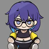
Pic 9 is finished colors with overhauled rendering, another 15 min or so of work. I've worked in purple for extremely simple color vibration, a concept that immediately adds more interest to work for me and starts to remove that "digital" look I try to avoid. There's more orange in areas of shadow, and a light filter has been applied to the tail to lighten it, in a sense pushing it back, because I didn't like how close it appeared to the hand. The collar and shween have been finished off, both more saturated to act as the two focal points for this character.
Pic 10 is the beginning of the background process. I copy the color layer and change it to a solid fill, then place it behind the color layer and free transform it flat. It's also orange with a slight gausian blur to replicate diffusion.
Pic 11 is the solid fill background, almost always a complimentary color to the character.
Pic 12 is the finished piece with a subtle gradient and texture applied to the background. This is pretty much my process for every piece, though there is random variance depending on how impulsive I'm feeling lol
Will do more of these for each piece they're fun
M Scott
2022-11-12 17:31:43 +0000 UTCDaoShishi
2022-11-12 17:03:45 +0000 UTC