Kafka WIP3 (Eye Painting to Completion)
Added 2025-08-08 10:00:06 +0000 UTC
In my previous post, I talked about how important key colors (main colors) are. Since then, I’ve realized something:
I often rely more on intuition and experience than theory when working.
Sure, there's merit in thinking "As long as the result looks good, who cares how it got there?" But it becomes hard to explain to others exactly how to get there.
What counts as a key color might vary from person to person. Especially for beginners, figuring it out can be confusing. When I say “key color,” I mean the core color that defines the design.
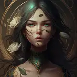
For Kafka, that would be the magenta to violet range. Once you decide that this is your main tone, it becomes easier to plan the rest of the gradients around it. By doing so, you can create harmonious gradations.
There's a helpful site called “配色の見本帳” (Color Sample Book) that helps visualize color harmony based on your selected key color:
For example, selecting “deep blue-violet” will show you brightness, saturation, and similar colors.
 Using tools like this can help you create gradients that feel natural and cohesive.
Of course, once you're experienced, you might not need such tools anymore. You begin to mentally categorize colors and automatically know things like “If I want lower saturation, use this,” or “This color works well in this kind of gradient.” You just know from memory and visual reference.
Still, it’s good to regularly reassess whether your current process is really optimal.
Anyone Can Paint and Do Eye Details—It’s Easier Than You Think
This might be a bit repetitive, but it's important: the brain can't distinguish between imagination and actual experience. That's why mental rehearsal works.
And that’s huge, especially when it comes to painting or eye detailing. I often see comments on X (formerly Twitter) or YouTube where people say things like, “I could never do that,” or “You can do it because you're special.”
But that’s simply not true.
Most of the time, the people saying “I can’t” are just convinced they can’t. Or maybe they don’t really want to do it in the first place.
They're building that “I can't” version of themselves, which becomes a self-fulfilling prophecy. Over time, this mindset seeps into other areas too, and you start believing you're incapable in general.
Let me say it again: it’s not about talent or an art background. It’s about the attitude of “This looks fun as hell, let’s go!!!” (cue loud inner voice). Sometimes you need to trick your brain into believing.
Often the task is much easier than imagined—but we psych ourselves out. And this doesn’t apply only to figure painting. It applies to everything.
Whether you’re skilled right now or not doesn’t matter. If you believe you can do it, you will. Just imagine yourself succeeding, and that alone makes it more likely.
Try mental training—visualize yourself painting eyes or applying color perfectly. Even if you’re not physically doing it, that rehearsal makes a difference. Especially for those who struggle, start by imagining yourself succeeding.
Get into that positive mindset, and next month you’ll be painting like a pro—no stress!
Is this survivor’s bias? Maybe. But for people who want to try but don’t see the value yet, this mindset shift can be really meaningful. And even if you mess up eye painting, you can use decals. You can also start painting with simple solid colors. Just have fun and go “This is AWESOME!!” at least once.
That’s really all it takes. Enthusiasm will eventually align with reality. So many people are overly serious or pessimistic when it comes to painting or detailing—but there's no need. Mistakes won’t kill you.
Back to the Topic...
Oops, I went way off track.
I know some people test combinations on color chips and log their results. I don’t. I usually either visualize it in my head or just try it on resin directly and adjust as needed. So I rarely make or keep color chips. I admire people who do—it’s amazing discipline.
If you're keeping records to teach others, that definitely helps reinforce your memory. But if you’re mentally rehearsing and testing in real time, that works too. I guess it depends on your goals.
Sticking to Key Colors Preserves Character Image (This Applies to Professional Work)
Let’s return to key colors again. As long as you don’t stray from the key color, the character’s image won’t collapse.
If you do stray, though, even just a little, the character might start to feel off.
For example, if you go too strong with violet, Kafka starts to feel like a different character entirely.

So yes, it’s very important to stay true to the key color when working on character paint.

Why bring this up now? Because I imagine some of you are interested in applying for the Good Smile Tryout.
Painting in a commercial context is work. And work means doing something that brings value to others—specifically, delighting the person receiving the product or service.
So what’s the goal of a finisher or painter?
→ To accurately reflect the character’s image through coloring.
That means personal satisfaction doesn’t come first. Your job is to faithfully reproduce the character. The same applies to eye detailing. Don’t overthink it—just aim to reproduce the character as closely as possible. No compromises. Artistic individuality? Throw that out.
If you want to make painting your profession, you must reproduce the character faithfully. That’s the one rule you must never forget. Sure, some exaggeration or enhancement is fine, but only when it serves faithful representation.
Always ask yourself: Who is this piece for?
Once you do that, everything else falls into place. Deadlines, accurate color usage, everything. If you're doing it for yourself, you lose sight of that purpose, fall into procrastination, and your color choices become selfish and disconnected.
Ask yourself—how’s your current workflow? Are you getting distracted by social media? Comparing yourself to others and thinking “I suck”?
Refocus. Aim to be better than your past self.
Whew, I Wrote Something Pretty Profound Again Today! (smug face)
That probably made me sound kinda lame, huh?
But really, I just keep telling myself, “Forget individuality—focus on who you’re delivering this to.” That’s why I stick to character-first color schemes. In personal hobby work, of course, creativity and experimentation are totally valid.
As long as your goal is clear, you won’t lose your way.
Eye Painting Process
Let’s talk eye detailing.
Kafka's kit is around 1/7 scale, but the face part is tiny, and there's practically no sculpting for the eyes. It’s... intense. Definitely a high-difficulty kit.

I started by referencing official examples and decals while sketching the initial eye lines.

Yep, the face is small...
Here’s my first draft.
 Eyebrow placement, eye size, and eyelid folds were off. I also needed a more sidelong glance.
I adjusted those things to get this version:
 I did a lot of dry-fitting to check the balance. Once it looked okay, I sealed it and started painting the irises.
At this point, I noticed the face color didn’t match the rest of the body. I should’ve repainted here... hindsight is 20/20.
Here’s the face part with eye lines.
 Eventually, I couldn’t ignore the mismatch, so I masked the irises with Gaia’s Masking Coat R and repainted the skin tone.
To repaint: just remove paint from areas not drawn with a brush. If needed, I’ll use Super Assilex 300 grit.

Why Masking Coat R? Because it resists thinner. Even if you strip the whole part, the protected iris stays intact. That’s the advantage of vinyl-based masking fluid. Rubber-based ones dissolve with thinner, making them useless here.
Here’s how it looks after that fix:
 Any leftover edges can be scraped off gently with a hobby knife. Super simple—give it a try.
At this stage, I layered lacquer clear coats, sanded with 4000 grit to even the surface, and resumed work.
It really doesn’t matter if you paint skin first or last—you’ll make mistakes either way. What matters most is how you recover. Most people would strip the whole thing, but that’s a waste of time. This method saves you 80% of the effort.
I bet a lot of pro painters have quiet tricks like this they never talk about.
Now that I’m back on track, I adjusted the upper irises to be darker:
 I created a simple gradient like this.
Kafka’s kit comes with two face options—with and without makeup. This commission was for the no-makeup version, so I didn’t add much color to the lips, and I painted the pupils by hand.
Brows are a reddish-brown.
 Assemble and check—if the expression looks natural, we’re good.

 You’ll have to judge this part yourself. Comparing to the original illustration helps.
Depending on the eye size and face part, there’s a point where more detail doesn’t really add value. When that happens, I don’t bother. It's not worth the extra time.
More time doesn’t always mean better results—remember Parkinson’s Law.
Once everything checks out, I finish with matte coat and a hint of makeup.

 Assembly and Finish

 The spider web on her shoes? Hand-painted with enamel. No decals. Super easy—just draw three vertical strands and then horizontal ones to adjust the balance.
Honestly, the eye painting was the hardest part.
 And that’s a wrap on this project!

 While I worked, I listened to Kafka’s PV BGM. It was so epic I nearly got a nosebleed. There’s something about those classical motifs turned modern... so good (words fail me).
Next up is Asuna from Mugibutsu—but I’ve got another sample build to do first. Might be a small delay, but I hope I can deliver something that meets your expectations. Stay tuned!
Comments
Thank you~! I’m sure many people don’t want to remove the eye work they’ve worked so hard on, so I hope this helps them know there’s a way to recover it!
SUKIMA SANGYO
2025-08-10 02:10:35 +0000 UTCSo cool to see the final product! I need to try out the part of removing the skin color with paint because recently i tried the enamel method and i stained some part of the skin but i didnt wanted to remove my eye work. Thank you sm for the tips!
Skully
2025-08-09 01:50:51 +0000 UTC