[Making process] Fujiyama sankaku's Blue Archive Professor Niyaniya process and tips 2
Added 2025-07-28 10:00:05 +0000 UTC
This is a continuation of the previous article on creating the Smirking Professor.
This time, the focus is mainly on painting.
Thoughts on costume coloring
The approach to eye painting (why it's important to do it quickly instead of overthinking)
Thoughts and examples on packaging methods
I wrote about these topics here.
Production Process – Costume Painting (Color Scheme & Thought Process)
┃If you already know the answer, there's no need to create a color reference.
In my previous Gorizia article, I wrote a headline almost identical to this one—and the same idea applies here. Looking at the official reference illustration of the Smirking Professor, her overall color scheme is based on black.
However, I decided on the direction after looking at a lot of fan art.
Hair color: Chose a blonde tone rather than yellow.
Trunk case: Painting it with a rich leather tone would make it stand out more.
Tights: The official art shows black, but since the outfit is already black-based, that would cause too much overlap → So I went with a more realistic tights color.
Overall, I decided to paint with a higher saturation. Although the costume is all black, instead of painting it with solid black, I used a gray base and finished it with a clear black to add depth.
I actually spent quite a bit of time deciding on the hair color. Lowering the saturation like in the original illustration would have made it hard to create highlight and shade gradients, so I went with a more common blonde tone. It still fit the image well, so I think it was a good choice in the end.
Takatori-san’s hair sculpt is extremely sharp and full of edges, so I think it really benefits from a well-blended gradient.
So, once again, I skipped making a color reference and just painted based on image and instinct.
Even when you say “black,” there are many kinds. You can create blacks that show hints of blue, red, or brown. Solid black should really only be used for materials like leather or enamel.
In most other cases, you want a color that looks black, but isn’t actually pure black. You then add gradients to bring it to life.
For this reason, I’ve always found painting “black” extremely difficult. There’s a lot of room for interpretation in the references. That said, after painting it enough times, you start to get a feel for the patterns—like “pure black for this,” or “mix something into the black for that.” Once you’ve built up your own internal patterns, you’ll spend less time agonizing over it.
I think I said this elsewhere before, but colors that pop in illustrations and colors that pop on physical figures can be really different. For 3D models, higher saturation tends to look better. You might’ve noticed how a soft-colored illustration gets turned into a surprisingly vibrant figure by manufacturers. I believe that’s because higher saturation is a quicker way to create depth and a sense of volume.
...At this point, you might think I’m overanalyzing, but that’s not the case.
Ultimately, if you can’t explain why you chose certain colors, then it’s hard to be satisfied with the result yourself. And more importantly, paint jobs without a clear concept can easily be spotted by others—people can tell when something was painted without thought. Nobody wants to be caught with a paint job that screams “I just winged it!” Right?
So, I always try to make sure I can explain at least why this part is that color to others.
If you’re struggling with coloring choices, “because the official art is that color” is totally fine as a starting point. Just having an intentional reason behind your choices makes the paint job more convincing.
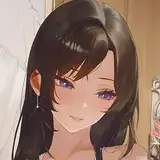
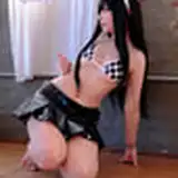
┃Here's a progress photo showing the coloring nearly complete
“Enough talk—just show us already!” If that’s how you feel, I get it.
So here’s a photo where everything except the eye painting is finished:

 At this stage, the line on the hat and the eyelets on the boots haven’t been painted yet.
As for the outfit, I’ve stuck to the principle of “don’t paint white as pure white, and don’t paint black as pure black.” I added shading colors to the white parts of the skirt and boots.
The staff was painted using actual black paint, with subtle highlights in gray.
And here’s how it looked after finishing the eye painting and applying the matte coat:


 Personally, I’m really happy that I managed to convey the feeling of real tights over bare legs. That darker gradient toward the edges really sells the illusion.
 I also demonstrated the texture technique for the tights in the video, and it works really well—please give it a try.
… I’ve completely run out of vocabulary to describe things.
As for the boot eyelets, follow the method shown in the video. Just use lacquer gold with a brush after the matte coat, being careful not to go outside the lines. Simple, right? (Bob Ross voice)
┃Painting long hair really is tough
 In the last article, I said painting is just fun once you know your direction!! That wasn’t a lie… but it’s not only fun either. Seriously.
It’s the curse of long hair—after applying the color surfacer, I found tons of spots that hadn’t been sanded properly. And most of those were deep in the recesses. You’ll need to really put in the work to sand them properly.
The reason I use colored surfacer is simple: repainting is way easier. If you used gray surfacer instead, you’d need to strip and repaint every time, which is a nightmare. So for long hair like this, using a color surfacer is essential.
Gray surfacer should only be used for black-based color schemes.
Color surfacer also acts as the base tone, so highlights and shading are adjusted on top of it.
By the way, I spent around 30 hours sanding this Smirking Professor figure, and I’d say at least 25 of those were just on the hair. It’s insane. Just put on something to listen to and zone out while working.
The trunk case was another unexpectedly time-consuming part.

The actual painting takes seconds, but masking off all the small corner fasteners takes a ridiculous amount of time. Just go zen and power through it.
Production Process – Eye Painting
┃The Importance of Setting Deadlines for Work
When it comes to eye painting, the eye designs of Blue Archive characters are generally simple in terms of color, so I aim to complete them as quickly as possible.
“Huh? It’s not like I’m doing a speedrun or anything?”
I’m sure some people might feel that way…
But in reality, if you tackle a task without setting a deadline and just drag it out, it usually doesn’t lead to better results. It’s said that if you have too much time, the amount of time the task takes will just expand to fill it. You try unnecessary things, end up not liking them, and revert back—wasting time in the process. (Look up Parkinson’s Law for more on this.)
Come to think of it, even if it’s a hobby, working without deadlines doesn’t necessarily improve the final quality. Yes, I’ve definitely experienced this…


“Umm… it’s been a year since I started this… how’s progress?”
“It’s… not going well… nothing’s changed!”
Just dragging out the work doesn’t automatically make it better. So (and I’m guilty of this myself), even if it’s a hobby, it’s best to set deadlines. Then push yourself by shortening that deadline. If your goal is two months, try one. Without a set end, people tend to become endlessly lazy by nature.
So, no matter the quality, I recommend setting a tight deadline to motivate yourself. It naturally drives you into work mode. Let’s work hard together! (What am I even talking about?)
Which brings us back to the opening: “I aim to finish it as quickly as possible.” No wasted steps. That’s the only way to work efficiently.
There’s no new official reference art, so I aim to finish the eye painting quickly while staying true to the character’s look.
┃Drafting the Eyes
Here’s what the initial sketch looks like. Of course, I use enamel paint.
Some people use clear enamel colors like clear orange or red for the draft, but I recommend solid colors because clear paints tend to become blotchy.
 For the mouth, shade the corners rather than drawing a full line—use a stippling/dotting approach. Mixing in enamel clear makes it less likely to spread to the center. Avoid drawing the line all the way across—it keeps the expression soft and cute.
A thick, bold horizontal mouth line gives a harsher, more masculine expression. So try different approaches and find the one that suits the character. For soft smiles, I personally recommend dotting at the corners. And of course, make sure to do a temporary assembly to check the eye direction at this stage.

┃Painting the Eyes
Here’s how the eyes look when painted—kept very simple.
 These are the paints I used:

 These days, it’s pretty common to use fluorescent paints.
Some might avoid them because they fade under UV light, but there are colors that can only be achieved with fluorescent pigments. Modern illustrations often use very vivid colors, so sometimes you can’t match the art without using them.
So personally, I no longer limit myself and just use them freely. Even that pale, pinkish skin tone seen in Alter’s Azur Lane figures is dependent on fluorescent paints.
Then I add the eyebrows, skin tone, blush, lip color, and eye highlights. I also added a little extra color at the top of the iris for a nice finish.
 If the eye paint looks natural when placed into the hair parts, you’re good to go.
 Finally, seal it with a matte topcoat, assemble, and you’re done!
 I hope this article is helpful for your own builds!
I always work with the mindset that I might teach someone later, and I’ve found that mindset really helps me learn more as I go.
Seriously—not even joking.
Comments
The paint brand I use is Gaia Notes, but this hair color can be reproduced with any brand as long as you mix the colors yourself. Yes, although the hair appears yellow, it actually doesn’t look quite right unless you aim for a blonde shade. Start by painting a base color of yellow thinned with white, then gradually layer clear brown and white over it to achieve this hair color.
SUKIMA SANGYO
2025-08-03 23:27:02 +0000 UTCThe coloring style you pick on her hair is amazing. On my other Niyaniya kit I tried yellow that try to fit ingame style but in display it looks meh. May I know what the color brand did you used? or you tune it yourself? Thanks!
FatDaddy6969
2025-08-03 16:18:32 +0000 UTCYes, exactly. I wrote that with the hope that people won’t overlook what’s truly essential. Surprisingly, I think quite a few people tend to overlook this part and believe it’s okay to spend as much time as they want. But in many cases, repeating the process more times leads to faster improvement, so I believe it’s important to judge that balance depending on the work.
SUKIMA SANGYO
2025-07-31 15:28:42 +0000 UTCI feel guilty reading this, as I have not set a deadline for my own works... it is true, even as a hobby with the freedom to do anything you want, it is still very sensible to have discipline to set deadlines. Realistically, as humans we only have little time to do what we like...
kat
2025-07-31 14:14:31 +0000 UTC