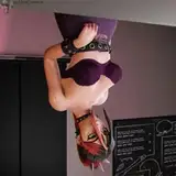
![[Making process] Vispo's Azur Lane Gorizia making process and tips 2](https://img5.xaiju.com/storage/6/rz/pl/d38796-019e8e83-8279-78ee-be3d-37f0032983ef.jpg)

Since this is my first post in a while, I tried to write about what is extremely important and indispensable to continue painting as a hobby or a job, not about which paints to use, which solvents to use, or other such petty techniques.
In my previous post, I reported on the points to note and the parts that were processed during the process from surface treatment to Dry fit of Gorizia.
This time, instead of introducing the painting process as usual, I wrote about how I put the abstract image of the painting process into a concrete work process, not about techniques!
┃If you know the answer, you don't necessarily need to make a coloring document
In most of the most recent productions, I made materials for most cases.
I thought it might be necessary to make materials for this case, too, since the painting would be complicated to a certain degree. but, I did not dare to make them.
The reason is that the color scheme was completely decided in my mind. If you have already decided what colors you want to use and you know how to create them, there is no need to create materials.
Of course, one of the reasons was that the client had given us permission to "create freely. When the client does not have a clear image, or when he or she is undecided about what colors to use, materials can be used to help both parties to reconcile their images, as it is easy to establish a roadmap to the goal.
I think this means that it is just right to use a useful tool when it is appropriate to use it. There is no need to make materials to check something for which the answer is already known.
In this painting of Gorizia I had the following image clearly in mind.
┃Image developed without materials (somewhat abstract)
Blonde hair with strong saturation and highlights
Paint with a metallic feel
Green with a sense of depth.
The inside of the cape is a metallic red, which is reminiscent of satin cloth.
Painted with higher overall saturation than the original illustration.
The paint job is comparable to that of Alter's Azur Lane scale figures.
Once you have a list of images like this, the entire work process, including what kind of paint and topcoat should be applied, will naturally be derived.
The question then is how to make this happen, and the solution is generally as follows.
Learn by watching other people paint and PVC finished products.
Learn by watching other people paint.
Learn from experience
The easiest way is still to look at other people's paintings and finished PVC products and imagine their painting process.
I imagine all kinds of things, such as “How is this kind of painting done,” "What kind of method does this person use? I imagine the work process at all hours.
┃If you can imagine the specific work process, painting is just fun (except for masking)
I know there are some people who look at videos, how-to books, and other materials on painting and think or say, “No, I don't understand anything in this way,” but if you really want to improve, it is really important to think for yourself and do trial and error even without any given materials (or in the abstract).
This method of learning is recommended for people who tend to be cautious about asking others how to do things. I was the same way, so I did it almost exclusively by imagination without asking others. I've managed to get by, so it's probably okay. It takes time, but....
I digress, but anyway, it is extremely important to imagine the coloring image and the path to the goal (work process) to some extent before production.
Incidentally, in my last image, I wanted to line them up like this so that they would be comparable.

Here is the completed figure


I personally believe that I was able to express all of the above mentioned images.
Sometimes I am asked, “What kind of paint do you use for this painting?” or "What is the dilution concentration?
But what really matters is neither the paint manufacturer nor the paint number. It's not even about the dilution concentration, as long as the paint doesn't get sandy when airbrushed on.
Essentially, what is important is to have some idea of the color scheme and know how to incorporate it into the work. To achieve this, it is necessary to know how to combine and layer colors, dilution methods, and the function of each topcoat.
To do this, you have to know it by doing it yourself in the end. I believe that this is the reason why only those who are actively trying to gain skills, rather than passively, can move on to the next step.
Knowing only a small technique is only a stopgap measure. Personally, I think that the best way to make the technique completely your own is to try it out many times, verify it, and try to get reproducible results.
In short, if you keep on creating, you will be able to imagine to some extent what kind of paint is suitable for your work, and you will be able to imagine the work process, so until that happens, let's keep having fun while doing it.
┃So what exactly did you use, what kind of techniques did you use?
First, we need to take an abstract image and put it into something more concrete. It is really important to be able to convert abstract images into concrete work processes.
Let's write down the specifics of each.
・Blonde hair with strong saturation and highlights
↓↓
Ivory base with a little red, shade black slightly darker at the ends, and lightly apply a thinned white to the curled areas to show the highlights.
Matte coat the entire hair to give the hair a cuticle look, then apply semi-gloss clear to the highlights.
 ・Paint with a metallic feel
↓↓
The metallic texture should be retained in areas where the original illustration clearly shows that the metallic would look better.
The gold part is not a solid coat, but a clear brown on the edge to make it a shade and a topcoat.
Too much clear color will diminish the metallic look, so use in moderation.
After the matte coat is finished, masking and applying gold can bring out the metallic luster without killing the metallic look.
*If there is a situation where a semi-gloss clear is needed, you can use it because it can be matte coated (semi-glossy) while retaining a metallic look.
 Green with a sense of depth
↓↓
Separate the shaded areas from the saturated areas. Adjust the pleats of the skirt and the hem to be darker. The waist part is high, so use high saturation to express shading.
 ・The inside of the cape is a metallic red that is reminiscent of satin-type fabric
↓↓
Satin cloth is sometimes used for the lining of jackets. It is moderately shiny and smooth. To express this, metallic paint and semi-gloss clear can be applied first to create a satin-like atmosphere.
 ・Paint with higher overall saturation than the original illustration
↓↓
The color scheme was chosen to be more flamboyant.
The green, white, and red used in the Italian flag are Christmas colors, and since the hair color is blonde and the cape are black, the only colors used are those that have a strong impact.
I expected that the colors would be rather bland if the saturation was low, so I increased the saturation to a very high level. As a result, I am happy with the result because it looks good.

 The paint job is comparable to that of Alter's Azur Lane scale figures.
↓↓
I want to believe it will be OK.
...Now that we have broken it down from an abstract image to a concrete work process, what do you think? I think anyone can understand what kind of process they need to follow if they can be this specific.
By the way, I have not asked anyone about the specific processes I have described so far, but rather, I have tried to reproduce them by my imagination.
If you can think about this kind of thing, the next time you make a kit that includes similar hair and costumes, you will be able to quickly come up with a working procedure that says, “Oh, I can use this technique because I did it that time,” or "I can rearrange the technique that I used that time.
You will also be able to calculate the masking procedure and the time required, although it is only approximate.
┃Learn actively, not passively
I think this is probably why it is important to convert abstract images into concrete methods, and to acquire these methods not only as knowledge but also through practice.
Whatever the case may be, I think it is important not to just look at the given materials and say “I see”, but rather to verify and put them into practice, as I have seen the recent expansion of painting and modeling courses using videos.
I really think the service itself is a good idea.
The important thing is how to make use of it. There is no point in just looking at it in a lazy way. If you want to get 100% or even 120% of your money back, you should do all of the things I have written here (such as developing an abstract image and putting it into a concrete process, or looking at other people's work and trying to imagine what kind of process they went through).
I think those who go that far will probably be confirmed commercial painters in another six months...what am I talking about...?
Oh, yes, I was talking about how important it is to be able to develop an abstract image and put it into a concrete process.
┃When you find a better way, it's important to abandon “your way” as soon as possible and switch to it.
What? You're abandoning it? And at a high speed? You may be thinking, "What? In other words, it's called “my way of doing things” or “individuality,” and in a sense, it's no different from stagnation.
If you want to improve your painting, you should throw away your own way of doing things and your own individuality.
If you don't have that kind of switching speed, you won't get good at it. It is psychologically stressful for anyone to be afraid of changing the conventional way of doing things, but the trend of character figure design changes every year, so it is fun to try new ways of doing things with the mindset that it's not so bad.
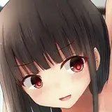
After a long write-up, suddenly it's the eye-painting process. It's bad, isn't it? haha
There is nothing much to say about the eye paint, and I tried to reproduce the pouty image as much as possible.
As I mentioned in the article on surface treatment, this kit had a deeper sculpting around the mouth, so I tweaked the sculpting there only.
 I'll draw it like this.
I tried to make it crisp and match the bangs, but the angle of the eyebrows was a little too low.
 Since this is before applying skin tone, shave off the clear coat and redraw the eyebrows. It is recommended that the lower lashes should not be dotted but crossed to create a line to create an atmosphere.
 I fixed it and it looked good, so I applied skin tone and blush/lipstick.
 This is an OK one because it is OK as long as it is not uncomfortable when assembled.
 I think I could put it side by side with Alter's Honolulu and it would be okay
And so it is completed.