Please use this MEGA link to access the entire set.
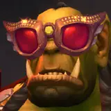
While this is a repost, I've actually updated several things here and there. There were two shots focusing on my Pirate moo (0_BullZoom and 0_Full) that had him flaccid. I quickly went back to my old project files and rendered out new versions with him hard as a rock. And almost every image has a new version (suffixed with a _U) that features slightly different post-processing. All of the original images are still around in case you don't like the new changes.
The rest of this commentary is lifted straight from the original post from around September 2020:
My pirate moo strikes again! And just like in his previous excursions, he's bringing with him some big moo booty to play with! So what's the story like for this one? Well as always, I'll leave most of the details up to your imagination. I don't think I need to explicitly explain what's going on here; you can see for yourself what's happening.
What was my biggest learning experience with this project? Definitely playing around with aspect ratios and framing. I would say this is the first project in a while that really challenged me to experiment a bit with the frames that I tend to use, and why I tend to use them.
For most of my projects since my beginnings as a hobbyist, I usually defaulted to 16:9 (or 9:16 when doing a vertical shot). I then went through a brief phase where I would default to 21:9 for everything, which was most definitely a stupid amateurish mistake. My naive mind thought that 21:9 looked sooooo cinematic, which meant it *had* to be "good", but I was very wrong. After that, I would jump back and forth between 16:9 and 18.5:9 (because it matched the AR of my then phone).
In this project, I think I really doubled down on trying to be more flexible with my framing. While the majority of the shots are still in 16:9 or 9:16, it certainly wasn't the default. I constantly checked to see if the shot I wanted to achieve could look better in a narrower, 4:3 or 3:4 frame. Or another aspect ratio entirely. I realized more than ever that handing negative space properly was very much a tricky balancing act. A wider frame like 16:9 could sometimes feel too "empty" if your subjects are super close together, but sometimes you also appreciate having anything else to look at so that your eyes can "take a break" from the main subjects of the frame. Conversely, a narrow frame really encourages your eyes to home in on the subjects, but can also feel very cramped if not used properly.
I think that covers much of what I wanted to say about this project, for now. I may ramble on about other things in later posts.


![VAM_Erup[VR]](https://xaiju.com/istorage/28584.jpg)