XaiJu
guweiz
guweiz

patreon


"Movie Poster"

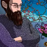
A very experimental presentation style! I was inspired by some of the really cool illustrations from Gundam Hathaway by Pablo Uchida, and so I wanted to try something along the same veins.

However, it was much, much harder than what I thought going in! Many aspects of the composition required both accuracy and insight while balancing choices in composition, pose and lighting. A thing I definitely still can't quite get down is Irena's pose (character on the left) even in this final version. I wanted her to be a little taller than Yin (right), but the perspective made that difficult. However, strong-arming it like I did here doesn't quite seem to be the right solution.

Her expression was also difficult to tackle too! To sum it up, I'm not quite satisfied with the result, but it was a great fault-finding exercise for myself! I would be happy to discuss this more in the process video coming soon :)

Thank you for your support! I'll try to finish one more character-based set of illustrations before the end of the month. Next month the plan is to head back into my more traditional cinematic sets once again!

"Movie Poster"

Comments

It was revealed a couple posts ago! Her name is Yin :)

GUWEIZ

Thank you so much!

GUWEIZ

Thank you! Simple patterns can really hep quite a bit with detailing :)

GUWEIZ

Thank you for the kind words!

GUWEIZ

Thank you! That's an very interesting observation :) I'm glad you like it!

GUWEIZ

On a side note, I’ve been wondering for a long time what the other character’s name was 😭

Edith W.

your art keeps slapping soo hard, its unbelievable. Great, simply great!

MSM

UUUH the pattern on the back of her dress is beautiful!!

T_B_Tato

So Sick! Really love the movie poster composition. These ladies always give me Boondock Saints vibes. If only the saints were female crime fighting vigilantes in Hong Kong. Can't wait for the process video. Great work!

Fiercebreed

Yes, that is exactly what I am doing. Maybe i explained my self a little bit wrong.... i just changed the colors, to their opposite.

Vanaris

I immediately thought to Pablo's work even before reading the source of your inspiration. I think you accomplished your mission even though you're being hard on yourself with Irena's pose.

Jose Rodriguez

Soon showing in the theaters, in spe!

Archie

Thank you, I'm very glad you enjoyed that "poster" aspect! Still a lot to learn to make this style of presentation more convincing :)

GUWEIZ

Thank you! That challenge sounds like a true nightmare! I can imagine that for light and some local colors, but it would be very challenging for certain elements to read accurately (especially with a strict requirement to invert everything). But extensively changing the color palette could be fun!

GUWEIZ

I'm glad you like it so much! It's just in a little bit on an awkward zone where she feels a little too tall but I can't shrink her either, and interesting dilemma :)

GUWEIZ

Thank you!, it would be quite an interesting process to explain!

GUWEIZ

Thank you for the very kind words, being able to improve definitely makes the challenge worth it! And indeed, it's wise to be able to take things in stride as well :)

GUWEIZ

It's definitely a bit one the "cooler" side vs the more grungy tones I like the use most of the time! I'm glad you enjoyed it nonetheless!

GUWEIZ

Thank you!

GUWEIZ

I'm a Gundam fan, and I roughly understand the inspiration behind your creation, but I still have to marvel at the surprise this artwork brings me. It's like a captivating movie poster that grabs your attention. <3

9YL

Amazing work! Guweiz, have you ever thought of drawing your piece in an invert (so that the blue is red, green is purple, and so on)? I'm kind of trying to do it and is quite challenging.

Vanaris

and I think Irena looks taller!

Iga

wow, incredible painting! can't stop looking at it <3 and I think Irena looks taller :)

Iga

Awesome! Looking forward to seeing the process video!

dustykuro

It looks amazing!! Thank you for sharing your troubles too. I keep forgetting that even for very skilled artists making art can be a difficult challenge. We all should be less hard on ourselves 🖤

Sad Kéké

I can feel more Sci-fi sense than the usual retro sense from the poster, the background makes me think of the poster of Star Wars and a game called Starfield, it gives me a deep impression like them, I love the cold ambience and the little red on the high-heels and hair cave, thanks for the amazing work!

Zwei Zhang

this is dope, love it

QueueSS


More Creators