XaiJu
guweiz
guweiz

patreon


EP31 Color Drafts (Plus Process Walkthrough)

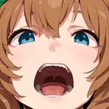
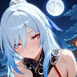
Today's video is a light and simple (but important!) tutorial on when and how to start with a color draft on your illustrations. I've also combined in the process explanation of the latest piece to explain how the effects of a good color draft and extend onto the rest of the painting!

As always, thank you for all your amazing support, and feel free to ask any questions below :)


Watch on Youtube 


EP31 Color Drafts (Plus Process Walkthrough)

Comments

@hryf

حريف Hryf

please role patron for I can share my practice

حريف Hryf

Can you please do one on setting up perspective before the rest of the piece

Rachel T.

Thank you for the question - Honestly your workflow sounds very normal to me! I feel we can compartmentalize (a little bit) various drawings into different categories. For learning, exploration drawings, what you've mentioned is perfect - a lot experimentation is in fact a VERY efficient way to develop your vision and "eye" for what works and what doesn't. Of course if you have client work that needs to go little bit more "on rails", then a more time or effort efficient composition/ subjects/ plan/ workflow that includes more familiarity and ease can be better. For myself, since I do a lot of original work, it is essentially endless experimentation and finding ways to draw things more interestingly and so on, and that indeed includes making major changes halfway through (just see the mega tutorial series here on patreon). However, experience does help to make things streamlined when I want it to be! All in all it's a good way to learn, and naturally you will get better at reading your sketches and plans early on:)

GUWEIZ

Hi Guweiz, thank you so much for the tutorial. I'm always impressed by your initial design intuition and follow through to your plan. I found my work is that, for a complex piece, my end result often looks very different than how I planned out initially. I have trouble seeing the final image in the initial stage and normally I keep experimenting different element at different stages, in another words, test the boundaries, and if it looks better, I'll go that route. I feel like this workflow is extremely inefficient comparing to what I see you are doing. My question would be, have you always done your illustration in this workflow? Have you done a piece where in the final stage, you realized maybe do another major change to the composition can make the illustration much better? Or do you think as you become more and more proficient, mastery at your craft, you can pretty much lock in your design and see the final piece from a fairly early on stage of the process?

KenanCanDraw

Good question! Its important to remember that nothing is permanent in the sketch stage, so a perspective grid first approach can also help you feel out the scene (sometimes it might not match our intention precisely etc). After some sketching, you can get a better feel of how you want to adjust the camera (POV) or grid too. So either way, feel free to work both sides of the draft according to your preference!

GUWEIZ

I've a small question I'd like to ask. If this has been explained before, please excuse me, and thank you in advance :D. So when you start a sketch, do you set up the perspective grid first, or just sketch things out then fix them accordingly to the grid; and why do so? Personnally, I find the second option a bit easier, since I'm struggling quite a bit with camera placement.

Minh Nguyen

Boy am I glad I became a paid member of your Patreon

Chitranjan Muthulingam

It mostly depends on which is the more dominant element - if it's a really bright scene with some shadows, then it's much more efficient to put in the shadows first to get a fast read. Vice versa, if it's a dark scene with a spotlight effect then the lights can come first. The actually arrangement and plan is a lot more important than the sequence.

GUWEIZ

Fair enough, it is my usual starting setup as well for these really good reasons. But sometimes when you really need color to work (that will be even more demonstrated in the next set!) color drafting first is a good method to try - in the end you will still need both pieces of the puzzle anyway :) The profile picture has been remastered once already a few years back, so no plans to change it for now!

GUWEIZ

I used the curves adjustment layer to tune down the brighter ranges specifically, multiply tends to crush the darker colors a bit too much. Thank you for the kind words too!

GUWEIZ

when you add lighting is it easier to start with shadows and paint in the light? i've seen artists start with light and paint in shadows. just curious if there's any difference or if that's just your preference

SHIRAIsHORIZON

I prefer value draft. It gives me so much more information and I can make a picture work only with them. Then I use curves layer to put in color and may be light layer. But I have a question..... I was just scrolling thru your instagram and I came arcoss you profile picture. I was wondering if you are going to do a remaster this year? 🤔 you make quite a lot of them and I wonder how much would you change it know

Vanaris

I have question ? On the third slide how did you darken the image ? Did you put a multiply layer on top of the whole piece ? Or did you darken it with hue and saturation tool ? Also thank you for all the wonderful tutorials I love all your content and keep up the amazing art work.

LastSamurai

Thank you for the pretty in-depth question! Generally I think of the process back from the desired result - for example for this piece I wanted the characters to be in direct light, but not overexposed, leaving some parts to be silhouetted against the background. From that goal I work in the lighting as per the fundamentals, etc. As the piece develops I start thinking more about the shapes as you've mentioned. Usually the goal is to use them to reinforce and support the pose - e.g. the looseness of a hoodie can be used to manage the overall shape of the character's presence, add creases where limbs bend, or where the weight of the clothes reach a pinch point, and so on. To answer the question more directly, I don't really care too much about shapes in the draft stage beyond a very basic level of 1. Is it clear enough to tell what's going on, and 2. Is it at least somewhat dynamic and not too stiff.

GUWEIZ

so much content this week :o

Wj

For me i will prefer value draft.

NCL

Hi Guweiz! So what I like about the most about this piece is the shape distribution/economy (of the lighting, folds etc). I'm curious, do you think about them at all during the sketch/draft or no? If yes then I would love to learn them from you bcs most of the time, what makes an illustration stands out to me is the shapes, and I really suck at them. A popular method that I see often is the 2 values method (3 if lines is included). Maybe you could call them shape draft in this case(?) idk haha. Maybe a video for that topic would be helpful! Thank you!

Lndo Gusto


More Creators