XaiJu
guweiz
guweiz

patreon


GUWEIZ Patreon Series EP26 (Process Steps)

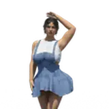
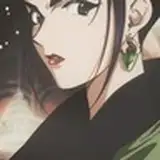
This month's process steps are up! I haven't been too happy with some recent WIP's, so I've been spending quite a bit of time trying out a whole bunch of new compositions (I show a peek at the end of this video!).

Sadly, that means only 2 completed pieces this month - on the bright side, it also means I'm able to go a lot more in depth for each of the processes, compared to the usual highlight-style of explaining things.

As always, feel free to let me know what you think down below!
You can also hop over to discord to discuss it with fellow patrons, or ask me questions there as well.

Thank you as always for your support - I'm looking to try something interesting for this month's tutorial as well, so please look forward to that :)

Watch on Youtube

Download Here

GUWEIZ Patreon Series EP26 (Process Steps) GUWEIZ Patreon Series EP26 (Process Steps) GUWEIZ Patreon Series EP26 (Process Steps)

Comments

first time patreon enjoyer, what a great walkthrough! Thanks Guweiz, I learned a lot! :)

Arjo Rosato

Of course, a very bright day could make white clothing even brighter (or even seem luminiscent), match that with a bright BG and you can find them blending in places as well. But important to note is that as with real life, we see bright things really clearly, so the edges usually remain pretty sharp in this case!

GUWEIZ

I see. Would more light/daytime settings cause the "inverse" of that I suppose? (e.g. the light would blend close with the light reflecting off the clothing) Thank You for replying BTW!

Austin Grage

The process is quite straightforward in it's essence - expose the character and their surroundings to the same light sources consistently. Allow the values themselves to also blend closer together when needed - for example, parts of black clothing in a dark room, away from immediate light, essentially can almost merge together very naturally. Separating them artificially could make it feel odd instead!

GUWEIZ

Do you have any advice on having your foreground subject "blend" in with the background? Some of my art lately has been having this issue where the subject "pops" out too much. I want it to feel like the subject is apart of the piece. Any tips?

Austin Grage


More Creators