XaiJu
guweiz
guweiz

patreon


GUWEIZ Patreon Series EP21 (Process Steps)

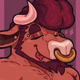
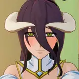
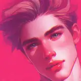
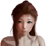
The process walkthrough for this month's pieces is up! I realize my commentary is becoming more of a flow of consciousness type of deal, skipping over a lot of the more basic and repetitive parts of the process. So I'd just like to remind you that if you have any specific questions, feel free to ask them below.

Please look forward to the tutorial video coming out soon as well - this month's should be quite interesting as well :)

Thank you as always for all the amazing support!

Watch on Youtube

Download Here

GUWEIZ Patreon Series EP21 (Process Steps)

Comments

Thank you - it's volumes as well too! I'm glad you like the cinematic style frames, I have lots of fun doing them as well, but definitely feel there are still ways I have to learn to make them more interesting and exciting. It's a bit tough to really know exactly when to stop. Generally when the key focal areas are all done, and the periphery is large sorted as well, I feel comfortable stopping there. It definitely varies between artists though, and is probably one aspect where individual preference can materialize as style.

GUWEIZ

Very interesting walk through. I really like how you repeat several times that you draw shapes. It took me a lot of time to understand, and I still regularly forget that everything is made of shapes, and that it's what I have to represent. To answer your "concern", these cinematic frames are not boring at all. They really suck me into the developing scenes. On this particular picture, I was astonished by how well you mislead our brain. The picture as a whole is really beautiful, but when I zoomed in on her hat, I realized that the orange glow at the tip of it is so unpolished, but yet works perfectly well. Is that the signal for you to stop working on a specific part: when it does the job ?

CJoe

I photobashed together some textures, and then overpainted them! I think the most efficient way of doing this (if you're doing it a lot) would be modelling it in 3D, but with a 2D approach, the key is to make clear the identifying features. For example - what kind of location is it? Industrial, commercial, or residential? Depending on the answer, you might want to select specific elements to display. As always, there's a hierarchy of big to small - rather than think about it as 3000 small items to all fill in, it's more like 5 big, very clearly identifying features, 15 medium supporting details, and then 100 super rough, but readable small details (that can be duplicated and spaced out). E.g. Aircon units are a super easy way to identify living/office space, big pipes are good for indicating industrial activity, and huge signboards are commercial. Once the scene speaks for itself, it will be a lot easier to populate it more with supporting and filler details!

GUWEIZ

for the one with the witch and cat, did you sketch the city BG in a flat 2D area and then transform it into perspective or was it drawn in perspective from the start? would also love to know any time saving tips on how to draw detailed cities/buildings like that

SHIRAIsHORIZON


More Creators