This is a continuation of the previous lesson: Introduction to Backgrounds. While last time, we dealt with the types and the purpose of backgrounds, this lesson will talk about the elements that exist in a background, as well as a few concepts you can put into practice when working with backgrounds in your art.
As mentioned before, this lesson is only meant to be a building block in your knowledge, not to act as your entire knowledge library, so I still encourage you to do your own research to figure out your own, personal approach to doing backgrounds.
When I think about elements that exist in a background, I like to differentiate it based on how the character(s) are interacting with it. Thinking of it that way, there are three kinds of elements in a background: Non-interactive elements, Interactive elements, and Planes.
Non-interactive elements
Starting from the simplest one, non-interactive background elements are things that exist without the character interacting with it, usually in the form of a backdrop, like the stained glass in this piece.

Alternatively, it can be stuff that exists in the foreground (so like a frontdrop? idk). Like the barrel/drum in the bottom right corner in this piece.

You can think of Non-interactive elements like set dressing or scenery. They serve their purpose by simply existing there, without needing the character to interact, or even acknowledge, that they exist.
Examples of very commonly used Non-Interactive elements:
The sky, plus stuff that exist up there like clouds, the sun/moon/stars
Mountains, hills, rocks, trees, and other natural landscape features
Buildings, power lines, street lights, traffic signs, urban greenery
Background characters that are just doing their own thing
The list goes on
Interactive Elements
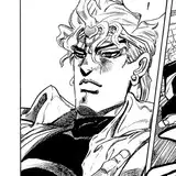
As a direct opposite, Interactive elements are stuff that the character is actively interacting with. The tree branch in this piece counts as that.

Strictly speaking though, depending on how these elements are drawn, they may not be a “background” at all, and moreso a part of the character’s posing, like the alien egg trap above. Technically it’s part of the background, but it’s also an integral part of the character’s posing and the story that is being told. The barbell in this piece below is another example.

You can think of Interactive elements as props. They serve their purpose by being something that the character is interacting with, usually in a way that tells a story.
Common examples of Interactive background elements (at least in NSFW art):
Chairs, sofas, tables/counters, pillows and blankets
Gym equipment, showers, glory holes
Toys, handcuffs or other gear, swings or other suspension tools, poles
Tentacles, symbiote goo, eggs
Drinks and/or food (usually stuff that drips onto the character like ice cream)
NOTE!
It’s probably important for me to mention that Interactive background elements are not inherently better than Non-interactive ones. What matters in the end is what story you want to convey to your viewers with your piece, and how much interaction between subject and background is necessary for that story to be told well.
For example, if your drawing is a dude confidently sunbathing nakey at a beach, you can either have him just relaxing on a beach towel or a lounge chair, or he could be holding a drink, or applying sunscreen on himself or otherwise interacting with other beach-type props that you can think of.
On the other hand, if your drawing is two dudes in the middle of Pounding™ in bed, it wouldn’t really make sense for them to unnecessarily interact with anything in the background, unless you specifically want to make, say, the top be holding a camera or phone to record the ordeal, or maybe the bottom is being handcuffed to the bed or something.
Planes
The last kind of background element is something that sorta straddles the line between Interactive and Non-interactive, Planes. These are essentially surfaces or objects that the character is standing on, lying on, or otherwise resting their weight on. In standard contexts, this is usually something like the floor or ground; some flat object like a bed, table, pedestal, or counter; or even something like a chair, bench, or a sofa.
The main purpose of Planes is to establish depth and 3D perception. It helps with creating a sense of perspective even if there isn’t much perspective work actually put in the piece. Additionally, it grounds the character into becoming a part of the environment, and prevents a character from looking like they’re just standing in front of a green screen, as I’ll explain further later in this lesson.

The floor and walls in this piece above are an example. Together, they establish that sense of cramped 3D space in which the character is trapped in, and of course, they also act as a vessel for the light to direct the composition. Lastly of course, they also act as a place where the character is resting his body.

The floor above acts in a similar way. With only 1 visible plane, it’s a bit more of a challenge to establish a sense of perspective, but that’s where the line markings on the floor and the background table+chair comes in. They help to establish a downward camera angle, and properly create the sense that the character is lying on a surface, instead of just floating.
You can also see in that piece that the table, chair, and foreground toolbox are the non-interactive BG elements, and the cables he tripped on act as a semi-interactive BG element.
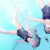
It’s good to note that a plane isn’t always flat, as the below example shows. Sometimes the plane that the character is resting on can be irregular like the rocks here. Though the flat water surface does act as an additional tool to sell the 3D plane sense.

----
Now that you know about the kinds of backgrounds, the purpose of backgrounds, and the elements of a background, let me show you an example of how to put this into practice.
To start with, you need to think about what scene you’re composing. As mentioned before, certain compositions benefit from having a background containing all 3 elements: plane, non-interactive, and interactive elements, while others may only need one or two.
Let’s take an idea to test this out: “A guy cooling off on a hot day by splashing himself with water.”
The most basic and easy approach would be to use entirely non-interactive background elements, for example, like this:

In this way, the only thing the background does is provide context for where the character is, which is a perfectly acceptable way to do backgrounds. However, the downside is, because there isn’t any clear interaction between the character and the distant background elements, there is a risk that the character looks like he’s simply standing on a backdrop or a greenscreen.


This risk can be mitigated with 2 ways: first is to make sure the lighting on the character is properly aligned with how the background lighting looks (if the artwork is coloured), and the second is to add foreground elements, maybe a water cooler for this example:

By sandwiching the character between a distant background and a foreground, it enhances the illusion that the foreground, character, and background are all part of the same environment.


Let’s do another take. This time, I’ll try to use all 3 elements and have a more detailed composition.

Compared to Example #1, the character and the background in this one are much more well-integrated with each other. The surface of the bench and the floor establishes the 3D plane on which the character exists, which removes the risk of the background looking like a greenscreen. Plus, because he’s actually putting his hand on the water cooler, it becomes more than just a simple foreground set dressing, and is instead an object that the character is actively interacting with. Overall, it’s a much more concrete and tangible composition.
The downside, however, is that this sort of composition is prone to losing focus. Compared to Example #1, where the character takes all the spotlight, the background in this example feels a little more distracting, fighting with the character to earn the attention of the viewer.
In cases where the character is the primary focus, this kind of distraction is a bad thing. You want to keep in mind that the background should be in a lower, supportive role, compared to the character. Even if the background is complex and detailed, it should ultimately direct the focus back onto the character, instead of stealing focus away from it.
(We’ll talk about other cases a little later!)
The question then becomes: how do you achieve this balance, where the background can have complexity but doesn’t steal focus away from the character?
Since art is a creative and open-ended endeavor, there isn’t a “one size fits all” answer to this, but there are two compositional concepts I tend to use: Clarity Contrast, and Leading Lines.
I’ve talked about the concept of contrast in a previous lesson before (Composition Basics). Clarity Contrast, or I sometimes call it Contrast-Contrast, is a difference in clarity, starkness, or noticeability between the object of focus in a piece and everything else.
(There’s probably a better name for this concept out there, but for now we can call it Clarity Contrast)
Taking this painting titled The Night Watch by Rembrandt as an example:

You might notice that the two people in the front are illuminated very starkly. The whites and beiges of the guy in the right are very bright and eye-catching, and the black outfit of the guy in the left is pitch black. The shadows are also intense, which you can see in the right guy’s shoes; the illuminated one is almost glowing, while the other shoe is nearly invisible against the dark background.

Moving back from the primary focal points, every other character (except for the little girl for some reason) are painted with duller and duller colours, to the point that the guy who’s just peeking from behind the flag is pretty much completely made out of browns and grays.

By having some characters be starker and clearer than others, it helps distinguish them from the background. The particular technique used in this piece is called Tenebrism, which is the intentional darkening/shading of parts of an artwork to sink them away from the focus. You can also think of this technique as putting a direct spotlight on the focal point to make it stark and distinct, and leaving everything else dark and less distinct. I use a similar technique in this piece:

Notice how the bright light on the floor is bouncing nicely against the taur lower body, and is especially putting the dick in focus, while the upper body is relatively more sunken into the background.
I also used it in a more Spotlight-like literal sense in this piece:


The opposite of this can also be done, where instead of the background being made indistinct due to shadow, the background can instead be made indistinct by using Light, in a technique called Overexposure (borrowing the term from photography). This is most often seen in scenes set in the outdoors, like this for example:


And I also used it a little more subtly in this piece:


Notice how in grayscale, the black hair of the background characters are all medium gray, different from the orc’s hair which is much closer to black. The overwhelming brightness of the background compared to the more normally lit orc, makes the background a little less distinct than the orc, i.e. it makes the orc more eye-catching.
Aside from Tenebrism and Overexposure, another technique is just Blurring the background. This is the easiest and also probably the most commonly used technique in the current bara art climate. You can see me subtly using that in the orc piece above, as well as in this piece below:

Notice how the window which isn’t too far away is only slightly blurred, while the buildings far in the background are all just blobs, simulating depth of field where objects far away get Really blurred.
Now, to apply that to Example #2, I might do something like this:

Using a combination of overexposure (by lightening the lines in the background) and blurring, I’m able to make the subject and the foreground elements far more distinct and noticeable than the background.
You might also notice that I’ve added a white gradient effect radiating from the subject onto the background, highlighted in blue below:

This is a technique you can use to force the illusion of depth difference between something in the foreground and something in the background. I personally learned this trick from watching Digimon Adventure.


I call it like, Fog effect..? Because it kinda looks like fog or mist in the anime.
Anyway, we can also apply this Clarity Contrast + Fog effect onto Example #1

Note two things in how I executed this: First, I blurred the trees and the basketball hoop a little less intensely compared to the buildings that are further away, and second, I blurred the foreground element significantly. This kind of blurring creates the illusion of a narrow depth of focus, which really focuses the viewer’s eyes to the subject and the stuff immediately around him.
A narrow depth of focus isn’t always the right call for every piece, though, so make sure to use your artistic judgement when applying this technique. If you’re unsure, you can always dial it back with a more subtle blur, or not use any blur at all, like this for example, only using some overexposure in the background:

Leading lines are lines in the background that point towards the intended focus of the piece, leading the viewer’s eyes towards it. This can be in the form of the vanishing point being behind the character (so all the perspective lines point towards the character), or in the case of a room, a corner being behind the character (so the wall, floor, and/or ceiling lines point towards the character). It’s also not always a tangible line that’s drawn on the canvas. Sometimes, it can also be in the form of a background character’s gaze leading back to the main character.
Here are some examples:


With this method, even if the background is detailed, the viewer’s eyes are ultimately going to be pulled towards the leading lines and back to the character as the main focus.
You can see that I used the same trick in the Example #1.

But I did not use this trick in the Example #2. Instead, the perspective lines lead away from the character, which resulted in the background stealing focus from it.

But now’s the time to bring up the other case: What if there’s a reason for the background to steal some focus?
Depending on the story you’re telling in your piece, framing the lines to lead away from the character may be exactly what you want. For example, if I changed the background of Example #2 to something like this:

Suddenly the leading lines make more sense, as now there’s a secondary character that I want the viewer to also take a glance at, and the leading lines lead to that character.
You can see how this secondary character addition is far less effective on Example #1, since all the leading lines direct the focus back towards the character; to the point that it’s possible for a viewer to completely miss and not notice the secondary character at a glance.

Now to take this to an even higher level, I’m going to compose another take using an extreme angle. To start with, I’m going to put down the bench to establish the plane on which my character is going to lie on, and simultaneously establish leading lines using the long lines of the bench towards one part of the canvas.

From here, I’m going to plop the character down in a very exposed pose, showing all the goods. You can already see how the lines of the bench guide the eye towards the character.

From there, the rest of the background elements will serve to support the character as the focus, while still containing elements that provide context on where the character is.

And here is a more polished version.

You can see how when I put all the concepts together:
Putting the character on the bench as a plane which ensures he and the background are integrated into one environment
Using clarity contrast to fade the background via overexposure and blurring
Using leading lines that pull the viewer’s eyes into the character, and especially the character's action of splashing water on himself, which is the focal point of this piece.
It creates an interesting and immersive artwork that doesn’t necessarily feel like there’s a “character” and a “background” as separate entities anymore. Instead, it’s a cohesive scene that feels like you can sink into.
This is probably the ultimate goal of a good composition: to create the impression that your art is greater than the sum of its parts.

---
Backgrounds are an optional part of art. Many artworks can exist without a background, but a background usually tells a bigger and deeper story than a character who’s just standing in a void.
There are many tricks and compositional concepts you can learn to create good artworks with backgrounds. Two of the concepts I introduced were clarity contrast(including tenebrism, overexposure, and blurring) and leading lines, but you should definitely do your own research, study your favourite artist’s works, and build your own set of tools and tricks specifically for your art. This lesson probably only scratched the surface, and you can always learn more as you progress in your art journey.
In the end, a background should serve to improve your art. Don’t be compelled to add a background to a finished character art with no good reason; it might end up looking like your character’s standing in front of a green screen, or worse, the BG might distract from the character and ruin the piece 🙊. Instead, when you want to add a background, try to include it from the early stages of your sketch, so that you can fully integrate the character into the environment they’re in.
And that’s all I got to say on Backgrounds for now!
As always, if you have any questions, feel free to hit me up in the Art Labs channels in the AA Labs discord!