In this lesson, I will give an introduction to the concept of backgrounds, including the types of background and the purpose of backgrounds within NSFW artworks.
This lesson is meant to be a building block in your knowledge, not a comprehensive guide. I’m nowhere near an expert in drawing backgrounds especially outside of the context of NSFW art, so aside from reading this, you should also do your own research into the kinds of backgrounds you like, and the kinds of backgrounds you want to do in your own art.
Backgrounds go hand-in-hand in composition to create a good piece. While there are other reasons for putting in backgrounds (like providing context for where the character is, and such), ultimately a background must serve the purpose of making the piece look more aesthetically pleasing and interesting, i.e. to make a better composition. The one thing you wouldn’t want is to spend extra hours of work to make a background, only to have it detract, instead of improve, the aesthetic quality of the artwork.
Check my lesson on Composition Basics if you need a primer on the concept of Composition: https://www.patreon.com/posts/lesson-basics-62693715
Let’s quickly look at how backgrounds and composition interact with each other. First, a well-rendered, high-effort background can be wasted on a bad composition, like the piece below.
 I spent a lot of time rendering the temple in the back along with the trees and such, but the composition angle did nothing to sell just how large and grand the character is. For all we know, he could be normal sized, and sitting in a miniature replica of a temple scene instead of the real one.
It’s not a terrible composition, but it’s relatively flat, unfocused, and did not quite do what I wanted it to in the end.
Inversely, a well-laid out composition can make the illusion of a good background. Compare the two pieces below.

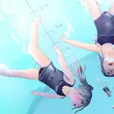
These are both well-composed pieces with a good sense of depth and focus on the characters, but note how the left piece has a very detailed background, with the actual stalls and signage and foods drawn like the real thing. Compared to that, if you zoom in on the individual background elements on the right piece, it’s all just vague brush strokes that simulate the shape of objects without actually defining them as real objects.
In both pieces, a well-thought out composition is the reason the pieces as a whole look good, but it’s especially pulling a lot of weight on the right piece, even if the background is relatively half-assed. The advantage to this is, you can get away with spending 30 minutes or 1 hour on a simple vibes-based background, instead of having to spend many hours drawing a real background, as long as the composition works with it to sell the illusion.
Here are a couple more examples of the same thing from my SFW portfolio, real(ish) background on the top, vibes background below it.


Now that I’ve established the importance of Composition as a whole within the concept of drawing backgrounds, let’s get into the types of backgrounds.
In terms of how it’s drawn, I separate backgrounds into 3 different types:
1. Real Background
Real backgrounds contain well-defined elements that represent real objects. This means that if you zoom in to the background, you can pick out and identify what things actually exist there.

For example, you can zoom into this and actually see where the individual pipes go, and you can see the details on the researchers, and you can even pick out things like the screws on the beds and the little yellow light strips.
This type of background is the most time-consuming, and potentially the most demanding on your knowledge. For example, even with a simple bedroom scene, you have to have some base level of knowledge on what bedroom objects look like to be able to draw them: the beds themselves, bedside tables, lamps, dirty laundry, dirty socks, AC units and other things hung on the wall, etc.; you may end up needing to grab references for every individual object to be able to draw them well.

At the same time, real backgrounds tend to be the most impressive if executed well. Though relatively few viewers will appreciate the effort going into stuff other than the main character, those who do take the time to zoom into the background details will likely appreciate the amount of effort put into it.
(I don’t have an example for this bc I’m usually too impatient for real backgrounds lol)
2. Vibes Background
This isn’t the actual technical term for it, but essentially, it’s a background that contains colours, lines, and shapes that create the illusion of things, but do not actually represent real objects. This means that if you zoom in, the illusion can break and you can pick out the shapes and brush strokes that make up the illusion.
A background that is blurred can also count as Vibes background.

The city background in this comic page is an example of that. At a glance it does look like buildings and skyscrapers, but if you zoom in, you can see it’s made up of strokes of colours that only vaguely form the impression of buildings.
Vibes backgrounds are useful for when you need to make a background quickly and without putting too much effort, like when you have a deadline, or when it’s part of a series of several drawings like a comic. Using premade brushes with specific shapes, such as city brushes or plant/foliage brushes, can be one way to create vibes-based backgrounds that look more like real backgrounds.
3. Abstract Background
Abstract backgrounds are made out of things (or lack of things) that are not meant to represent nor give the illusion of objects. In a sense, this kind of background is purely a compositional element without real substance, which has the purpose of adding mood, dynamism, or complement existing colours, as I’ll discuss later.

In this example, there are particles and textures in the background that resemble the idea of wind and snow, but it’s not actually meant to represent the object, and is purely there to sell the mood and the movement of the pose.
Note: Lack of Background vs White Background.
There is a difference between having no background and having solid white as a background. See if you can spot the difference in the two pieces below.

Do you see it?
In the left piece, the white background is essentially a void of nothing, i.e. a lack of background, while on the right, the white actually shines onto the character like a bright backlight, so it’s a form of background that affects the overall composition of the piece.

This kind of idea extends over to solid colours as backgrounds in general. If the solid colour BG has no bearing or effect on the subject, then it counts as a lack of background (and there’s nothing inherently wrong with that), but if the solid colour BG, for example, reflects on the subject’s skin, or tints the colour scheme of the subject, then it would count as a more substantial background element.

You can see in the example above, that the red in the left piece is mostly only there to complement the red colour scheme, but can otherwise be removed without impacting the overall composition. Meanwhile, the magenta on the right piece is reflected extensively on the subject's skin, and is an actual well-integrated background in the piece.
Why do we draw backgrounds? Most artists, especially NSFW artists, consider backgrounds to be a pain or a chore. In fact there are many downsides that come with drawing backgrounds, such as:
It takes significantly more time and effort to draw.
It can distract from the primary focus, which is usually the character(s)
It can end up distorting the sense of depth, force, or dynamism in the character’s pose and make it confusing
It can overcomplicate the colour palette, or even clash with the character’s colours.
So then what is the purpose of backgrounds?
Main Purpose: Telling a Story and Providing Context
The primary reason for including a background in your art is to tell a richer story. An artist can theoretically just draw characters standing in a void for most of their career, but more often than not, there will be times where they need to include other things in the artwork to provide context for the story being told.
Take this piece for example:

Could it have been drawn without the background? Certainly, but it would lose out on the extra thrill of the context, which is that the character is having his dick exposed in an office setting, where other people could be around to see him.

Likewise, something like this piece above could pass off as a good artwork on its own.

But putting in the effort to draw the background characters provides a far richer story. It gives a context on who the main character is, how big he is compared to normal people around him, and his importance within the setting he exists in.
This then brings up another point: There is a spectrum of focus between the character and the background or environment.
An artwork containing a background that puts a lot (or all) of its focus on the character, is something some people would call a “pin-up” (I’m not sure if there’s a more proper term for it out there). Meanwhile, an artwork where the focus is primarily on the background and the environment is something I would call a “scene”.

Pulling from earlier sections, here’s an example of a pin-up vs a scene.

As mentioned, this is a spectrum instead of an absolute. There are artworks that has a large focus on the primary character(s) but also gives significant focus to the environment, like this one:

The characters take up most of the spotlight, but enough work and detail is put into the background to really sell the story that all of this is happening within a church.
Meanwhile, there are artworks that have most of its focus on the environmental storytelling, but still put one or a few characters in a focal point, like this one.

The details are spread evenly across the environment here, from the people walking in the hallway, to the signs on the ceiling, and even to the two characters in the left booth, all to sell the story that this is a business happening in a public station. Even then, due to how the piece is composed, you can still tell that model TY-G-04 and the person considering hiring him are the main characters in this scene.
Usually, the further you are towards the Scene end of the spectrum, the more important it is to put effort and detail in the background, while on the other end, you can get away with quickly-sketched backgrounds or even no background at all.
Aside from telling a story, there are other reasons to include a background in your works.
1. To Convey Mood or Atmosphere
A background, even a simple one, can give a piece a certain mood or atmosphere that can enhance the effect of the piece to the viewer.

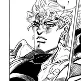
In this piece for example, even though the background only consists of walls and stark lighting, it enhances the impression that the guy is captured in a small, dark, cramped space, and that he’s being looked down upon by someone that has power over him. Without the background, this piece will likely have far less of a visual impact.
2. To Convey Force or Dynamism
A background can also help to enhance the force or movement of a character, strengthening the dynamic feeling of a given artwork.
Taking this example from above, the sweeping lines of the background enhances the character’s attacking motion, and helps to sell the impression that they are moving forcefully and dynamically.
This is pretty frequently seen in gacha character art, where the rarer variants of a character’s art tends to be a dynamic pose involving a lot of things in motion. Sometimes it’s abstract, like lines and magic effects, other times it’s more physical, like rocks, chains, or other debris being thrown around.
3. To Evoke a Theme
This is slightly different from telling a story or providing context, as in this case, a “theme” refers to a collection of objects, shapes, or colours that relates to a certain idea.
One common example in bara art is locker rooms as a thematic background, like in this piece.

Does it actually tell the viewer any context on why the character is there, or if the character is an athlete, or what kind of sports he plays?
Not really, but it’s a good and easy shorthand to evoke the idea of athleticism, sweatiness, masculinity, and the eroticism implied within those ideas. Hence, the purpose is less about telling a story, but more about evoking that theme.
Sometimes, evoking a theme can come down to simply using certain colours.

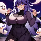
In this piece, there aren't actually any thematic objects in the background, but simply having purple and orange in the composition evokes that certain halloween-y mood in the piece.
4. Harmonizing Colours
The last reason for putting in a background is to create a harmonious colour scheme. This can be in the form of using adjacent colours, or repeating colours that exist on the character, to form a rounded colour scheme.

In this example, the character’s red hair is repeated on the blanket, the wall, and the curtains. This softens the usually high-contrast impact of red as a colour, and gives the gentle blue light from the window a chance to shine as the primary atmospheric colour.
Another way to do this is to put colours in the background that contrasts with the character, making the character’s colours pop.

In this example, the significant presence of muted reds in the background makes it the primarily blue-tinted design of the character pop against it, without creating a clash.
In both examples though, orange is strategically omitted from the background, so that the orange that exists on the characters really contrasts against everything else.
Note
Any given background is likely going to serve a combination of several different functions from the ones listed above.
Taking that last example, though the BG does harmonize the colours, it also tells the story that the character is wearing shibari in the middle of the city, which is why he’s flustered about it. The colours I picked also had the purpose of selling the atmosphere of a bright and hot summer day, which then explains his damp, slightly see-through shirt.
To summarize everything so far:
Backgrounds and Composition are inseparable. A bad composition can ruin a good BG, but a good composition can save an otherwise bad or low-effort BG.
Three types of backgrounds exist:
Real BG that involve real objects
Vibes BG that create the illusion of objects
Abstract BG that doesn’t involve objects, may just be a solid colour
Purpose of a background:
To tell a story and provide context
Convey a mood or atmosphere
Convey force or dynamism
Evoke a theme
Harmonize colours
Combination of several of the above.
This concludes the introduction to backgrounds!
Next month, I will be releasing a second part, which deals with what elements exist in background compositions, as well as a few techniques that apply into composing and drawing a background.
As always, if you have any questions, feel free to hit me up in the Art Labs channels in the AA Labs discord!
Kr (avantAberrant)
2025-02-03 15:12:43 +0000 UTCSquidpizza
2025-01-23 07:21:39 +0000 UTC