If you haven't finished reading Madman Apocalypse Book 2 (i.e. up-to-and-including chapter -155), then avoid this post if you don't want to be spoiled!
------------------------------
I figured that, for anyone who's read the ending of Book 2, it might be fun to see how the ending comic was made and the process behind it.
My amazing agent, Edward Kim, worked with Webtoon in the past as part of their Content Acquisition, so he has a lot of knowledge and ties to the webcomic industry. He also has his own team that he's been using for pitches and art and such.
Anyway, I had this idea of doing something different with the end of Book 2, since it was such a big plot-twist. Like, without a doubt the biggest I've done. I thought just delivering it normally would make it feel less special. When I found out he had this team, I got the idea for adapting the ending into a comic.
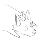
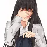
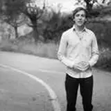
Here are my initial pitch drawings:
 Pretty good, right?
I then went on to write a script document, which was basically just an early version of the text-based version included in the pdf of chapter -155. After that was written, I wrote a panel breakdown, describing what each panel would have.
Here are my amazing drawings that went along with those:


As you can tell, my paint drawings are quite shit, which is why it was so surprising when the artists were actually able to interpret them and make this:


Working with professionals is pretty awesome to be honest. I mean, this was already more-or-less the concept I'd come up with and provided them, except it looks amazing.
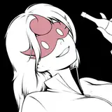
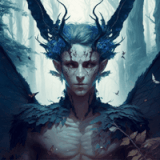
Of course, before this was made, I was sent some various sketches to pick between and mould into the right shape I had in mind. Such as these:


After the initial sketch came a version without any colour, to serve as a base for the colourist, who was separate from the person doing the art.


Okay, minor lie, the blood was somewhat coloured in. Not sure why. Also, the intestine hitting the sink was just a stroke of genius, lol.
I initially wanted the Queen to be brownish-red, since that was how the Agents were described. One of the issues I had with the descriptions was that, at the time of initiating the webcomic art, the story was only getting into something like chapter -100. As a result, I had to plan pretty far ahead, which is something I don't really do <.< at least not down to colour schemes and the minutiae of details.

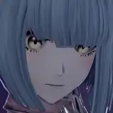
Anyway, after seeing this, both Eddie and I felt like blue was a much better colour, and it was conveniently also a much better match for the sub-story involving the Child Protective Services Hive and their reliance on Children's happiness to gain power, and how having those children pulled out of their grasp made them all basically start decaying. So it became this:

From here came full colouring.


It was deemed too dark and a brighter version was made, with this being a good example of before-and-after.

To wrap it up, all that was missing was the text, and it became the final version you now see on chapter -155.
It was just a super cool process and it was very gratifying to see part of my own story made into a comic like this. I really hope everyone was blown away when they first saw it, and I hope it was fun for you to learn how it came to be.
This small adaptation definitely won't be the last time I do something like this!
Kristoffer Pauly
2025-01-01 10:41:15 +0000 UTCthe ice man
2025-01-01 02:00:40 +0000 UTCKristoffer Pauly
2024-12-31 10:46:45 +0000 UTCthe ice man
2024-12-31 06:24:33 +0000 UTC