Night Lights (Chapter Five Colour Keys are done)
Added 2025-04-24 19:31:04 +0000 UTCFlatting is all done for Chapter Five of PRACTICAL DEFENCE AGAINST PIRACY, and I've spent the last week preparing its colour keys. You know what that means… it's almost time for finished pages! Those begin in the next post, probably in a week and a half.
Right now, though: some tips on how to render nighttime scenes without compromising readability, and a little ASSASSIN'S CREED ramble!

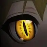
[ Above: my colour key for the opening page of the chapter. It's nighttime, and the only source of light is ostensibly the moon, but I still use a complete range of values in the image. ]
THE ILLUSION OF DARKNESS
I’ve just finished “colour keys” for chapter five — that’s where I take a few significant panels from throughout the chapter and work out their colour palette, mood, and lighting effects so I’ve solved those problems before I get to colouring the actual panels — and, as almost the whole thing takes place at night, I keep reminding myself of something I noticed a long time ago:
Darkness shouldn’t be dark.
That sounds dumb, but it’s the stupidity that makes it stick for me.
What this means is that when I am painting a scene set at night or in a dark location, the actual painting should not be dark overall. That is, the panels should not be smothered in black and dark blues and greys. You don’t convey a sense of “nightness” by just making everything black. No, that way, you make everything hard to read.
This may seem like a no-brainer. And yet, early on in my comics-making career, I saw a peer — a very talented painter, with a seemingly effortless command of light and shadow — paint a whole scene set in a cavern in dark, murky colours. It didn’t seem realistic, it didn’t even seem dark, it just looked like everything had been dimmed. I saw the same thing last night, watching a video of the new Elder Scrolls: Oblivion remake. Out in the open world, at night, everything was just dark. And you could argue that in a video game that attempts to simulate reality, or where you’re supposed to whip out a torch, that’s more acceptable. I agree. It is more acceptable. But it could have used a little art direction, and that’s what I’m talking about here.

[ Above: another moonlit scene. I've taken the distant hills down to black because it created the most convincing feeling of "countryside at night," despite it not making much logical sense. ]
When painting a “dark” scene, you still need a complete range of dark-to-light values. The lightest part of the image should still have a bright value, even though you’re trying to make the scene feel dark, and a scene can feel dark even if the final image uses the same range and proportion of values as a bright noon-day scene. More black doesn’t make a scene look like nighttime, it just uses up more printer ink.
Who needs to hear this? Probably not you, but definitely someone. Right now, someone is painting a night scene all in blacks and navies, without a single highlight to be seen.
Here are the practical things I tell myself when I’m trying to paint a darkened scene:
Lighting still needs to come from somewhere. You are making art. This is all artificial. Your panels need to be clear and readable, and with the style of illustration you’ve chosen,* that means pretending there are imaginary lights in your imaginary scenes.
Emphasize the effect of local light sources. E.g. torches, flashlights, fires, street lamps, etc. etc. The brilliant pulsing space orb is asleep. You stop illuminating your characters with daylight, or with bright windows. You start asking, “where can my light be coming from?” When the light comes from a side angle, or below, or is strongly coloured, it goes a long way toward convincing your reader that there is no sunlight here. This is the big one. As long as you can stop thinking, “dark means no light,” but rather “dark means choosing new light sources,” you’re 90% of the way there.
Get theatrical. Even in the soberest, most serious movie or TV show, night scenes are illuminated in dramatic ways. You can get away with a lot of fake-seeming lighting before people think it looks ridiculous. As long as your theatrical lighting doesn’t do what the sun would do, it won’t ruin the illusion of nighttime or darkness.
Shadows can be black. During daytime, or in bright scenes, my shadows adopt the colour of the ambient light, e.g., blue when out under the sky. Black shadows imply the absence of ambient light.
Rim lights are your friend. This is just a cheat-y way of encapsulating the ideas of A) smaller local light sources and B) getting theatrical.
Treat moonlight like sunlight… sort of. It’s just a colder colour, and both the shadows and the sky are darker. If you've ever taken long-exposure photos in bright moonlight, it can be surprising how much the images look like daylight photos. But try to avoid the fakey-looking "day for night" effect. In practice, I tend to narrow the moon’s beam, so it acts like a spotlight.
Not so dark! There better be a white (or near-white, at least) element to the image.
*Note this all assumes you’re trying to simulate the effect of light, even in a cartoony manner. If you’re working in a more abstract fashion, your solutions can be much different and honestly I don’t even know why you’re still reading this.
James Gurney’s COLOUR AND LIGHT: A GUIDE FOR THE REALIST PAINTER is a good guide to all of this in much greater depth. I think it’s an excellent balance of colour theory ideas, and practical, applicable approaches. He’ll teach you about colour wheels, palettes, and the science of light, but also drop tips like “typically, shadows are lighter and blue-er in snowy scenes.”

[ Above: I feel comfortable rendering a naturalistically-lit scene (top), but I need to test and experiment with more dramatic, theatrical approaches (bottom). ]
- - - - -
ASSASSIN’S CREED: RAMBLE
When I was gorging myself on French Revolution material, I mentioned I swan-dived into ASSASSIN’S CREED: UNITY, 2014’s semi-broken, questionably-designed entry set in revolutionary Paris. Since then, I’ve finished it and been pulled back into a deep enthusiasm for the series. I want to ramble on about the series at length, like the world’s nerdiest bar drunk, but that wouldn’t be a good use of your time or mine. Instead, here are some takeaways that we’re meaningful to me.
AC: MIRAGE and THE NINJA FANTASY.
I hadn’t clocked this until I heard a reviewer articulate it, but the AC series began as a “ninja fantasy,” despite its original setting in the Middle East. You sneak, you eavesdrop, you move in disguise and across the rafters, you murder a dude silently and undetected, and if you are detected you nimbly leap and climb your way to safety. It is fun to sneak and climb and stab.
At some point (maybe AC3) they partially abandon the ninja fantasy to the point where it’s almost an afterthought in ORIGINS, and ODYSSEY (and maybe VALHALLA, which I haven’t played). It’s there in UNITY, though, and it’s the focus in MIRAGE, which I had been ignoring until this reviewer pointed it out.
I’d heard MIRAGE was so-so, maybe even a “failure,” so I gave it a pass. I’d heard their goal was to “take the series back to its roots,” but then had also heard people whose opinions I trust say, “meh.”
Turns out, though, I actually really like it. Or, I like it in the same way I like UNITY: I love the setting, I love poking around in it, and it’s doing a great job of delivering the ninja fantasy in that setting. And the setting is beautiful. I really can’t emphasize enough how surprised I was by what a good game the game part of the game actually is. The only thing holding back MIRAGE is all the narrative trappings.
As an aside, for me, this also underscores the relationship between personal taste and what a reviewer thinks is good or bad. Is MIRAGE as good as ORIGINS (generally, the most well-regarded recent AC game)? Well, maybe and maybe not. Overall, it might be, except that ORIGINS is not as much of a ninja fantasy. So if I’m here for the ninja fantasy, maybe ORIGINS is less to my taste. Was the TV adaptation of FOUNDATION any good? Well, ehh, I’m not going to argue that it was, but I was also really in the mood for exactly that sort of thing when it first aired, so I enjoyed it. When you really, really want a pizza, but someone says, “I’ve made you the finest sushi in the world,” that can still be true, but it’s not pizza.
WRITING AND CHARACTER.
People really seem to like ASSASSIN’S CREED 2, the one set in Italy. Admittedly, it’s been a long time since I’ve played either AC2 or the original AC1, and I remember they unarguably improved a lot of the game elements, but I still feel like my heart belongs to the first game. I suspect that a lot of the love for AC2 is thanks to its writing and its main character, to a degree that most people don’t realize. To be sure, people do recognize it. Just not enough.
The protagonist of AC2, Ezio, is funny and likeable. He fits in with his setting and his motivations for becoming a whirling murder ninja line up as well as you reasonably need them to.
Meanwhile, in AC1, and UNITY, and ORIGINS, I remember the protagonists being… well, I don’t remember much of them at all. This can be fine — I love a silent protagonist in a video game, like in HALF-LIFE or FAR CRY 2. But a boring character is not the same as a silent protagonist. If you’re going to write characters into your video game (or anything), they need to be worthwhile.
I think MIRAGE is as fun to play as any AC has been, but the character and the story are… disappointing. Our protagonist, Basim, is as bland as seems humanly possible. He has no discernible conflicts, either internal or external. He speaks in platitudes and confirmations. I do not know what is driving him or why I should care in the least. He is certainly not funny.
I put over one hundred hours into AC: ODYSSEY, thanks largely to the appeal of its protagonist, Kassandra, a sort of Wonder Woman-y, amazon-adjacent Greek heroine. (That the guy who makes Delilah Dirk likes Kassandra should not startle anyone). She’s quippy, she cares about people, she laughs and can be sarcastic, and we understand she’s driven by a sort of familial obligation, if I remember correctly. In a piece of late-game material, all she wants to do is to rest and have a vacation, but picks up her sword again to humour her two friends, Barnabas and Herodotus. The characterization doesn’t have to be complicated, it just has to be something. Anything. I remember the overall story of ODYSSEY was a train wreck and seemed to be missing important beats, but Kassandra is so enjoyable, the ship stays afloat.
That’s what I’ve been thinking about while I finish up MIRAGE. I know people notice the quality of story and characterization, but I suspect they underestimate its effect. MIRAGE is fun and beautiful! But the narrative is such a lemon that I suspect a fun game seems less fun and a beautiful game seems less beautiful. Again, we know those things are important, but they’re hard to quantify, and I suspect we underestimate the way they affect us, even if we think we’re giving them their due.
- - - - -

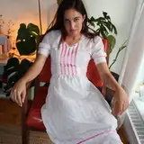
[ Above: I have also been playing with the idea of adding a theatrical pink light for Alexandra and her father's night ride, but I'm not convinced that it's working. I find a frustrating thing about lighting effects is that you have to render them fully, in detail, to get a sense of whether they actually work or not. Oh well, that's what the colour keys are for. ]
FINISHED PAGES INCOMING!
The next update will be the first to feature finished pages from Chapter Five, hot and fresh out of the back of my iMac!
Find out what happens to Alexandra and her father as they race across the island in search of help for Archipoli!
Discover how Nikos and Alexandra’s mother cope behind the closed gates of the Venetian quarter! How will they keep the townspeople safe from the pirate threat?
Chapter Five begins soon!
Until then,
I remain,
a range of dark-to-light values,
TC
Comments
The pink nighttime coloring makes it feel like the color out of space is definitely just over that rise on the right.
Charles Riffenburg
2025-04-25 22:18:12 +0000 UTCThanks for the detail on the darkness colouring, it’s amazing seeing how you tackle it and the specifics of the approach. (I tend to just make everything blue in a very unsophisticated way...) I’d not have thought such bright values could work and they just look so fantastic in-place. Reminds me a bit of the lovely stylistic lighting in 90s TV like X files, which always looks so much clearer and more fun in night scenes than some very hard to see modern stuff!
Hari draws
2025-04-25 09:17:41 +0000 UTC