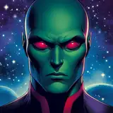
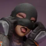
As mentioned last week, I am speed-dating some new typefaces for Practical Defence. My criticisms for the font I have been using to date are that it lacks some international characters, has no em-dash, and does not offer the fancy features that newer, more sophisticated fonts do, like variable "I" characters and alternate glyphs for repeated letters (like the es in "need").
So I looked at the two major vendors for comic-friendly typefaces — Blambot and Comicraft — and picked four that I thought might work.
I am asking you for your opinion, too, because I am so used to the typeface I've been using — it's what I lettered my first published work in, back in 2006 — I don't trust myself to be objective.
NOTES
In Patreon, I can't add a poll to an image post. It has to be one or the other. So: there's a carousel above (if you want to take a close look) and there will be a second post with the poll in it. Comment wherever you like. I'll figure it out.
Some of the fonts are "trial" versions, so you'll see little "demo" glyphs like this:

Know that I see them and they're not representative of the final treatment. I wish they weren't there but c'est la vie.
That's it! I'll see you in the other post. I'm wildly curious to see what you think, and not in an "Instagram engagement lure" sort of way — I really am curious how this will turn out, and what sort of thoughtful insight you all will have.
Until next week,
I remain,
lacking international character,
TC
Mike Maihack
2023-12-18 15:43:31 +0000 UTCTony Cliff
2023-12-11 19:19:33 +0000 UTCPaul Gesting
2023-12-08 07:11:22 +0000 UTC