A Closer Look at Flatting
Added 2023-04-20 17:33:01 +0000 UTCThis week: what's the point of "flatting?" Is there a better way to do it? Is it a good use of time? And in which ways, specifically, does it inspire a wish to completely rethink the process of illustrating a comic book? No big deal.
[ The assumed audience for this post is the general comic-reading public as well as people who make comics. The practices I describe here are not universal for everyone who colours comics. ]
WHAT IS FLATTING?
Think of "flatting" like the digital equivalent of using masking tape for house painting. You put the masking tape around your bathroom mirror so you don't splash paint all over it while you're painting the wall. It's called "flatting" because you're typically filling areas with flat blocks of colour. You define different areas of an image on different layers so that it's easier and faster to go in and do the actual "painting."
FLATTING IN PRACTICE.
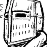
After I've drawn my line art, scanned it, and prepped it for colour, I'm looking at this (below).

If it looks like a colouring book, well, that's a perfectly reasonable way to think about flatting. The process of flatting is basically the act of completing a colouring book, but with an additional emphasis on organization.
So I spend some time colouring within the lines and I end up with something like this…

It's not supposed to be beautiful, it's supposed to be functional. This way, I can focus on rendering the characters without getting "paint" on the wall in the background, and vice versa.
By spending two to three hours flatting a page, I can spend one hour "colouring" it. I do the organizing and planning beforehand so that I don't have to fuss with it when I want to focus on the behaviour of colour and light. If I didn't flat the page first, I suspect I'd be spending much more time colouring overall.

[ ^ On the left, a complete flatted page, with the colour key in the corner for reference. Note that, say, the nearer sails are separated from the further sails. On the right, the same page in finished colour. ]
THIS SEEMS TEDIOUS.
It is, and it isn't. If you'll remember back to the boom in Adult Colouring Books from a few years ago, clearly it's appealing to just sit and colour in the lines. I find it to be pleasant enough—I like catching up on podcasts and audiobooks, something for which this process provides ample brain-room—though during my time flatting, I do feel a nagging, itching feeling in my heart that time is whizzing by while I'm focusing on putting yet another coloured line in just the right place.
THERE'S GOT TO BE A BETTER WAY, RIGHT?
Over the years, people have developed plug-ins and other automated solutions to reduce the chore of flatting. There are Photoshop add-ons and Clip Studio Paint has some neat brush tools for making the job easier.
When I posted about flatting Chapter Three two weeks ago, reader Jason commented with a link to a free and hassle-free web-based automated flatting service, flatto.nl. I gave it a shot! Here's what it gave me back…

These are, honestly, not bad results, all things considered. But you may notice that neither Alexandra's skirt nor legs are separated from the background and the tree on the right is not separated from the grass, while many things that I would like treated as one colour, like Katerina's face and neck, have been separated.
Also, sometimes the tool made some bad choices. Looking at the selection below, why has the turquoise fill spilled outside Katerina's hand, while her thumb hasn't been filled to the tip?

I'll happily take a lot of the blame here—my linework is not well-suited to this sort of automated flatting. I leave way too many gaps. And if I'd given Flatton a non-aliased image, or if it were higher-resolution, or if my scan were just a little cleaner, I might have got better results. (I err on the side of my contrast being a little soft in order to preserve the nuances of the pencil shading, like in the pencil-shaded bricks on the wall.)
It's an open question which would be faster: my current manual flatting process or a flatting process which involved interpreting and re-organizing automated results. I haven't tested, but I suspect they'd be about the same. If that's the case, then I'll stick with my current process, which feels cleaner and easier. You could say, "do both!" but I suspect then we'd be splitting hairs in terms of efficiency. And there's another reason I like my manual process…
FLATTING AS PART OF THE DRAWING PROCESS.
With all my big gaps, I end up doing a non-trivial amount of drawing during the "flatting" process. For example, where these trees meet the grass…

… and this work on Katerina's cuff, which looks better by improvising some colouring where I either chose or neglected to put any linework…

… and routinely along characters' hairlines, like mom's temple below.

Admittedly, I've sort of "fallen" into working this way, but I do like the way it ties the colouring process more tightly to the drawing process. In an art-making pipeline that is divided into all sorts of different steps, it helps the end result feel a little more fully-integrated, I think.
DO WE NEED TO WORK THIS WAY?
If you're a new comic book artist or are a seasoned artist considering a new project, I invite you to take time to reconsider your process.
A lot of us take it as a given that there are certain steps involved in making a comic. First, you write it. Then you rough it out and pencil it. Then it gets inked. Then lettered. Then coloured. That's just how a comic is made.
But it certainly doesn't have to be, especially if you've made the (highly dubious, wink wink) decision to work solo. Comics were inked because early publishing technology required the hard black-white contrast. Dividing the comics-making process into writing, pencilling, inking, and so-on is a way to spread the workload across many workers so that it's easier to publish 26 pages of comics every month.
So if you're working as a solo author and you're adopting this same approach to production, it's worth asking: why? What is it getting you?
I know why I do it. Admittedly, when I started, I took it for granted that comics were drawn first, then coloured. But I like working that way; breaking up the work this way makes it more approachable, easier to tackle. And I like the resulting aesthetic. Even if I didn't, I'm committing to it for the sake of consistency. But back at the start of work on Delilah Dirk, I knew I didn't need to ink pages; I made my line art in pencil, knowing technology would be good enough to get the look I wanted. This seemed to surprise people, though I don't know whether that's because my pencil lines looked inky or because people assumed you had to ink a comic. Since then, the real challenge has been finding ways to make the best of the natural qualities of the pencils I'm using while maintaining a consistent drawing style (and, more recently, incorporating ink as a new sort of challenge).
If you work in that traditional ink-on-top, colour-beneath sort of comic-art style, it's worth questioning it. That aesthetic is the result of several constraints that do not need to apply to you, again especially if you're working solo. It's 2023 and image-making technology is so different from the technology that powered early comic books. Look at Gigidigi's CUCUMBER QUEST or Molly Mendoza's SKIP. or Ryan North's DINOSAUR COMICS.
I'm not saying don't work in that traditional style. I am saying, make sure you give it some thought. By all means, make traditional-looking comics, but please, please do not do it just by default. Try something new, maybe something easier, something surprising, maybe something that doesn't involve spending so much damn time flatting.
:)
Until next week,
I remain,
Colouring within the lines,
TC
Comments
This is awesome! My goodness, I use adjustment layers, though hardly in such a painterly manner! Keeping this for reference... I see-saw on using a number of adjustment layers because... I don't know, it just seems like I'm trying too hard? Meanwhile, there are gorgeous, engaging comics that are "flat-painted" and seem to be less fussy?? Still finding my way, for sure.
Abrian Curington
2023-04-27 19:56:56 +0000 UTCYour mention of "flatting in local colours" reminds me of a post I saw, someone was showing their absolutely bonkers use of adjustment layers to take local colours to a painted look. I use adjustment layers a lot, but this made my head spin. Found it: https://mastodon.art/@artsangel/110231211201740591 (Let's see how links in Patreon comments work.)
Tony Cliff
2023-04-27 17:02:28 +0000 UTCAnd the flip side of the "getting in our own ways" coin is that with some artists, the seemingly weird processes they use is what makes their art stand out. Ideally. Hopefully. :) So I hope everyone can come to a place of honestly identifying the difference between "this works for me" and "I've been unnecessarily burdening myself."
Tony Cliff
2023-04-27 16:55:39 +0000 UTCYes, I think that stepwise fashion works for me too. The old wisdom of breaking big tasks into smaller tasks to make them easier to manage. First you sand the side of the barn, then you paint it. You don't sand with one hand and paint with the other. (Lol, metaphors.)
Tony Cliff
2023-04-27 16:51:55 +0000 UTCI'm all about trying new processes! I used Flatton on my last big book. I found that it was most effective for characters, but then I found myself starting to draw in ways that made it easier for the auto-flatter to do its job, which I wasn't too happy about! I'm much like Sarah in that I tend to review the same page in passes. Of all the steps, I'm the weakest at color, so I'm constantly revising my process! I'll often flat in local colors, desaturate areas of less focus, color holds where it seems necessary (or cool!). Then, I tend to pop on another layer to test out extreme lighting situations. I do a lot of drawing in the paint when it comes to backgrounds, especially since I'm trying to draw looser these days. I also would love to think about color while I'm inking, but my work is always weaker for it! For me, it's best to just think about texture and light in the ink, and muddle through the color afterward.
Abrian Curington
2023-04-23 19:10:59 +0000 UTCGreat review of your processes Tony, I had hoped Flatteron would have been a faster tool for you. It is surprising listening (via podcasts like "make it and tell everyone") how so many people have stuck with old processes that they started with when they starting out, some of which are crazy complicated. Making art/comics is hard enough and we can unknowingly get in our own ways, I appreciate you taking the time to give it a try and document that, perhaps it will help out another creative who it would work for.
Jason Blower
2023-04-21 16:12:41 +0000 UTCThank you for this! Really interesting to see the results of the automated flatter. It did seem to recognise quite a lot of your contours, but yeah, didn't really save that much work in the end ... I find one pays for a lot of potential labour savers in the fixes one has to do after they've 'helped', and I'm not sure it works out in their favour ... Plus, when else are you going to catch up on all those podcats?? My workflow is extremely front-end-heavy, but I think in the end probably everything works out about the same. The thing I like about breaking it into so many passes is that I only have to think about one thing at a time. When I'm thumbnailing, I'm only thinking about composition and readability. When drawing, only thinking about creating the reality of that panel. Colour keys, mood; flatting, the technicalities; final colour, making it look niiiice. I find when I try to juggle more than one of these things my brain slows right down, and not only does it take way longer but I don't enjoy it as much and I exhaust myself faster. But to each their own!
Tealin
2023-04-20 19:48:46 +0000 UTC