
CH3 Colour Keys Done, and a New Approach to Flatting
Added 2023-04-06 18:54:56 +0000 UTCThis week: at least one extremely pleasing panel and some very spoilery spoilers, but first: a recommendation.
- - - - -
PICK UP A BOOK TO PICK YOU UP
Over the last while, I've read three books which I think dovetail in interesting ways. The first is Cory Doctorow and Rebecca Gilpin's CHOKEPOINT CAPITALISM. The second is Robin Wall Kimmerer's BRAIDING SWEETGRASS. The third is Johann Hari's STOLEN FOCUS. It's a veritable trilogy on the theme of "why are we letting ourselves be made so miserable?"
I would wholeheartedly recommend CHOKEPOINT CAPITALISM to anyone involved in the creative industries (and thank you, Ben, for recommending it to me). It's about how corporate monopolies consolidate their power to wring dollars from every last wallet on the planet. If you've heard the term "enshittification" lately or encountered this article, this book extends and enriches that discussion. I really liked the scope and ambition of Cory and Rebecca's proposed solutions.
We've had a copy of BRAIDING SWEETGRASS kicking around for a few years, and I'd heard some good things, but it wasn't until seeing it recommended as "a book to provide some optimism about the climate disaster" that I made time for it. I'm glad I did. It is about ecology from a few maybe-contrasting perspectives, like being taken by both hands and guided through the forest by two voices moving in the same direction. It's also about stories. In discussing the actions of North American settlers, it is honest—as we all ought to expect—but compassionate, too. On top of it all, Kimmerer writes plainly but beautifully, and the overall narrative culminates in a lovely way.
I can't say enough good things about this uplifting book. BRAIDING SWEETGRASS is a must-read.
STOLEN FOCUS is about "our" declining ability to concentrate on anything and the way that social media and internet corporations create and capitalize on this distraction. It's worth noting that the author, Johann Hari, might not be the most trustworthy voice in the nonfiction space. Those links via this Metafilter thread, which I discovered after finishing the book. Still, if you're interested in this topic, I think it's worth reading for the insight into the ways Google And Friends are working to grab your brain cycles.
- - - - -
OKAY BUT SHOW ME SOME DRAWINGS.
Good idea, yes.
I was feeling daunted by the colour keys for one particular sequence, so I gave myself some time to treat them first as value studies, in black and white. If it works in black and white, it'll work in colour.
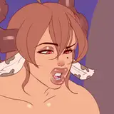
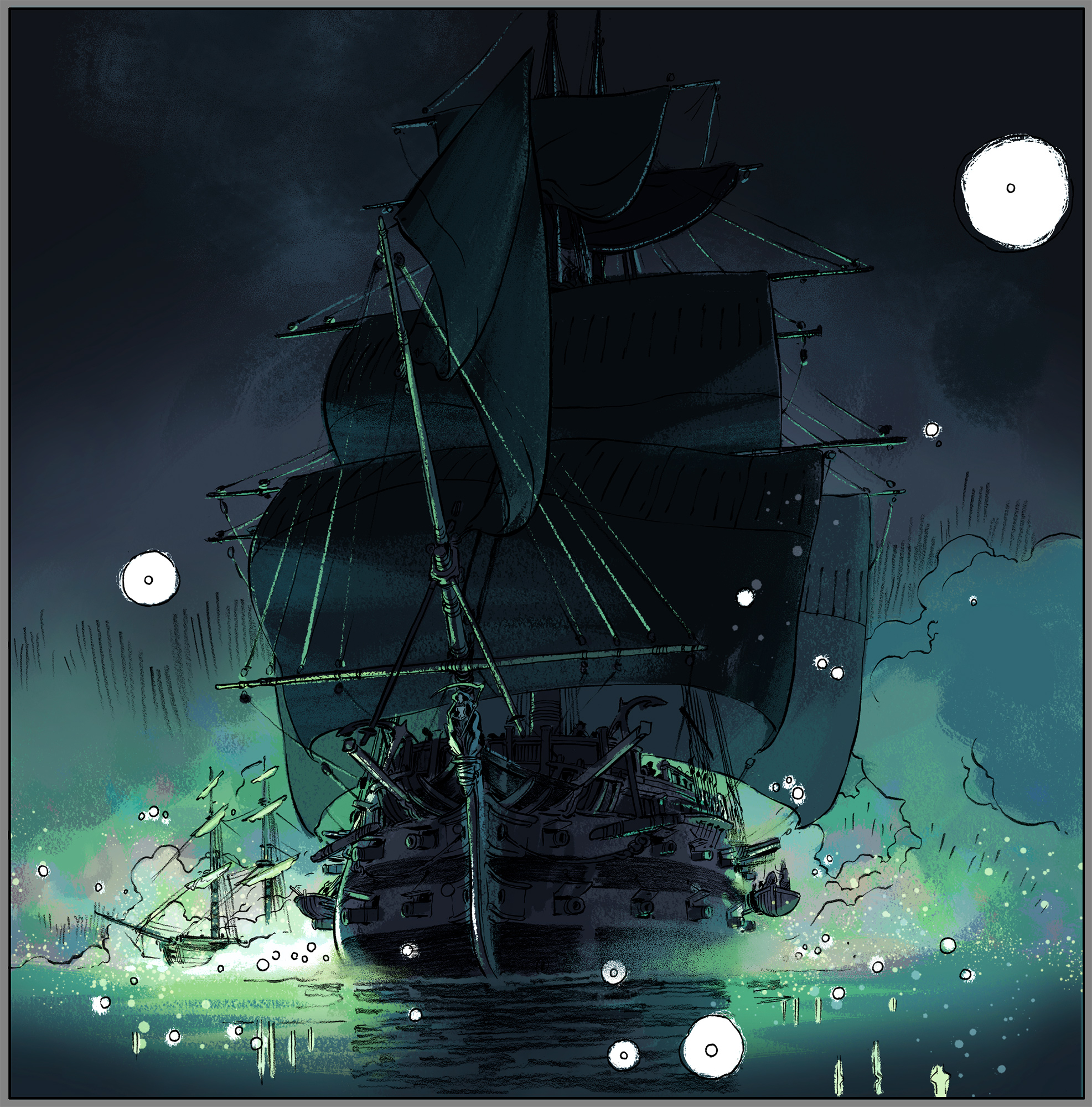
I was immediately rewarded with this (below), which I will call a definitive victory.

I was so happy when I finished laying in that shading, because I immediately saw: yes, this idea can work. Up until now, the lighting idea for this sequence was entirely theoretical—I did not do any studies beforehand to see whether it would work.
But the mood looks right and the lighting effect is doing what I wanted it to do: be an eerie fog lit that glows from within.
Here it is in colour (below).

^ Overall, I want the glow to be green, but—inspired by the effect of the Aurora Borealis—I added some shifted hues in there and I think it greatly enriches the whole effect.
Meanwhile, on land, my first take on this scene. We're outdoors, receiving candlelight from big windows nearby.

These are the "right" colour choices, according to a lot of my reference photos, but the end result feels a little plain. I remember seeing someone else's painting, and all I remember is that the palette was muted grey-purples, dotted with red lanterns (I did a quick search to try to find the image, but could not). It had a slightly haunted feeling which I liked, so I tried again (below).

It's not a definitive winner in my mind, but it's an improvement, so I'm moving forward with it. Also the reds contrast better with the greens from the fog-glow, so conceptually it's a better approach.

^ I wish the scale on this composition was even more dramatic. I wonder if losing some of the definition in some haze would improve that effect.

^ The left-most panel here is what I would call a "valiant attempt." There's a really strong feeling I had intended for it, but I have not yet been able to get it to work. The best I can describe this problem is: I think I have the right elements in there, the mood is right, and I think the lighting approach is right, but I don't think I composed it as well as I could have. Very pleased with that right-most panel, though.
Okay, let's spoil some really fun stuff!
I'm so excited to have made it to this sequence (below).

^ We are aboard the Cordelia here. I think it's all working, but now I want it to feel even "foggier." I might try to exaggerate it in the final colours.

^ Very pleased with this eerie green light starting to draw people's attention. :)
And finally this week, because I like it so much, I've blurred out my final Chapter Three colour key…

… but if you really want to see it, you can click here.
- - - - -
BETTER FLATTING STARTS WITH HUES
I've started flatting, and with this chapter I'm making one notable change.
In previous chapters, I'd get to this point (below) and call it done.

^ A flatted page from Chapter One. All the characters and objects are filled properly, and the rest—including all the character costume colours—I did in the "colouring" stage.
But the process of filling in all the character colour is an undemanding, methodical, relatively dull task, and it was bothering me to have to do it using the same brain mode I was using to, you know, do the final "painting," which is creative by comparison.
So for Chapter Three, I'm filling in all my character colour during the flatting stage so I don't have to worry about it during the real colour stage. Theoretically, this groups the brainless tasks separately from the more creative ones.

^ A flatted page from Chapter Three, with all the characters costume colours filled in. I don't usually throw the gradients in there, but sometimes I do just to help me feel like I'm moving in the right direction.
It means the flatting will go more slowly than the painting, but I suspect that not only will it all be faster overall, the colour stage will be more fun, more personally rewarding, and the results will be better, if only in intangible ways.
- - - - - -
OKAY ENOUGH CHATTER, BACK TO FLATTING.
Thank you as always, Dear Readers, for your continuing support. I feel like I say this a lot, but it's hard to overemphasize: I'm wildly excited about how this comic is coming along and it is a pleasure to be sharing it with you.
As always,
I remain,
Enshrouded by an eerie green fog,
TC
Comments
Always love your book recommendations, Tony! Thank you!
Douglas Holgate
2023-04-10 23:02:51 +0000 UTCEmail'd!
Tealin
2023-04-07 17:28:12 +0000 UTCAlas I just kind of pop between then and now, with a sort of muddy squelch, rather than taking the long way round. You've just got to find your destination timestamp and aim directly for it.
Tealin
2023-04-07 16:26:04 +0000 UTCAh. “Atmospheric perspective” was going to be my next try. On your way back from 1912 can you make a quick stop and try to talk those idiots out of leaded gasoline? Among many other things, I suppose.
Tony Cliff
2023-04-07 16:06:54 +0000 UTCNope, it's a bit of hedgey tweaking of the light source and reflections you have established already ... Will do a quick mockup when I pull my feet out of 1912.
Tealin
2023-04-07 16:01:45 +0000 UTCAre you kidding me? Of course I would. (Is it “atmospheric perspective?”)
Tony Cliff
2023-04-07 15:36:45 +0000 UTCI think I might have a solution to the leftmost colour key which you describe as a 'valiant effort' -- would you like to see it?
Tealin
2023-04-07 09:39:03 +0000 UTCGood to hear! Maybe I'll give it a shot. Meanwhile, I'll post some examples next week of lineart I have that just doesn't work with automated tools.
Tony Cliff
2023-04-06 20:46:06 +0000 UTCIt does a pretty decent job, even if you have to use the selection tool and bucket tool to group shapes it would save lots time. I did a quick test of one of the recent posted pages and it did I think a pretty decent job. this would be the one area I really think AI could be helpful in an illustrators workflow.
Jason Blower
2023-04-06 19:43:38 +0000 UTCOh! I had not heard of that tool, thank you for the heads up! In my experience my linework does not play well with automated flatting tools (I don't close ANYTHING), and I end up spending a not-insignificant amount of time reorganizing the automated results into something that's easy for me to work with. Maybe I'm too stuck in my ways, though.
Tony Cliff
2023-04-06 19:10:58 +0000 UTCI continually inspired by the amount of progress you make from post to post, thank you for regular posts. On a note of flatting, if you have not seen/used this, perhaps it would be a tool that would be helpful. https://flatto.nl/
Jason Blower
2023-04-06 19:01:04 +0000 UTC


