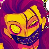
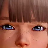
That first image above, with the three increasingly-grimed-up DDs, I had to share, because I really like how it works. In previous books, I don't think DD got filthy enough, considering all the dirty business she got up to. I'm aiming to correct that.
You can also see some additional Greek-influenced colour choices for DD and her mom, some uniform choices for Dad, the Captain, and the Midshipman, as well as some colour for Uncle Nikos. Looking at it now, I wonder if it might not be too much red. He might end up in a differently-coloured cloak.
Why do I do these colour lineups? Because…
I'm Making Colour Keys
Or I will be, starting tomorrow. Here's a page of keys from DD3, with explanations below…

On the left, I have selected and excerpted a few panels from their respective pages. They get coloured using a relatively rudimentary, blocky approach. The only goal is to figure out the open question of "which colours will I need?" How "objective" should the colours be (and, conversely, where or how should I use a more subjective or false-colour approach)?
On the right, I've opened up the character colour lineups and, for each key, I've applied Photoshop's "Photo Filter" adjustment to it. This allows me to give the colour lineup a warm effect or a cool effect or give it any sort of colour cast I wish. Theoretically, I think it's supposed to behave like the type of filter you might use to modify colours in a traditional film-development environment. Above, you can see characters with a nice warm cast applied to them, and with a cool, almost purple-y cast applied.

In the image above, I'm using two more tricks: selective YURMBY palettes, and photo ref.
Photo ref is simple: I see something I like, I use it. In this case, I liked the twilight colours and sky effect from that photo of a flock of birds. I dragged the photo in so I could steal—er, reference—those colour ideas.
As for the YURMBY palette, that's a thing I learned about from the James Gurney book, COLOUR AND LIGHT. Read more about the technique here (or at least find out what YURMBY stands for). Essentially, you take a colour wheel, with all of its multifarious hues, and you mask it out, saying to yourself, "of all the available colours, I will use only these." That may seem limiting, but the effect is actually enhancing. By choosing a limited palette, the end result is most often more harmonious than it would be otherwise. In the examples above, every panel on the left is painted using colours picked from its corresponding cut-down YURMBY wheel.
Since I make the choice of limiting the colours before I start painting, you might ask, "how do you make that choice?" Partly, you look at a reference photo and say "oh I'm going to need a bunch of purple." But mostly, you just put your faith in the system. Stop thinking, "I need all sorts of colours available to me, because different things are different colours," and start thinking, "how can I represent the things I see in this scene, using only the colours available to me?" SURPRISE: it's actually a lot easier than you think. You learn when you want a warm scene, when you want a cool scene, when a scene will be muted, when it will be vibrant. But also, part of the reason for the success of this method is that colour, like time and space and cousins, is all relative. A colour is only what you think it is because of its neighbour, who you're comparing it to. But that's a discussion for another time.
Other Goings-On
I've been switching back and forth between Photoshop and Clip Studio a lot. On one hand, Clip Studio feels crisp and capable, but its interface is ugly as hell and it doesn't have the HSV or Photo Filter adjustment layers that Photoshop has, and that I've come to rely on during DD2 and DD3. (Photoshop has an annoying bug that makes the modifier keys occasionally act weird, which is not a huge problem, but feels like having a bit of apple peel stuck between your teeth.)
It's got me thinking about how our tools define the work we make. In this case, the look of DD3 is at least partially dependent on the tools available to me via Photoshop (and, as it turns out, only Photoshop). But on a broader scale, I'm thinking about why comics look the way they do at all. Obviously, some of it is a holdover from the production methods and technical limitations of comics from fifty years ago. But then those artifacts of "this is how this needs to be made" can become "I appreciate this aesthetic just the way it is."
Anyway, I want to write more about it. In the meantime, if you make something, have you thought about ways in which your tools encourage or restrict you to a certain output? If you play piano, is there a certain quality to your specific piano that affects the type of music you like to make? If you make wooden furniture, is there something about your shaping tools that mean your furniture looks one way or another? If you make comics, have you thought about why you work in the style that you do? Like, does it need to have black outlines? It's always beneficial to reflect on that sort of thing.
Everyone stay healthy and safe. In the coming week or so, I will be asking how you would like your name to appear in credits for DD4! Think about whether you would like your name listed, an alias, or if you would like to remain anonymous. (No need to reply here; I'll be sending out a survey or something similar.)
Tony Cliff
2021-06-18 22:31:21 +0000 UTCLisa
2021-06-17 20:13:23 +0000 UTC


![さとと [satoto]](https://xaiju.com/istorage/108048.jpg)