XaiJu
N_taii
N_taii

patreon


Proof of Life #206: I need your o(pi)nion!

Hello everynyan, how are you doing in this fine morning/afternoon/evening? I hope everything's going well for everyone so far in 2024, or that everything gets better if that's not the case. 

I've started to work 100% on the new HC3 update over the weekend, and so far, I have little to show for it. It's mostly been about creating a few new NPCs to make the manor feel a bit less empty, adding the bathroom map to the manor's "maids' wings", and a few other visual changes here and there.

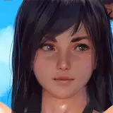
But that's not what's this PoL is mainly about. Since I wasn't working on new content over the holidays, I've tasked one of the artists with making a first draft for the new visual overhaul I've been hinting at for future games, and above is the new female sprite he came up with. So, uh, what do you think? I have a pretty good feeling about it personally, although there will probably need to have a few changes, like the position of the hands, which looks nice when standing still but might make the sprites look a bit ridiculous when walking.

A few disclaimers though:

-This is a very, very early sneak-peek to gather feedback. Sprites will remain the same as the current ones for the remaining of HC3. 

-The reason they look like Cyanna is because the artist decided to use her as an example of what the sprites would look like with hair and (partially) clothed.

-The sprite in question is based on the "medium sized breasts" version of the current female sprites of HC3.

-I cannot give an ETA for when the new sprites will be used in any upcoming game after HC3. This will mostly depend on the estimated costs and the budget at hand, and I expect it to be pretty expensive. I don't want to show you the promised land and have the boat sink halfway there because we didn't take the time to store enough fuel before leaving.

So there you have it. Let me know about your opinion in the comment section, or upvote those you agree with. I might not respond to everyone unless necessary, but I'll definitely be taking your thoughts into account.

There it is for today's PoL, see ya next week suckers!

Thank you for reading, and have a wonderful week,

N_Taii

Proof of Life #206: I need your o(pi)nion!

Comments

A bit of a late reply, but as I said in the post, the HC3 style will remain the same until the game is completed, and maybe for a bit longer, it depends : )

N_taii

It is the same effect Haylen has, where she looks like she has this creepy grin all the time lol.

Kul Man

To be honest, I can't say whether it will actually take that much longer. I might be able to hire more artists, it will all depend how well they can recreate the same style as the original sprites.

N_taii

The truth is that I really like the style of model that HC3 has and I thought you were going to keep them a while longer (at least until HC4 or maybe a short game) but at the same time one thing I like about you (that makes you stand out from other developers) is that you are always focused on improving with each game, either in terms of models, maps, assets, etc; and that's what made me want to support you on Patreon :), I sincerely hope this year is successful for you and that all the plans and demands you have for HC4 can be fulfilled.

SFukuro

Well for such a difference I would personally prefer what we have right now. Added to the fact that you could reuse a lot of the base pixel art for the new game that you had here. Of course I would have to see it better in actual action. Maybe the difference really IS that big. But I really liked the pretty fast pace of updates that you could bring out thanks to going with pixel art and not cg. Some games start to lose themselves when they start focusing too much on details and trying to get every aspect to the utmost perfection. Maybe make a poll before deciding to take the plunge. I think a lot of people would rather have faster updates. The great story is the core of what we are here for, having almost 50% more time between each update is a pretty big hit.

Kul Man

I like the old ones better

Terry Brazier

Thanks everyone for the feedback. So far, the main issues seem to be the hands and the legs/feet. I'll forward that to the artist so he can change it when he has time : )

N_taii

I think I see what you mean. The sprite actually has no mouth, or at least it's not drawn, so you might be thinking that the spot that ties her chin to her upper torso where the pixel are a different color is her mouth, but it's not (or at least I think that's not what the artist intended). If you look at it that way, she does look a bit rodent-like, so we'll have to change the color of those pixels.

N_taii

Thanks for the feedback! Pixel art would indeed take more time to commission, so the pace of the updates might need to be stretched a bit compared to now, like 50 days instead of 35. It's still a long way until we get there, so I'm not quite sure right now.

N_taii

Thank you! Yep, I'm not departing from HC's signature pixel art, I just wanted something a bit more detailed and that would stand out a bit more too. The plan would indeed be to keep the style as is for the rest of the games I make from now on , or at least for a longer while than just the span of one game, since I would also need to gradually introduce more environmental assets to fit the new sprites' bigger size.

N_taii

Thanks! Side and back sprites will be worked on later. For now I just wanted the front sprite so I could get a bit of feedback before asking the artist to do the rest.

N_taii

i like the body of the new sprites but prefer the faces of the old

dawnofthesilverd

face makes her look like a chipmunk, just my 2c i think its to do with the small mouth and brown blush, it literally looks like shes got a pointy almost fox-like nose

dawnofthesilverd

Man i love big hips, and approve a 1000% this new design, nice job, keep it up

Professor Gorilla

Right off the bat I see two main problems with them. First, the hips are too wide. The positioning of the hands means that they have the visual impression of being wider than her shoulders and that means she might look disproportionate in some situations. It also makes her torso seem shorter than it actually is. The hands add to the illusion of short torso and if there's any intention of having her arms move while she's walking I think you might run into the problem that the hips are also too wide for it to look good. Second, the sprites are bowlegged. You can't really tell closer to the waist because of the fact that she has thighs approaching Chun-Li thickness but from around the knee down there's a clear outward bend that tapers to an inward pointing of the feet. The sprite looks like it would have trouble walking. In general the sprite kind of makes me think of women who have had a way too big Brazilian butt lift and kind of wind up looking like a velociraptor. In general the design is good but the anatomy is kinda screwy.

Iokua

I love the new art, it's a lot better

pedrofuentes1995

I dont know. I somewhat like the old faces better. I guess the less detail on those works better, since you could never make it close to the real detail faces need. So you leave more space to put in the profile picture from the non pixel art. Also the fingers look okay like this. But would this be the default for them when standing? It gives off a... "dainty" feeling? It could hamper with some scenes where they would want to be angry, serious etc. Again, sometimes less detail allows for more room for interpretation (kinda why the pixel art works in the first place imo). Guessing the pixel art would take longer to make as well, if you had better details? Not to seem overly critical. People tend to give positive reviews so I like to be the devils advocate usually. Its overall good. Just that with more detail you might be sacrificing flexibility, requiring even more detail to convey the right meaning.

Kul Man

Looking good

Surav

I can't say for sure that it would look better, at least not until i see it with my own eyes, but i feel like each thigh should be 1 pixel thinner and the lower leg (from knee to feet) should have 1 extra row of pixel added to it. The ratio of the legs compared to the rest of the body looks great now as it is so i don't know if making the legs longer would ruin that, but the lower legs definitely look weird to me, it almost looks as if the sprite is sitting down from this angle, the knees give way too much shadow, almost the entire shin is covered in shade. Actually now that i think about it, i'm pretty sure that this sprite IS sitting down, that's why the hands look like that. Apart from that, everything looks great, the arms need to be worked on i'll admit, but making each thigh thinner by 1 pixel should give the hands more room and it would make it look more...natural, i guess. I gotta say i don't envy you, you're gonna have your hands full whenever you'll be making maps for these sprites, can't wait.

Matoga

I don’t know when they move. But the hands look fine when idle

Mr. V

I think the design is on the right way, the body, legs, breasts, eyes, hair and clothes look good; although the hands and feet need a little more work because they look weird (I always remember an artist friend of mine who says that drawing hands is a nightmare for him hahaha). About the rest I can't give more details because I'm not very technical in detecting flaws in drawings, but personally I really like the design because it doesn't stray too far from the pixel art style which was something that worried me when I read that the artist was working on a more detailed model. I sincerely hope the production cost is not that high and you can use it in future games. Regards :). P.S: One thing I forgot to comment, from what you are saying I understand that the goal of the new character model is to make one that will not only last for HC4 but also for other games, either HC5 or any other game you are thinking of making.

SFukuro

I like everything about it apart from the feet and hands. This looks like a lying down sprite, with how the hands are upturned and the feet pointing downwards. The hands I could accept, if it were for an upper-class royalty-type character. The knees look like they are pointing in a bit too much, maybe moving the kneecap detail more centred to the leg will fix that but the feet I think need a refresh. They don't look like they are facing towards the camera like the rest of the body but instead downwards, which is fine if they are wearing high heels but barefoot not so much. Apart from that I really like it. I like how the characters have curves and the size of the sprite could allow faces to express more emotion; and the breasts and ass more movement during animation. I'd be interested to see a side sprite in the future. Keep up the good work, looking forward to more from you this year!

TSP

Don't think more details make it worse, prefer the new breasts for sure, and now you can even see fingers, so I like it!

Thomas W.

I approve πŸ‘

jay


More Creators