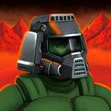
So, what do you think about this way of move selector UI? It's not so obvious as a big circle in the middle of the screen, but it keep your fighters visible all the time, even on the move selection stage.
UPD. Added some variation. Let me know which one is the best option?
UPD2. Square button looks much-much better IMO!