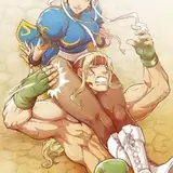
All characters presented in this image are fictional, 18 years and older, and the acts depicted in this image are consensual to the individuals involved.
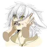
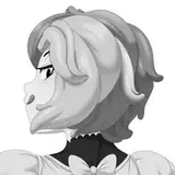
Recently I mentioned in previous posts that I started doing a new coloring method and Im SO happy using it. Unfortunately, when I applied it to this image it was really satisfying but too jarring from the previous images from the set which left an odd taste in my mouth when viewing through the images together. It definitely may sound too hypocritical really since I allowed the Ruby comic to have too many differences but the Pollinated set is relatively short in comparison from the Ruby comic which inevitably will have changes from how much time has been invested into it so I want to keep Pollinated set as uniform as possible if that makes sense? There are some strings of the new method here and there such as green skin having more blue tones in the shade rather than just green becoming a darker green.
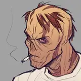
Another example is that there are more red tones in the gold or the highlights of green in general have more yellow to them. But again, I had to keep it consistent from the previous images so I had to edit the overlay blue tone and shifted some hues to keep it melded. However now I feel somewhat dissatisfied due to the conflict of colors from my previous method and the current method being inharmoniously melded by force. Like the highlights of the guy for instance seems to have too much yellow to the point where it seems like that its his midtone but its not. And Roserades white hair doesnt feel as soft and I think its due to using too much darker tones.
Not sure. Oh well, new learning experiences and at least I know the bulk of the problem is due to the conflict of what I previously done. Hope you guys like either way!