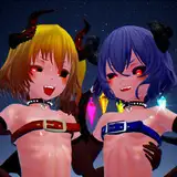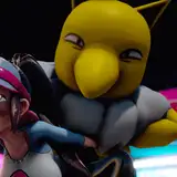
Fucking backgrounds man i swear. I definitely shouldn't have slacked when it came to practicing backgrounds because i was so lost in direction of this. I tried to stay dedicated into making a background that derived from the show but emulate my style upon it and man was that an awful process. i mean the technicalilty of it was definitely fun just painting of course with leisure but when it came down for the sake of immersion of the characters being in it, color harmonizing it, lighting, distance and depth, my brain and eyes just fried x_x you can tell that i was comfortable for a moment of refinement if you look at the bottom left rocks, and left side mushrooms, however once i got into the rest of the piece such as the far back rocks, it was starting to become a whole new world for me especially in trying to create different kind of rock formations rather than slabs.
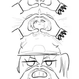
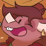
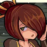
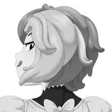
i figured i should create a variety of it especially since the background derived from it showed certain characteristics of different rock formation, however the refinement of said rock formations was null and void to me. What i definitely enjoyed the most is definitely rendering the characters! at first i was intimidated because i think this is the closest i've come to translating and keeping certain characteristics of the characters style intact but merged in my style as well, but what made me nervous was shading those certain shapes such as their hair. Reggie (redhead) has square fly aways and block-ish shaped hair while the Butt Witch, well, has horns. However what made it easier to render these cartoonish shapes was really rendering backwards! Essentially instead of working with the base color of whatever i shaded, i tried a counter intuitive (?) method where i start with the shadows instead and then apply where i think light should be! i found this FAR easier to deal with when it comes to unfamiliar or cartoonish shapes so maybe i might've found a system around shading the toon look!
hopefully that is because I crave just to somehow preserve that look without sacrificing too much of it for the sake of "making sense" with style. anyway, that's all for now, i honestly wish i could've done better with this piece, particularly with the background, but i gotta keep learning!