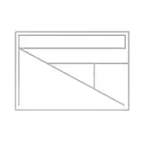
Check it out! I was doing a bit of breakdown/analysis of an app game I've been playing a lot recently. I need more knowledge in terms of UI and UX Design, so I've been keeping my eyes peeled and doing small analysis like this!
It's interesting to see how a lot of these decisions are made not only for creative reasons, but to fit the form of the game (it's on a phone). Really cool shit.
To give you an idea, this is the kind of study/analysis stuff I'd do for anything I'm unfamiliar with. Anatomy, Composition, Color, Music, Story telling, Animation, Game design, whatever!
Aether Fang
2019-06-02 21:17:40 +0000 UTCJean - Enzonaki
2019-06-02 16:23:28 +0000 UTC