Rogue-Like Discussion, Word Balloons
Added 2018-03-18 22:56:53 +0000 UTCI wanted to start an open discussion thread on a new change to the game dealing with how text is displayed. In the most recent version, I moved both the "text box" and word balloons to always be in the top left corner of the screen. I did this for several reasons.
1. I felt that the character models were too often being crammed into the far right of the screen, and I wanted room to move them toward the center, but if they were in the center with the centered word balloons, the balloon would cover up their face in standard views.
2. I felt that it was visually distracting to have word balloons at top-center, and the text box at bottom-left, since if they alternated you'd have to shift your eyes from one to the other. Putting them in one place allows for more continuous reading.
Now this system is not "finished" I know that there are some immediate issues with it, and also some things to change. For one thing, menus currently have a habit of growing overly long, making some options run off the screen. I do plan to fix that by at the very least nesting some of these menus to shorten the longer menus, but I also want to figure out how to make double-column menus where necessary. Also the menu graphics themselves can sometimes be tricky to read, I'd like to fix that as well.
For another, I'm aware that not every seen is optimized for the new format, especially the intro scene, which was designed with the old positions in mind. It will not be hard for me to go back in and make sure that the character positions make more sense there.
All that said, I'd like to hear what you guys think, do you agree with my reasons for doing this? Do you think once I've ironed out the above issues that it's a good idea? What should I do slightly differently here? I might move the text stuff slightly more toward the center, while still keeping it off-center. Is there anything else about this system that you'd like to see done differently?
Please keep discussions generally on the way text and menus are displayed, anything else can be discussed elsewhere, but I'd like to stay focused.
Comments
There was made an impressive work. Keep on it!
ZULEYKA GAMES
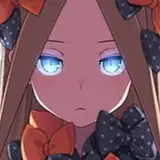
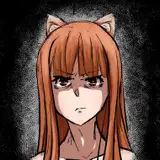
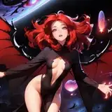
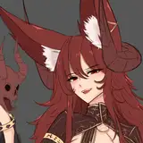
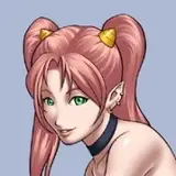
2018-03-27 23:23:42 +0000 UTCYes. Rogue and Kitty, yes. Emma's still like 15% complete, so no on her.
Oni
2018-03-27 09:03:32 +0000 UTCI not played yet,because i se the size of the game some..."Low" but...The question is... CAN I FUCK SOME ONE ON THE GAME?!
Rodita Sephflare
2018-03-27 06:31:51 +0000 UTCThe easiest way is you can just send me a PM over Patreon.
Oni
2018-03-26 22:04:33 +0000 UTCHey, Oni, first of all... huge fan of your work,, second... do you have a contact email? i´d like to ask you a few questions if you don´t mind
Bad Cate
2018-03-26 21:21:21 +0000 UTCTry visiting the class in the evenings.
Oni
2018-03-25 11:25:28 +0000 UTCi cant find a way to talk with emma ? in class she said wait after class but i cant find her !
AKOBEL
2018-03-25 09:04:44 +0000 UTCPersonally, I like it better this way. It feels tidier and I can rest my eyes on one part of the screen rather than have to dart them about all the time. :P
Waelan
2018-03-20 23:18:50 +0000 UTCMove to the update thread as this comment wasn't on topic. Sorry.
Shadow5
2018-03-20 16:10:55 +0000 UTCTry leaving the classroom and then coming back in the evening. You might stumble onto something.
Oni
2018-03-20 12:29:16 +0000 UTCI have some troubles wih Ms.Frost how can i get her number? Whenever i ask for her number she refuses to give me and i cannot talk with her either. I think i'm doing something wrong?
2018-03-20 11:52:50 +0000 UTCI only distribute it at the $1+ pledge level. I imagine you shouldn't have too much trouble tracking down a copy though if you really don't want to pledge. I mean, The Internet.
Oni
2018-03-20 11:40:56 +0000 UTCWhen will the game be publish for free download?
master8
2018-03-20 10:36:15 +0000 UTCYeah, I'll try to clean those up as best I can. The more I know about the circumstances where this happens, the better, like were they there and then left, or did you just get there, what are they saying to you (exact words, ideally)? I know vaguely why this might happen, but not what is causing each specific case.
Oni
2018-03-20 07:23:50 +0000 UTCLol, I'll see what I can do with that, it's a work in progress. I have an idea to turn it into a screen object, which means I could make a button to toggle it.
Oni
2018-03-20 07:22:25 +0000 UTCEDIT again: Figured out how to go back. Could do with making that option a bit clearer, very small text at the bottom of the screen doesn't seem ideal. EDIT #3 Nvm that no longer works. Back to being stuck.
Kim Åkerman
2018-03-20 04:50:03 +0000 UTCI preferred it the way it was before I think. It's a bit annoying to constantly have to look to the side to see the main point of your interaction, atleast when you're moving between rooms. It also cuts off at the bottom of the screen for me when I interact with Emma. EDIT: I am now also stuck interacting with Emma. Don't seem to be an option to exit out of it atm. That could be the part of it that's cut off at the bottom of the screen I suppose.
Kim Åkerman
2018-03-20 04:49:01 +0000 UTCI don't know if any one had seen this but i am still getting text bubbles of the girls when they are no where near.
Thighhighstockinglover
2018-03-20 04:21:14 +0000 UTCI'm fine with the word balloons being where they were moved. Honestly, if you hadn't said anything, I might not have noticed. I kinda wish I could toggle the penis display off though.
pinkdoors
2018-03-20 03:51:46 +0000 UTCHmm. So if I change it so that "main girl" is in the center, and "secondary girl" is more where the main girl used to be (roughly 3/4 to the right), then you're saying put the second girl's word balloon on the right hand side of the screen? That might be doable, but the problem would be that you'd have to look back and forth between her and the other girl's dialog. That's part of what I liked about putting them all in a central location.
Oni
2018-03-20 03:29:01 +0000 UTCI'll just pop on my own two cents regarding the text boxes. It seems odd right now that they're all to the left now, but it's also a partial implementation so I can't say that it's perfect in it's current state. That said, I kinda wish that the text boxes would display on the side that the character speaking is standing. Thereby making it more visually apparent whom the text box goes to.
Shadow5
2018-03-20 02:06:24 +0000 UTCHaving played for a bit, I don't mind the change, other than the GUI issues it's creating. You're addressing those, so I won't go into them.
voyeurkind
2018-03-19 16:28:07 +0000 UTCIs it almostly ready but not implemented yet or do you still have a lot of work to do before they are selectable options?
Harry Jamerson
2018-03-19 11:28:48 +0000 UTCSorry if this has been asked before but how soon can we expect to get access to options for Emma such as dating, giving gifts and sex?
Harry Jamerson
2018-03-19 11:27:37 +0000 UTCI think fiddling with the size would be kind of complicated too. What I've done in the meantime is I changed the chat options to be shorter in length, basically instead of being conversational phrases, they're now just direct commands, and the player character says the more conversational version when you select them. This turns 2-3 line phrases into 1 line, or 2 at most, which takes up a lot less vertical space.
Oni
2018-03-19 10:34:03 +0000 UTCIs it easier to add a text size adjustment to the options in the bedroom as an immediate fix while you work on re-nesting the conversations or two-column layout?
2018-03-19 10:31:50 +0000 UTCThat can definitely be part of it. I think I already had a tail like that in there for if they were really at the side of the screen, but I could repurpose it for the new setup.
Oni
2018-03-19 07:48:26 +0000 UTCmaybe you'll take this as an idea? <a href="https://ibb.co/nn9gqH" rel="nofollow noopener" target="_blank">https://ibb.co/nn9gqH</a>
Krutomerrik (RU)
2018-03-19 07:42:15 +0000 UTCOk, the settings menus should be cleaner now. Let me know if any other combinations end up being too long.
Oni
2018-03-19 05:22:33 +0000 UTCThat is an issue for me.
2018-03-19 04:21:07 +0000 UTCYeah, I can understand that, and that was the original intent. Maybe I can figure out some sort fo compromise.
Oni
2018-03-19 03:26:05 +0000 UTCJust a quick update on android, I tried to get the android version working, but hit some snags on getting the SDK to work. Apparently I need the 32 bit java SDK to work with Renpy, but now I can only find the 64 bit SDK, which isn't good enough. It's all an exporting issue, it doesn't really have anything to do with what I spend time working on.
Oni
2018-03-19 03:25:20 +0000 UTCOne quick question, when you guy are having issues with "too many menu items so they run off the screen," how many is that? Like count the menu items. I'm actually trying to find a menu that runs off the screen, and at the moment I'm having a hard time replicating it, and think it may have to do with different resolutions or something.
Oni
2018-03-19 03:22:19 +0000 UTCIf you do for various reasons keep things over to the left, the other thing I'm noticing is the text box and the balloon in the same position are really similar. So if based on your expansion plans you need to keep all the text\thought bubbles over there, then different font (or italics) for non-dialogue might be another option too to make them read differently.
Patrick Thrasher
2018-03-19 01:16:28 +0000 UTChonestly I liked the center style a lot because although it does lead to more glancing between characters, it just feels more natural; especially in an x-men based game. It feels more like a comic, which given the setting of the game is way more organic.
2018-03-19 00:22:24 +0000 UTCI heavily agree with the idea of continuous reading. Makes it feel more like tbe dating sim x visjal novel cross that it's meant to be and less of tje dating sim x optical excercise that it felt like.
Matt Ahn
2018-03-18 23:23:36 +0000 UTCIf you allow me....I think this is too much work just for "texts". I prefer this effort at android version.
Mind Blow
2018-03-18 23:16:41 +0000 UTCMaybe color coding the balloons to character? Also, I'm surprised scrolling with the keyboard doesn't bypass the visibility problem of the menu. I think the menu may have to overlap the text balloons for spacing in the current configuration.
Patrick Thrasher
2018-03-18 23:07:49 +0000 UTCWell, with the rationale properly presented, I withdraw my earlier objections to the UI change; overall, I must agree with Noah, just some minor stylistic changes need to made to properly align the menus with the background images.
2018-03-18 23:06:56 +0000 UTCMy only real complaint is this. In the new classroom the glow from the tables in the background makes it a little harder to read the options. Other than that, it's good.
River Asmussen
2018-03-18 23:05:46 +0000 UTCCurrently everything feels shoved to the left and downward. My best example is talking about things regard what rogue does
Booty4Bass
2018-03-18 23:02:48 +0000 UTCI like it being in the top left. Makes the UI feel less cluttered.
Eck
2018-03-18 23:01:20 +0000 UTC