The new video had an excess of sequences about abstract, difficult-to-illustrate things. I always struggle with what to put on the screen to keep it interesting during those parts. For one particularly verbose section, I figured an old video game pixel art style would look refreshing.
Never tried it before, but I've seen people explain the general workflow. Basically, you draw at very low resolution and then blow up the image.
I made each character on a 64 x 64 px canvas in Photoshop using the old-school pencil tool, which just stamps solid pixels. I first drew in black, then went over the pixels with different colors, establishing a limited palette. At this scale it feels less like drawing and more like assembling a puzzle. Figuring out how to indicate small details is surprisingly fun and intuitive.
Once an initial standing pose was drawn, I used extra layers do make other poses. This is what my first attempt looked like:

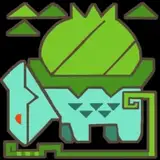
But it felt messy. I realized the design needed to be neater and more symmetrical. So I put Captain D aside and drew the other characters to start fresh. The poses for Adam and Korney were an improvement:


For front angles, it helped to draw one side and then just mirror. After getting the hang of it, I went back to CD and was a bit more generous with the animation phases. He is the hero, after all.

In a way, drawing a detailed character in pixels is easier than drawing a simple, smooth shape. I wasn't sure how to depict a soccer ball and animate it spinning without ending up with a blob of wiggling pixels. So I took a different approach:

I modeled a sphere in Blender, shaded it with the pattern, made a 4-frame looping spin animation and rendered it at 64 x 64 pixels in lowest possible sampling quality so there was no antialiasing. The result fit well with the rest of the artwork:

After drawing the goal net using the same method as the characters, I took the images into After Effects and magnified everything 500%, making sure to switch each layer to low quality to avoid pixel blending. (In modern software it takes extra effort to keep things in low quality!)
I first assembled the character layers into animated comps, then positioned all the elements on the screen in a master comp.

The rest of the environment and text was made directly in AE. A simple pattern of dots indicating grass was cloned across the screen using the "motion tile" effect. The graphics were generated normally then degraded with a combination of the "mosaic" and "block load" effects.

The whole process is time-consuming, but not as tedious as it may seem. And the results are worth it. I might try it again in the future!
Adam Anderson
2018-01-09 02:58:08 +0000 UTCJo Tyler
2018-01-09 02:06:53 +0000 UTCDaniel Staniforth
2018-01-08 20:48:53 +0000 UTCAbsolutely Nobody
2018-01-08 19:20:21 +0000 UTCArielvaale
2018-01-08 18:56:25 +0000 UTC