I was commissioned for this design back in may- I didn't think it would be too complex a design so I saved the steps to make a process post!
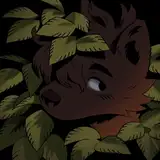
 the commissioner provided the moodboard and sketch- they wanted a gradient of light to dark and the effect of a sunrise sky over the ocean. in the gradient they also wanted the leafy shapes of the veil in the middle of the moodboard. I figured most of the body would be the ocean gradient, so I filled them in with a blue base.
 the sunrise half of the design would be its own separate gradient, so to keep it separate for easier airbrushing, I blocked it out on a layer above the base.
 it's helpful to start a design with one or two main colors and then add accents and transition colors as you go- so my starting points for this design were light cream/yellow and blue inspired by the moodboard, and I grabbed a photo of the sunrise over the ocean to reference for more colors. to make the transition between halves more interesting and a little softer, I airbrushed a touch of pink in. the colors are pretty muddy at this point, usually my designs are a bit ugly at the start and I tweak the colors as I go!
 added some light cream and orange accents to bring attention to the face, and more pink accents in the nose, pawpads, and gradient- I thought the leafy pattern looked too stark and simple and wasn't blending the halves well, so I added another layer of leaves in pinks and blues in a layer below, and softened the edges of the original leaves with blue. the blue base was looking too grey so I bumped up the saturation at this point.
 then I added a bunch of details- a light greyish blue underbelly, a touch of pink accent to the wingtips and a lighter blue on the base of the wings, some blue stripes to resemble the lower left and right images on the moodboard, like ocean waves or currents, more pink to transition between gradients, and some sparkles on top. adding little speckles like that to gradient heavy designs often works well as a finishing touch! I turned this in to get their feedback.
 they wanted some tweaks to the cream markings on the face and neck, a new scaley pattern in the gradient, and the saturation and contrast boosted for the whole thing- here it is finished with those adjustments!
let me know if this was interesting or helpful to read!
arboret
2025-07-08 07:20:42 +0000 UTChelioangel
2025-07-04 08:12:43 +0000 UTC