The first Volume is officially out! I'm excited, nervous, and overwhelmingly thankful to all of you for joining me in my crazy catgirl endeavors. This month, I wanted to share some of the behind-the-scenes work that went into creating this book.
The Cover & The Logo
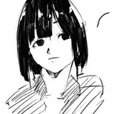
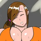
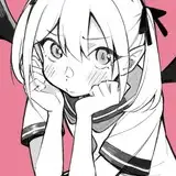
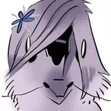
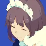
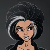
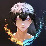
I don't know how many of you remember, but this was the first logo for the story:

I whipped it together in Photoshop with a bunch of stock photos and free fonts I found through dafont.com. The original cover was by Juu-kah, made only for online posting. I went for more of a CLAMP-style feel because I was still trying to figure out the story.

If anyone has ever watched or read Chobits, you know what I'm talking about.

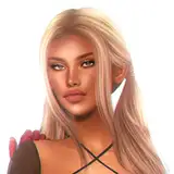
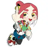
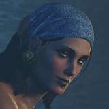
Once the story started picking up traction, I knew that I eventually wanted to publish it in paperback and eBook. So I started searching for an expert in graphic design and a commercial cover artist.
I found GBS Artworks for the cover, and I'm so excited to continue working with him. He'll also be doing the covers for the audiobooks.

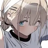
I worked with Racknar Teyssier for the Everyone's a Catgirl! title logo. I wanted it to have the same weight as other major players in the light novel industry: immediately recognizable, appealing, and something that I could use on every cover.

Racknar is incredible. He used my prompts and examples and developed a couple of designs in record time. The second one resonated with me immediately, so we worked on perfecting it. (Bonus, this was where the cover art progress was at the time of working on the logo).

He sent me an SVG vector to toy around with.

I played with a bunch of colors until I was happy with the orange. I left it as a flat orange for a while, but something about the preview image on RR felt lacking.
Chros-Xerox was the one to suggest ditching the outside white border around the letters, and I decided to clear out some of the other bubbles (like the circle inside of the bell).

Nirvana reached.
The Formatting
Cat dragged me to a Barnes and Noble, and we sat down and poured through a ton of English Light Novels.

We looked for how the stats were laid out, how levels were announced, what skill trees looked like, and what fonts they used. Chapter headings, drop caps, page numbers, scene splits, headings, illustrations...to name a few things.
Cat tried a lot of different images for the chapter headings. The one we finally picked reminded us both of skill trees from older RPGs. Those ones that just go on forever.

To add to the geometric design in the paperbacks, we threw this beneath the chapter titles. It reminded us of a cat sticking its head out below the line.

I have to give all the credit to Cat for the kitty ear scene breaks. It's perfect. There are 8 different pairs of kitty ears in the book that rotate out.

The bracketed page numbers at the bottom were one of the last add-ons, and I think they match the overall formatting well.
The paperback book was formatted in MS Word, and the ebook was formatted in Atticus.
The Editing
Haha. Hahaha.
The Final Product


We made it guys. It's here. Thank you so much again, and I hope you enjoyed seeing a slice of what's gone into this so far.
Once again, thank you Cat for all of your help. Thank you beta and arc readers for your feedback, hawk eyes, and reviews. And thank YOU for believing in this project with me.
See you soon!
PS. I'm working on Necromancer Skills.