XaiJu
Rick Scott
Rick Scott

patreon


Book 4 Cover Sketches

Hey all!

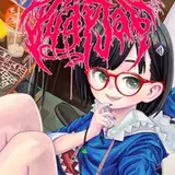
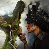
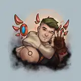
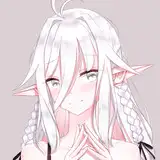
So this is the cover design that my artist came up with based on you guys ideas. This one focused around the cursed star. Which one you guys like better and also let me know what ideas you all have for the color scheme of the cursed star.

Also, will hopefully get a new chapter out soon. Still busy travelling but i think i might get some words out today!

Cheers~

Rick

Book 4 Cover Sketches

Comments

I think A

Kenneth Wence

I think A does it better with having a big horde coming at them but it shouldn’t be in a line coming right at the front of them. It should be more like B where they are spread out and some are closer with many more coming from behind. It should look like they are being swarmed by a horde that’s coming at them from all over not a horde that’s nicely lining up for slaughter.

Colby Smith

I really like A. I would also recommend changing it to say book 4 instead of book 3 lol.

Zach pinkham

I like B better.

Cardio27

To add to A it should be more chaotic with like the giant school bus sized flying demons max saw on the moon and maybe add more swarms also the color of cursed star should basically be the eye of sauron but more evil

evan maples

I'm leaning towards B. I'm not a fan of how they are all lined up in A. Maybe if the demons were amassed in a blob like a flock of birds Itd be less weird to me.

Larry Newbury

A looks best

evan maples

I agree with combining them to get the up close sense. Also having the the stream of demons be a bit more random in their distribution flight so it seems more natural.

Dark Sky

I agree, A

Jason Huber

I vote for A

Joe

A for the same reason as Heavy

Lotfi Adam

Thanks Heavy! I kind of had the same thoughts. Maybe he can combine them!

Rick Scott

I'm going to go A , because it looks like the Horde is endless, though I would like the see a bigger one up a little closer.

Heavyarms670


More Creators