Need your opinion
Added 2024-05-15 16:23:12 +0000 UTCHey folks!
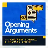
I badly want to change the OA artwork and I wanted to know how you all feel about it. I have the best podcast art guy in the world, I swear. And though he can be tough to get ahold of, I'm confident he'll want to work on a new thing. But I also saw someone say the other day they loved the art, and I wouldn't want to change something that people liked if I was in the minority on it. So as I see it, there are 3 main options, let me know what you think!
Comments
I voted redesign, but I REALLY hope you keep that deep blue color prominent. It's what jumps out at me as "OA" when I'm scrolling through thumbnails.
Melanie Odhner
2024-05-31 10:48:30 +0000 UTCAll of this.
Mary Crook
2024-05-18 13:07:32 +0000 UTCThe existing art is ok, and you went through hell for it to be yours and yours alone. Doesn't really matter whether you were passionate about owning it to venerate it or to bury it - do with it what you will.
Barmp
2024-05-17 14:40:29 +0000 UTCArt was good, but this is a new show with new(ish) hosts. The new one will be better.
Ding Dong, the Pest is Gone
2024-05-17 05:16:46 +0000 UTCI voted 3. I was fine with the art, but after actually looking at the art for you different podcasts, and I think it's clear that OA has by far the worst. Let's do something new!
Jeremy Smith
2024-05-17 04:34:14 +0000 UTCThis is the best part of the Dear Old Dad’s is the red bar lets me know which to listen to.
Tuba, or not Tuba, that is the question
2024-05-17 03:10:57 +0000 UTCIf you change it I will absolutely hate it. For about 2 weeks. Then I will forget it was ever different. Just do what you think is right and don't worry about the bikesheders
ADHDProgrammer
2024-05-16 22:13:39 +0000 UTCCould there be a 4th option of “Literally don’t care. Do what makes you happy”?
Corey Helwig
2024-05-16 21:49:08 +0000 UTCI'd vote for 2.5 if I could - Give the artist broad discretion, but take inspiration from the existing logo & colors.
squinklebutt
2024-05-16 14:42:29 +0000 UTCThe one true font
Jamie
2024-05-16 13:41:46 +0000 UTCI really like the old artwork but I think having an artist do a remix of it - maybe using some of the same colors or icons from the old one - would be a nice change. It would be a good way to symbolize a fresh start.
Andrew W
2024-05-16 09:04:06 +0000 UTCSo many podcasts I listen to just randomly change their artwork for no known reason and I've always figured it out, so I voted #3
hanareadsalot
2024-05-16 06:16:06 +0000 UTCI'm all for seeing what the new design would look like, but I don't have a problem sticking with the old one either. I'm fine with leaving it up to your feelings about it.
Michael Morrisson
2024-05-16 04:26:42 +0000 UTCWhatever you want to do. If changing, my preference would be for the same/similar colours & concept but an updated look & feel.
Laura Dell
2024-05-16 03:44:27 +0000 UTCI was a fan of OA from shortly after it launched, and dropped it when we the original audience learned what we did about Andrew. Glad to see what Thomas and Matt have made of it since Thomas' return.
ToddTheOdd
2024-05-16 03:04:41 +0000 UTCI voted 2 but only because I thought it might help people find it if they come across an older reference. But otherwise, like others have said, I'm here for the content and the hosts - the logo doesn't change that.
Kaetrin Allen
2024-05-16 02:33:19 +0000 UTCI have to say - I joined OA when that other guy and Liz were doing the show. I really liked Liz and - frankly - that guy kinda gave me the creeps ( did anyone else notice that she kinda put him in his box on occasion?) But anyway - I am loving the (new to me) show and have immense respect for what Thomas has been through. I am now a total fan and added GavelGavel to my short list of Patreon support. For those reasons - I say that OA needs a fresh look. One that doesn’t remind me of that other podcast I joined last year. Love your work Thomas and Matt. You guys are the highlight of my week ❤️
Ginger Bean
2024-05-16 02:32:33 +0000 UTCI voted for #3 because you sound like you could use the change. I am here for the content.
Meridaandmouse
2024-05-16 02:26:58 +0000 UTCTotally! I’ve learned all my history from statue plaques, thumbnail art, and old Calvin and Hobbes comic strips
Meridaandmouse
2024-05-16 02:25:19 +0000 UTCMake the bonus feed(s) distinguishable from public feeds.
Tim Neu
2024-05-16 02:19:20 +0000 UTCSmh… Just like tearing down the Robert E Lee statue! You’re erasing our heritage and history! /s
Oso Hermoso
2024-05-16 01:24:57 +0000 UTCI like the current look and I hate to see it go, but voted for #3 anyway. New era, change is appropriate given the circumstances, and on reflection my best reason for keeping the current one was "I'm used to this though". I can get used to a new image, and that's pessimistically assuming I don't automatically like it. Besides, might help with people that haven't followed along with the proceedings or returned, seeing such a clear change if they come across it again one day.
Ad Astra
2024-05-16 00:46:27 +0000 UTCYes, I came here to say the same. @nickfish ftw. And awesome that OA Actual noted it. In my current player I always feel mildly punished when you've gone to the (much appreciated) effort of adding episode art, as in my play queue I have to hunt to find the OA (or SIO, or WTW) episodes (relying on the ep title and a pic _way_ too tiny for my Ludgeons-aged eyes) Meanwhile, in the "show me all the OA eps" view where I'd love each episode to it's own little pic, they just skip it other than putting the OA icon at the top of the page.
NobTinker
2024-05-15 22:06:29 +0000 UTCI like the classic logo, but it'd be great to have something new for the new era of OA. And I'm curious to see what the best podcast art guy in the world would come up with!
Kevin Duff
2024-05-15 20:36:41 +0000 UTCI do like the scroll but I'm open to redesign.
Torsten 'what the fluff' Pihl
2024-05-15 20:23:35 +0000 UTCDon't care either way. Your podcast your choice
Mike Koeppen
2024-05-15 19:20:28 +0000 UTCLove the idea of changing the art, I think it'll help create a nice break between the old and new eras. Plus, need to get artists as many gigs as possible before AI completely destroys the art economy.
Humean, All Too Humean
2024-05-15 19:19:57 +0000 UTCI vote change. Change is healthy and good. We're in a new era of the show, unbound by the constraints of the past.
Philly Basement Bar is back open, and isn't taking this shit lying down.
2024-05-15 18:39:02 +0000 UTCThis is a good note, thank you
Opening Arguments
2024-05-15 18:16:53 +0000 UTCI’m so excited at the thought of a whole new design!
Jennifer Eckert
2024-05-15 17:58:20 +0000 UTCThis makes me want to change my vote
Russ
2024-05-15 17:52:42 +0000 UTCI mainly listen in CarPlay, and it always is showing the non-brand icon. Hard for me to see what show it is, or maybe it's just some cool album art from Spotify (note: I listen via Spotify if that helps)
Tim H
2024-05-15 17:49:25 +0000 UTCOne bit on redesign (or even keeping the same overall branding) that I wanted to mention is specific episode art. A lot of players now prioritize the episode's art (a picture of Steve Vladeck, for example) over the podcast logo. It makes it tough to see which podcast it is if the episode art doesn't have a theme or prominently feature the logo. I've seen some good execution that still allows the featured image to shine through while also having a strong and distinctive logo and visual identity that makes it clear at a glance what podcast it's from.
Nick Fish
2024-05-15 17:33:17 +0000 UTCI went with "keep this one" for brand reasons. I figured part of what you fought for was the brand... and yeah, you know - Twitter
I am a philosophical hole
2024-05-15 17:18:12 +0000 UTCAs a middle-of-the-road centrist moderate liberal, I think it will surprise exactly no one that I like the idea of an updated design that maintains the colour scheme and is immediately recognisable as OA, but incorporates some new elements as well. Perhaps get away from the cartoony artwork from before (I never did like the caricatures of you and Andrew) but still maintain the strong brand identity. Perhaps keep the blue logo with the scroll, but change the scroll to a different icon depending on the topic that week? That may require the artist to do a number of different versions in advance, but it could be cool to have the scales of justice for criminal law episodes, the Capitol dome for politics episodes, a ballot box for election episodes, the Statue of Liberty for immigration episodes, etc.
Congress- the opposite of PROgress
2024-05-15 17:18:11 +0000 UTCAnd ideally the black band on the bottom, the details could change a lot if you kept a lot of that blue and the bottom band
Melissa Hall
2024-05-15 17:06:49 +0000 UTCi do like the current art, but it is your show thomas (as recent litigation has shown). if you want to change the art, i trust that youll find something suitable.
mandibleman
2024-05-15 17:00:43 +0000 UTCOn the idea of “medium redesign” how about keep some of the main elements but find a new icon. The show started as a somewhat Con Law / historical focus with Andrew, which is reflected in the scroll icon. The new era is more focused on the reality of the court system and restorative justice so some new icon (like an unbalanced scale) could go in its place.
NewNamesOnly
2024-05-15 16:58:36 +0000 UTCI like the current artwork, but also recognize that something new is a great way to mark a new era for the show, and think that swapping out the current art for something completely different is a great idea.
Peter H.
2024-05-15 16:43:09 +0000 UTCIf there were ranked choice voting, my first choice is (1) and second is (2). I think keeping the blue for brand-recognition/finding the podcast is a valuable element no matter what.
Madalyn & Zacary Wilson-Fetrow
2024-05-15 16:42:49 +0000 UTCI'm with a few of the others as far as keep the blue as a primary, but everything else could be refreshed
Ryan Enbom
2024-05-15 16:39:44 +0000 UTCThis what I was about to say. Keeping the blue, in some way, would be useful. However if you don't, I'm sure I'll cope :)
AliceMerray
2024-05-15 16:38:46 +0000 UTCI'm actually between 2 & 3 on this -- I think it'd be good to do more than a "slight modification", but to keep the broader elements (such as the white text and the blue background with the black bar) while putting everything else up for grabs.
James Redekop
2024-05-15 16:37:05 +0000 UTCI think a fresh rebrand would be indicative of the new direction of the podcast. Excited to see the updated artwork!
Peaches from Tulsa
2024-05-15 16:36:46 +0000 UTCI voted for new logo, but I am happy with whatever you want. I like the old logo and I'll probably like the new one.
Justin (not the judge) Walker
2024-05-15 16:35:24 +0000 UTCNothing prevents you from changing it on a schedule, honestly. If you can stick to similar colors, it should still provide a visual connection for people who find the podcast based on the icon.
Richard Murray
2024-05-15 16:33:47 +0000 UTCI mostly don't care. Please just keep a lot of blue so I can find it in my ridiculously lonh podcast list :)
Drew Vogel
2024-05-15 16:32:27 +0000 UTCThanks for the response. I probably left a snarky comment on that at some point, so good to have that cleared up.
Gmork
2024-05-15 16:32:02 +0000 UTCHey, thanks so much! Glad you enjoyed them.
J. Zachary Pike, author of Orconomics and other funny fantasy books
2024-05-15 16:31:20 +0000 UTCOh wow it’s you. I know this might be a bit of a weird context for this but I recently came across your books and absolutely loved Orconomics. Hoping to get started on the next two in the series soon.
Jack
2024-05-15 16:29:45 +0000 UTCHere’s my thought. You, sort of caricature style, in a blue collar worker’s shirt with the old logo as a patch on your left chest, your name in script on your right chest. You’re successful because you outwork the competition.
Incomplete Sentience
2024-05-15 16:29:40 +0000 UTCThis is interesting and it seems to completely vary by app or something. My app doesn't show me the "per episode" graphics at ALL. Weird that yours ONLY shows you that. Personally, I kinda like seeing a different image for each show, for podcasts I listen to. But I think the ideal is seeing the main branding in all places except when you're actually playing the episode, and then have it show the episode specific art then.
Opening Arguments
2024-05-15 16:29:31 +0000 UTCI'm a fan of the current look, and as a visual person, I always look for that big blue box of awesome in my feed to find the latest OA. But I understand a need for change, and if it's the same artist who did the DOD thumbnail, I think I'm on board.
Andrew Torres did everything wrong
2024-05-15 16:28:56 +0000 UTCKeep it recognizable to some extent.
iceypayne
2024-05-15 16:28:45 +0000 UTCHe wanted to put Liz's name on everything and we said fuck no. One thing he gets unfairly blamed for is keeping my name on stuff. It was not only how I felt, but also our entire case was that he unlawfully took the show (since he, you know, did) so granting any ground on this was a no-go.
Opening Arguments
2024-05-15 16:27:58 +0000 UTCI like this old art but I'm sure this is the same person you have do the art for your other shows, which I think all have even better art. It'd be nice if we could see the proposed change and vote on that but I also understand it maybe wouldn't make sense to commission new art only to not use it.
ToddTheOdd
2024-05-15 16:27:50 +0000 UTCThe old one always bothered me a bit since the scroll didn't make any logical sense the longer you looked at it. It's not a bad cover, but it's been that the whole time I've been a patron. (minus the weird characatures for a while) the guy you have for the others hooked you up with some of the best podcast art I've ever seen. OA is basically a new podcast at this point. It needs a facelift.
Aindörf
2024-05-15 16:27:25 +0000 UTCHonestly I love the current one but I think change would probably be good.
Jack
2024-05-15 16:27:14 +0000 UTCIt's not uncommon for shows to update songs, opening credits ect. Go for it.
Don't use bad yarn as a life line in a fae yarn store. The yarn fairies will immediately remove it and you will get lost.
2024-05-15 16:27:08 +0000 UTCI voted new, but I think it might be good to keep the blue/yellow color scheme
Mike M
2024-05-15 16:26:59 +0000 UTCHow long after Andrew stole the show did he keep the art with Thomas' name on it? Was that an issue in the litigation?
Gmork
2024-05-15 16:26:44 +0000 UTCBranding matters -- think about where/how it shows up. I, for one, don't like the feed changing to random pictures as it has been lately. In CarPlay and other apps, I don't "see" the brand of OA anymore, I see random pictures that I don't associate with a podcast. So I'd reconsider doing that too IMO. You have an identity. If this represents a shift for your (very good) reasons, then do it once...I'd personally stick with the identity that is known.
Tim H
2024-05-15 16:26:36 +0000 UTCI like the colors, but maybe keep the font (Matts opinion is necessary here) I don't think a full on brand new redesign is gonna be your best. Bet just because we want you know reminders of you know the old show but it definitely needs a new upgrade.
NSaneAtheist
2024-05-15 16:26:03 +0000 UTCI do love the current one (distinctive, looks good as a tiny icon) but it does feel like time for a fresh start!
The 40-Year-Old 1L
2024-05-15 16:26:01 +0000 UTCI like a new logo but maybe keep the background color or color scheme so it’s recognizable.
Lisa S
2024-05-15 16:25:55 +0000 UTCDo what you think is best. …as long as the title is in Garamond.
J. Zachary Pike, author of Orconomics and other funny fantasy books
2024-05-15 16:25:24 +0000 UTC