Before we're heading straight into June (and the this months five FREE RAW-files are only available for Tier 3 patrons), let's have a look at your submissions and results from the 'Edit challenge' of April announced on this post. 😁
The rules were simple: 'You were all given five free raw-files of mine, from the photoshoot to process the way you felt the most'. 🤓🤌🏻🔥
So basically you were all given completely opportunities to edit just the way you wanted. 🤷🏻♂️🥳 Nothing is wrong - everything is absolutely right! 😁👏🏻
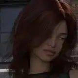
Patreon Supporter Quinzin:


Oooookay ok ok, where to start!! 👏🏻😅🔥
Some very different stuff going on here - but let's take them one by one, ok?
First up photo #01:
I immediately noticed the amount of grain you've added to the photo. That caught my eye, because it surprised me. 😁 Like what's the idea behind that? Aiming for a more analogue vibe or? 👀🤷🏻♂️
You've also lowered the contrast in the colours a bit it seems. That actually works pretty well, if you ask me. 👌🏻☺️ The overall retouch on Sabrina tho, is a bit harsh for my personal taste, but that was kind of the standard, back then when shooting analogue so somehow it makes sense. 💪🏻🤓
Photo #02:
On this one you've gone full on 'selective colour' on her skin. It draws the eye and lowers the interest in the "background" (or outside the window, you know ☺️).
I also like how it seems you've darkened the left area of the photo a bit more, than it actually was to begin with. 😁 I did this photo with only the light coming in from the window, and you have added a bit more drama to that effect, by lowering the light completely on the left side. 👌🏻
Interesting take on the photo, indeed.
Photo #03:
This is a bit like #02, but more towards a complete black & white photo it seems. ☺️ You have decreased the saturation a lot, but still kept the "idea of colours" overall.
I like the concept - however, you really have to be carefull when doing this on models / people, since they often end up look dead to me.. 😂 I mean, the grey skin tones are something which we either associate with a 109 year old munk or a dead body. Not the most sexy thing in the world.. 🤪
Photo #04a & #04b:
I see you've submitted two variations of this particular photo - and I've been looking at them quite a lot, to figure out why, and I've simply come to the conclusion that it's because "you just thought it looked cool! 😁", am I right? 😁🤷🏻♂️
They are heavily filtered and I have a hard time exactly figuring out what techniques you've used, or manually chosen the colorpalette, but no matter what: I like what I see! 😎🤘🏻
It's fun. It's silly. It's playful - exactly what this whole concept is about! 👏🏻
-----------------------------
Patreon Supporter Casper K:


A really calm and nice toning, actually. ☺️ The contrast or 'clarity' on photo #02, might be a bit too much if you ask me, but aside from that I think you've managed to make a really fine and cool toning in the colors. 👍🏻
I can't see any retouch on the skin, but I guess that's totally on purpose and just something you don't prefer. ☺️
You've lighten up her butt and the left side of the photo, really well. Not too much and not too little. 🙌🏻
-----------------------------
Patreon Supporter Christian K:


It's clear that you've gone with a more cold and blue-ish look at the lingerie photos - and cranked up the temperature with the White Balance, on the rollerskates photo. 😁🙌🏻
Is there any idea behind this creative direction?
My personal favorite of your four submissions, is the one in the bed (#03). I think that lowering the White Balance as you've done, creates a totally different mood for the photo. It's much more "raw" yet still very mysterious and sexy.
That's a super interesting result you've got there. 👀👏🏻
-----------------------------
Patreon Supporter Dengladeviking:


Let's start with the black / white photos in this set. 😁
I really like your cropping to 'itensify' them. It works very well, in my opinion. Maybe you could have balanced the dark contra bright areas a bit, but it's just minor adjustments. All in all I think that the cropping is a super smart move, Viking. 🥳👏🏻
The two colored photos has been decreased a bit in the white balance, making them a bit cold and blue-ish, it seems. Again; an interesting move away from my originals (which were much warmer). 👍🏻
I can't really see any skin retouch on any of the photos, so I guess it's on purpose or you've just kept it very subtle. 😁
-----------------------------
Patreon Supporter Fie Munch:


I don't know what it is with your three submissions, but that first one really draws my attention! 👀 You've darkened it a bit, but yet brightened up the wall behind Sabrina, making her butt slightly visible.
Very fine tuning you've done there - while keeping the skin tones warm and balanced. 👏🏻
The second photo (the on in the kitchen) is a bit 'colder' than the two others. Is there any concept behind this? - Because I think it's a shame when the two others has been kept in the warm end of Kelvin spectrum.
-----------------------------
Patreon Supporter Larsen:


It looks to me like you've increased the 'Shadows' tuning to the max and decreased the 'Highlight'-bar to the bottom, am I right? 😅🤷🏻♂️
True it does create some intensifying on the photos, but it's not my personal taste.
Also, be carefull with the use of the 'Clarity'-bar. It seems like you've maxed it out a bit, resulting in the photos looking a bit like they were made with the HDR-technology or something. 😁
I do like tho, that you've kept them in the warm end of the spectrum, creating a soothing calm atmosphere. 💪🏻
-----------------------------
Patreon Supporter JanPhoto:


These are interesting, since I see them as a combination of what Quinzins photo #02 and Fie Munchs photo #01! 😅
Like those two patrons, you've going with some sort of 'Selective Color'-concept, and desaturated all yellow & red-ish tones.- creating a somehow surreal look.
A technique I sometimes use myself, but you really got to be careful using this, since it's not all settings it works with, if you ask me. ☺️
You've darkened all the photos and went for a little bit 'colder' look - and it works! 🥳👏🏻
Thanks for participating in this fun little game. ☺️ There will be many more in the future, so stay tuned, since the raw-files are timed exclusives for PREMIUM*. (*Afterwards they are only available for tier 3 supporters)
To all of you who wrote me telling that you were worried of others looking at your submissions; Don't be. ☺️🖤 It's super fine to be totally new in the game and just using this as a practice to get better, due to the feedback. That's what this is all about. ☺️
NEXT CHALLENGE IS BEING ANNOUNCED ON THE 2ND OF JUNE AND AGAIN: WILL CONSIST OF FIVE FREE RAW-FILES. I won't tell you which shoot are up next, but there will be released a video tomorrow hinting you.....! 😏💦🙌🏻
All submissions shall be send to: mikkel.laumann@gmail.com
Now, let me know in a comment what you think about all the wonderful submissions or maybe get inspired to join for the next round! 🥳👇🏻
Mikkel Laumann
2023-05-30 10:52:00 +0000 UTCDennis P
2023-05-30 09:46:13 +0000 UTC