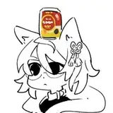
Public Art for 2023-02-10
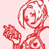
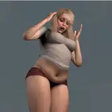
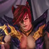
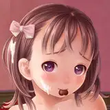
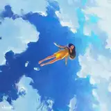
Here I've been experimenting a little more with shapes and design, but I'm not sure it worked out that well. I feel like I simplified the colors way too much and this made the illustration a little flat. I feel like being colorful in an illustration is not just about using very saturated colors, but balancing different colors well, which is pretty hard for me to do. I feel like it's definitely a sticking point I need to fix somehow.
There are also some perspective problems which I didn't fix cause I noticed them too late in the drawing. This shows why I shouldn't continue on from the sketch until I'm really sure that the shapes and perspective are correct.
From my experience, it seems like the best way to design an illustration is having one or two bigger shapes and then a lot more smaller shapes that break up the rest of the image. This means that it is very important to choose very soon (even before starting to draw at all) what is the main shape we want to focus on and how to make it pop from the rest, and also how it should be mixed in with smaller shapes. Failing in doing so, like I did in this pic, ends up creating an illustrations where it's hard to tell where to look exactly, as there are many competing shapes that should be simplified a lot.
All in all I'm not super excited about this one, but I think it was still a good learning experience.