Godzilla x Mothra Process! + PSD!
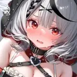
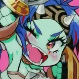
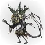
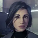
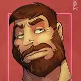
Added 2019-06-12 00:18:55 +0000 UTCLooks like my fanart of my friend Kat Hudson's human versions of Godzilla and Mothra made good traction! So lemme show you how I did it!
So there I am at my table in GZA and I wanted to ward off my boredom by doing fanart for my friend and just have some fun! So I sketched out my general idea in my sketchbook!

I thought I would just trace over it and post it like any other post, but I wanted to do something fun and just color on top of the sketch. Julio Cesar, an artist I love does this in some of his works.
So I went ahead and decided to make this a lineless piece. If you guys have a hard time doing lineless work and have started already, I share your frustration. Some of the few lineless pieces I've done looked off or weird, but it all takes time, patience and practice. But basically, the best way to get a grainy retro result is using digital gouache brushes. My favorite collection of these brushes are the Kyle Webster gouache brushes! The ones I use generally for putting down my solid colors are the gouache Blair brushes. The 70 pixel one for large objects and the 30 pixel one for details and painting narrow edges! I also use the Nupastel brush if I want a more grainy result.

But all in all, really for doing lineless pieces, you're really working from the ground up. You'll see most likely when you check out the psd I provided in this post!

Once you have all your separate color layers down, now you group all those layers into one. Don't flatten! You might have forgotten something, so leave it as a group unless you're very sure that you colored every layer and have no gaps or layers in the wrong spot! I choose not to flatten, but it's up to you what you do! But getting the layers altogether somehow is very important!

Next you make a new layer on top of the group layer and choose a color you want! This will serve as the shadows! Pinks, blues, greens, whatever you want! I choose a reddish pink so evoke the love shown here, but also to evoke chaos since these are humanized heckin KAIJUS! lol
But once you choose your color, go ahead and fill the whole layer with it. That's right, fill it. Then go up to the blend modes and set the layer from "Normal" to "Multiply". Next, you turn the layer into a clipping masks. What that does is keep whatever you draw stays within the boundaries of the layer below it. Say I draw a ball/circle, and put a clipping mask above it. Whatever I draw in the clipping mask will show up ONLY within the ball and won't escape the lines.
Then you take the color white, and "erase" the shadow color to draw in the light. The light edges on the right sides of our characters is essentially that white-out in the shadow layer.

Once you have the shadows and lights established, you make a new layer and make that a clipping mask too! Don't worry, it will still be based on the group layer. But this time, switch the blending mode from "Normal" to "Addition", It also takes other names, like "add", "add (glow)", etc. What this blend mode does is extremely lighten, which is great for highlights. But wait, don't draw on the layer yet. First you need to fill the layer with the color black. Why? I don't know. For some reason the highlights come out much brighter with a black layer rather than not filling it and outright coloring in the highlights. They come out more intense against the black essentially.
But before you draw in the highlights, you must choose a good bright color, preferably one that would contrast the color you chose for the shadows. I chose a reddish peach color, almost orangey color for the shadows. So I chose a bright tealy blue color for the highlights. If you choose a pink/purple color as a shadow, choose yellow or greenish for the highlighs and vice versa. For red shadows, use a bright green color for highlights. Plain and simple!

Next I put in the overlay! This is completely after you. I'm sure after all this work you just wanna call the piece done already, but this optional step is very quick and easy! I usually do overlay layers since they give off a nice, subtle atmospheric effect in my work and use it to your benefit. It can be used to enhance the warmth of a piece or make it look gloomy or menacing. It's a nice effect! So for here I made a new layer, clipping mask again, and switch the blend mode to "Overlay". Then I got a noise brush (any large noise/grain brush will do!) and enhance the lights with bright vibrant colors and the shadows with dark vibrant colors. You can see here I used a light pink against the right side where my light source is and a blue-violet color against the shadows.
Also notice how all three clipping mask layers pay attention to only the flat color group! Makes everything easier!

Lastly I do the lines inside the characters! The reason I chose to do the colors after everything is just so the colors are consistent to all the effects we put on. They would have looked very off against the new darks and lights of the characters. All I did was essentially use eyedropper and darken or lighten to the point that the lines would be noticeable enough. Also what helps is that if you're gonna line a bright color, eyedropper it and go darker. Same for lining a dark color, go brighter. Going darker for already dark colors just makes it harder to see, same for light on light colors. Just do opposites and they will show more clearly. You can see that above!

And there you go! I have provided the PSD file for you to see the steps I went, and hopefully you take it in and apply it to your own work! Don't stress. Don't fret. Don't pressure yourself too much. It all takes practice and just leaning. I hope this lesson helps you guys out!
Vane