XaiJu
thedude3dx
thedude3dx

patreon


Just a teaser of what's coming up!

So I'm currently hard at work on the renders for part 2 of the new monthly comic. Meaning I'll be releasing part 1 and part 2 together somewhere over the next week. The comic itself will be available for the Desire tier, the unedited renders will be available for Craving and higher.

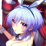
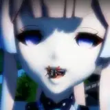
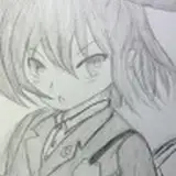
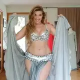
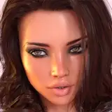
So to whet your appetite, here's another shot from part 1, which is already complete:

To use this opportunity to go a little bit more indepth, I'll talk a bit about how I've lit this scene. Usually, to light most of my scenes, I go with a simple three point lighting system in combination with environment lights. Sometimes, if the environment map is really good, I can use just that and I don't have to bother with additional lights at all.

Over the last three years, my lighting style and quality has been a bit inconsistent as a result of that. It really is one of the trickiest things to get right as an an artist and it's one of the things I'm most intent on mastering.

In this case, the setting is a cramped interior. There is no room for creating additional spotlights without that resulting in overexposure on nearby surfaces. Think about it: if I placed an invisible, light emitting orb above the headrest of a chair, or near a wall, for the viewer there would be the weird presence of intense light on a surface without a nearby source, distracting from the shot.

So all the lights in this scene are mesh lights. That is, lamps in the ceiling and walls that were purposefully put there by the asset creator. I've tuned them a bit to my own taste and I've adjusted some of the surfaces, creating darker materials where necessary to absorb light instead of emitting it.

The end result is a really natural looking interior light design, with clear shadows and clear emission points. In the thumbnail image, Tatiana's face is mostly in shadow. Normally, I would feel inclined to correct that with a spotlight. This time, it is what it is. It's pretty counterintuitive for me to just roll with it the way it comes out of the render process, but ultimately I do think it looks better.

So this comic is going to look a little bit different to what you're used to from me if you're someone with an eye for lighting. But hopefully it will be for the better :)

Just a teaser of what's coming up!

Comments

great working with new challenges in space and light. really speaks well of your dedication and pushing your craft. Also, the ladies are so freakin' sexy I can't see straight. So, you're doing it right.

Vibratos M Blaster

oof, the waiting is killing me :O when do we get to see this masterpiece? :)

Chris3DX

Glad to hear it :D

TheDude3DX

Cheese and rice- that brunette's globes are bigger than her head. I strongly approve.

Mr. Juggs

Kayla: "Let's get down to business." Tati: "To defeat...the Huns!??"

Kyropracter

Actually that James Bond thing isn't bad idea at all and the whole idea of Tatiana carrying a gun...amusing yet interesting :)

Raziel Crowley

First, I have to agree with Zdoria about Kayla's facial expression. So hot, emotional but no doubt a little bit perversion is hidden behind it (if it's that true, it's only a good thing) And I have to agree with Zdoria about the different colors and changes in girls outfits. I do like the combination of black/gold on Tatiana that's why I wasn't entirely sure about the lingerie color back than in her interview. But it turns out great. More than I could have known. But this dress she is wearing in that recent photo...OMG. Don't hate me but I immediately thought of a Disney movie Mulan which I watched as a kid. I mean that type of red with yellow (maybe gold) ornaments...almost Asian style to me and that type and style of dress also...so definitely a GREAT choice for her. And that cleavage now words needed. So with that being said...I can't wait enough for the next week to see the results and all images. (I might be weird, but I also like that detail she is holding a bottle of wine...small details are often the best) And about the light/shadow in your images and different approach. I think this is a good thing. I know even in rl photographies lights and shadows play a very important role so the fact you want to try something new something different I say "Go for it." So far everything new you tried and tested worked out so I have faith this will be no different. I believe it might be a challenge sometimes to edit everything and to make it work perfectly but as I said...you never failed to deliver perfect images so this should be interesting to see as well.

Raziel Crowley

IDK why but I'm totally getting a James Bond vibe from this and all its cheesiness. Tati: "Would you rather I pour some wine into this glass or a taste of myself?" (Unzips dress to reveal gun) Tati: "I never travel without protection." Kayla: "Then perhaps you should fasten your seat belt. We're in for some turbulence." In all seriousness though, these previews look great. You can feel the emotion and the tension between your character now; the way they're postured and the way they interact with each other. Bravo!

Kyropracter

I posted before that Tati looks incredible in that color, but in that image you couldn't see the design on her outfit. I'm even more impressed now that I can see it up close! Not only does she look incredible, but I'm so glad to see the girls in some different colored outfits. Sometimes I wonder if you have some fashion design in your background. The clothes you put the girls in are really awesome! I'm by no stretch of the imagination an expert on the lighting in renders, but I think the lighting in this looks really good. It's got to be really tricky to light this in such a small space as and airplane cabin. And don't worry about looking different. Variety is a good thing. And with your overall attention to detail, there's no doubt in my mind that this will turn out just as awesome as your works so far. No worries. :) Oh, and that "come take me" look on Kayla's face is SO hot!

Zdoria

Looks so hot!

Bob Fink

😍🤤

Tricky


More Creators