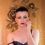
Hero headers alt design
Added 2020-02-03 13:10:10 +0000 UTCLara made a different size version of the Hero Headers. I personally like it, but she feels it's too big.

Can you check it out, and let us know which version you prefer? The first type of Hero Header is on the first screen, the new design is on the second.
Comments
I personally love photos so either option works well, but I think the smaller version suits the overall theme of the game design better.
2020-02-05 21:40:12 +0000 UTCI'd definitely say the first one, the second one makes the screen too crowded
2020-02-03 22:48:06 +0000 UTCI think the smaller one is better as well
2020-02-03 21:33:34 +0000 UTCYeah! We've got a working prototype now, so this *should* be a selectable option in the next release.
Crushstation
2020-02-03 21:23:50 +0000 UTCFirst one works better
xgrotesc
2020-02-03 21:01:52 +0000 UTCThe first one is better in my opinion (and I use a 2K screen).
Breadloaf
2020-02-03 20:40:51 +0000 UTCI agree the first is better
Matthew Cook
2020-02-03 18:26:47 +0000 UTCThe previous one. Scrolling too much could lead to player fatigue and make Bangkok seem really grindy if all locations have the same same sized header.
NaughtyLus
2020-02-03 17:52:08 +0000 UTCThe original version, the second one takes up 65% of the screen ffs XD
Enrico
2020-02-03 16:35:51 +0000 UTCYes. The bigger monitor you get, more you prefer dark themes.
2020-02-03 15:56:55 +0000 UTCI suspect others may have mentioned this - but while you are working on UI optimization - is it available to add an optional dark theme?
Cereburn
2020-02-03 13:56:46 +0000 UTCFirst one(smaller one) is the one I like more - specifically having the text on the bottom of the image and the image itself not getting in the way of the rest of the page.
Cereburn
2020-02-03 13:56:06 +0000 UTC