I'm Still working on a few Art breakdowns and will even be introducing a new tier that will be used make more extensive ones. If you interested in Art tutor Pro (Here) you can learn more in the linked and future post .
Todays art breakdown will consist of comic art and panel prepping. Like always, I'm no pro-- I like what I like and I have a basic understanding of the concept. So as I winged this idea this I thought I display this option for "quick Paneling" for your OC's or projects,
Now I'm not a reader of any sorts-- I wish I was but, I've always loved the look of manga and comics. But instead of using them as a one for one reference, you find you favor and piece on together to create the aesthetic you're looking for.

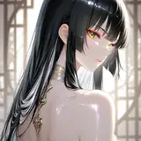
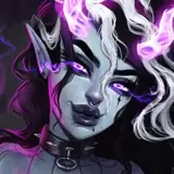
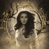
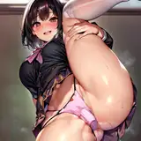
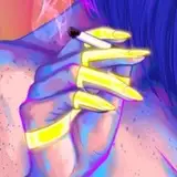
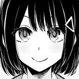
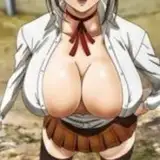
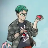
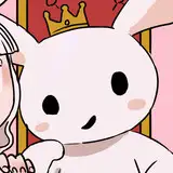
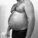
These are my references -- All these images can be found on Pinterest. Now I'm personally nowhere near the stages of actually storyboarding or putting a visual story on paper. I do this as a later reference for when I'm ready, fun and in hopes that when it comes together I can develop a mini story. In other words, these are truly just randomly selected images with no prior story in mind. As I was selecting them, a theme would just come and a story developed but, for the most part that happened for me as my first reference draft was completed.
Things to keep in mind :
Having a story, theme or idea prior -- This should help your search overall
How to piece the scene-- Everything isn't told on one page so, this doesn't have to be frame by frame work. Were frame jumping and want to display the most impactful frames that still line up with the over story for the page.
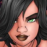
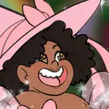
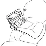
Now there is more to Piecing frames together obviously-- using the image above as an example I have 2 images that aren't within frames. Those images for me are the focus of my story. Image (1) is the cell phone-- used as my first characters focus. Image (2) is Character (2) and also works similar to image one but, is also a way to show that these characters aren't near to each other or are on the other side of the room of each other. I also used these images for aesthetic. This series is heavily pink, girl focus , and magic themed-- since this isn't officially a page in a book, I want to really pull in my audience with my theme . I have nothing else to show to others so this is another way to advertise/pitch a concept.

So I'm always going to promote not tracing but, to taking the elements needed to form the frames to from your reference. Now, if you have noticed I Used very fun poses and some interesting frames. Plus The more dynamic the poses are, the more interesting the comic page is. Now when breaking down the poses like this, you can arrange the shapes in a more dynamic way ( if you have a greater understanding of anatomy).

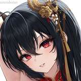
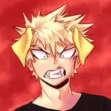
 Now as mentioned, my focus point is Character (2) {Lang}, and with no background this looks less cluttered. Now for the other frames that will, should and can display a setting, contrast is key. Though color isn't added, this is a way to make an interesting look. Also it can center the focal point for each frame.
  At this point, I'm not sure that ill color this page tbh. But if I do, it make be flat colors-- but for color, I think is all part of the developing a comic and your look. if you have any suggestion on how I could approach this please feel to leave them below.
Also if you have any more questions please leave those below as well. till then Bye.


![BSZ白水粥[Bl ゲーム開発者]](https://xaiju.com/istorage/91515.jpg)