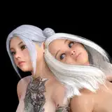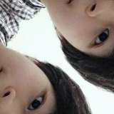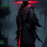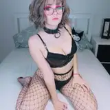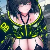
【P01201A】 Pyra (Making Process)
Added 2022-10-19 07:38:53 +0000 UTC【P01201A】 ホムラ (製作過程)

I always use the clip studio when I draw.
Make it smaller than the actual canvas size so that the PC does not slow down and feels light during sketch work.
I sketch with the pencil tool, color it, and do sketch work thinking of the finished image.
---
私は絵を描くときいつもクリップスタジオを使います。
ラフ作業中にPCが遅くならず軽く感じられるように、実際の製作キャンバスより小さいサイズにします。
鉛筆ツールでスケッチをして色をつけ完成イメージを思い浮かべながらラフ作業をします。

Enlarge the image to the actual production size of 12K.
Create a vector layer on it, and draw a line drawing.
If you do the line drawing on the vector layer, you can use convenient functions such as line correction or vector eraser, which increases efficiency.
I work on about 25pt of G-pen based on 12k.
In this process, the more detailed the description while organizing the messy sketch, the less effort the coloring process will take.
---
画像を実制作サイズの12Kに拡大します。
ベクターレイヤーを生成した後、線画を描きます。
線画作業をベクターレイヤーの上にすると、線修正やベクター消しゴムなどの便利な機能が使えて効率が上がります。
私は12k基準でG-pen25pt程度で作業します。
この過程で汚れたラフを整理しながらディテール描写を几帳面にすればするほど、後で着色過程の手間が減っていきます。

When the line drawing is finished, specify the coloring area for each part of the character and start the basic coloring.
In the coloring process, I usually use a [Transparent watercolor] brush and a [Paint and apply] brush, which is the basic brush of the clip studio.
Use a [Transparent watercolor] brush to split the sides or draw details, and a [Paint and apply] brush to blend.
Colors use basic color and shading steps 1 and 2.
Use the basic color and shading step 1 to express the basic volume, and use the shading step 2 to describe the shadow of the bent surface.
I'm conscious of reducing the use of shading step2 as much as possible by using it only for essential points.
In this process, I focus on expressing the character's sense of volume and leave the highlights or reflections as later work.
After the basic coloring, it feels like a pretty complete painting.
---
線画作業が終わったら、キャラクターのパーツ別に着色領域を指定してから基本着色に入ります。
私は着色過程でほとんどはクリップスタジオの基本ブラシである[透明水彩]ブラシと[塗り&なじませ]ブラシを使います。
大きく面を割ったりディテールを描いたりする時は[透明水彩]ブラシを使用し、[塗り&なじませ]ブラシはブレンドをする時に使用します。
色彩は基本色と陰影1、2段階を使用します。
基本色と陰影1段階を利用して基本的な量感を表現し、陰影2段階は曲がる面の影の表現に使います。
私は2段階の陰影は、必ず必要なポイントだけに使うというふうに、使用を最大限減らすことを意識しています。
私はこの過程ではキャラクターの量感を表現することに集中し、ハイライトや反射光は後の作業として残しておきます。
基本着色が終わるとかなり完成した絵の感じがします。

Turn on the background sketch drawn previously.
Consider the direction of the light source in the background, and create a [multiply] layer on the character to make an overall shading plan.
It is recommended that the main light flows in one direction so that it is intuitive to the viewer.
Just splitting the light as above, can avoid looking monotonous and increase the density of the screen.
---
以前描いておいた背景ラフを見せるようにします。
背景の光源の方向を考え、キャラクターの上に[乗算]レイヤーを1つ生成して陰影計画を立てます。
主光源は一方向に流れるようにして、見る人が直観的に分かりやすくするのがいいです。
上記のように光を割るだけで絵が単調に見えるのを避け、画面の密度をさらに高めることができます。

This time it is the plan of the highlight.
Set up an add (Glow) layer and make it easier to understand where the main light source touches.
---
今回はハイライトの計画です。
加算(発光)レイヤーを一つ追加し、主光源が当たる部分をわかりやすく表現します。

This time, it is a plan of reflected light that allows the character and background to match in harmony.
The color of the reflected light is selected by considering the color of the background and the color of the character.
Add a Hard light layer and among the shaded areas created above, color the areas that are likely to be affected by the reflected light.
---
今回はキャラクターと背景が調和して似合うようにしてくれる反射光の計画です。
反射光のカラーは背景のカラーとキャラクターのカラーを考慮して自然なカラーを選択します。
ハードライトレイヤーを1つ追加し、上で作った陰影部分のうち反射光の影響を受けそうなところに色を塗ります。

Now duplicate the 3 layers just created, clipping on each layer group of the character, and start adding details.
From here, pay attention to texture expression, and in some cases, can use a texture brush to give more realistic descriptions.
The point of expressing the texture is to make a difference in the amount of highlights and reflected light by material.
---
今作ったばかりの3つのレイヤーを複製してキャラクターの各レイヤーグループにクリッピングし、詳細な描写を始めます。
ここからは質感の表現にも気を使い、場合によってはテクスチャーブラシを使ってよりリアルな描写をすることもできます。
質感を表現するポイントは、材質ごとにハイライトと反射光の量に差をつけることです。

After finishing drawing the background, I finished it with some corrections and effects.
---
背景を描き終えた後、若干の補正とエフェクトを追加して仕上げました。