download the attached file to watch the process video of the july MOTM painting!
as indicated elsewhere, i think this piece looks simultaneously really cool and kind of ... weird. i recognise that i'm probably just being my own worst critic, and i'm definitely not unhappy with it. i just took a few experimental risks with the stylisation and i'm still over-analysing exactly how i feel about it.
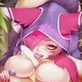
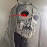
the main thing i'm thinking about is the contrast between 2D and 3D. i sometimes like to juxtapose more or less different styles in my art, but this time the difference is more extreme than usual. the human is rendered in my usual style, while the monster looks entirely two-dimensional. moreover, the human is drawn with a pretty thin lineart while the two-dimensional monster is drawn with thick lines and less precise brush strokes. this is all to mimic the look of stained glass window panes lined with lead strips, dust gathered in the corners and details painted onto the surface.
in other words, the contrast makes sense given the theme of the design, and of course i never expected it to look natural. i just can't decide if it looks odd in a cool and interesting way, or if it's too mismatched? the biggest challenge was to make the characters look like they're interacting and touching each other. funny enough i think that the abundant creampie saved the day, because it kind of bridges the gap between the styles. ultimately, i think the juxtaposition works for the aesthetic of this particular painting, it was a fun experiment, and the effect is definitely alluringly unusual. but it probably won't become a new staple in my art, lol.
i'm also not entirely sure about the symmetrical pose. when people are portrayed in stained glass windows, their stance is usually more or less natural-looking -- but decorative elements like florals or geometrical patterns are often symmetrical. since my stained glass monster is covered in such ornate decor, i wanted to pose them in a mostly symmetrical way, with the "tendrils" fanning out around them (almost like a peacock tail). this meant i was pretty much limited to drawing them straight from the front, and i doodled several ideas on a different canvas before transferring my favourite to a new, blank slate (that's why the video starts with the anatomical building blocks already in place).
once more, the symmetry also makes sense given the stained glass theme; it looks elegant, artful, and beautifully uncanny. however, you could also argue that it's a little stiff and ... dispassionate. the interaction between the characters might have looked more natural and sensual if i had chosen a less stylised pose and thrown symmetry out the window. in sum, the symmetry achieves exactly what i intended, but in hindsight i'm realising that it's maybe not the best fit for smut...?
the human's pose, in turn, was challenging in terms of figuring out the anatomy. i've long wanted to draw a flexible person getting bent in half like this, but it can be hard to draw acrobatic positions without making them look uncomfortable. he's clearly enjoying himself, but i want to do more studies of how to foreshorten torsos in poses like this. i really like his legs though, with the muscles of his calves straining from how his toes seek purchase on the floor. if the symmetrical body language of the monster is a little stale, their human lover makes up for it with his blissful expression and his body tensing up in pleasure. i also think that the way his hands grab the monster's thighs provides another point of touch that makes the characters look like they connect, rather than seeming plucked from two different pieces of art.
anyway, that's enough reflecting on the pros and cons of the choices i made. in the end i feel perfectly fine with this piece, and several of you have already given me wonderful feedback on both the art and the design, which has been wonderful to hear! i don't mean to sound like i'm dissatisfied with the painting, and i hope that this process commentary doesn't come off as putting myself down or having a bummer tone. artistic experimentation is a trial and error thing and you can learn a lot from unpacking why you're feeling uncertain about a painting, which is the kind of thoughts i wanted to share today.
let's finish with a few comments on the process itself. as mentioned above, the human is rendered in my usual style, while the figure of stained glass is rendered in mimicry of their namesake. it was time-consuming to gradually refine the decorative elements of the monster's body, but thanks to the symmetrical pose i could copypaste and flip various sections of my sketches, which sped the process up a bit. however, for the final and most polished sketch/rough lineart i "manually" drew most of the elements on both sides of his body, with a few exceptions (like the tendrils). i didn't want the symmetry to reach every single pixel, and the same went for the colouring. the thick lines made it easy to block in the colours of the decor, and then i worked in layers of top of the rough lineart to add details and refine the shapes of the glass panes. i outlined the main elements in thicker lines, and applied layer effects like "overlay" to make the colours look more glowy.
but the main trick for achieving the look of sunlight through stained glass was to duplicate the lineart, move it to on top of all other layers, change the colour to sienna, set the layer to "linear burn," add gaussian blur, and lower the opacity until the whole character seemed to bathe in a soft glow. you can see the magic happen at around 04.11 -- it makes a huge difference.
all that said, let me know if you have any questions about this process or if there's any part of it you'd like me to elaborate on!
// art + characters © me.