download the attached file to watch the process video for june's MOTM painting!
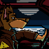
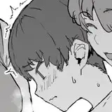
this time i didn't have any specific ideas for the pose, so i sat down to think with my pen, and basically doodled a page full of rough and tiny thumbnails. i hit jackpot with a sketch of the werebear rubbing his half-boner against the witch's inviting behind, because it presented a great opportunity to draw it looking all heavy and thick and veiny and warm. they haven't even gotten started, but it's one of those foreplay moments that really gets the imagination going. the pose required something for the witch to lean on, so i added a log and some rocks -- which, yeah, non-descript forests are my go-to backdrop lol. but hey, outdoors sex makes sense if your lover is a 9 foot monster person, right?
after refining the sketch i decided to experiment with making the lineart slightly less precise than usual. the best way i can explain what i mean is by showing some examples from my sketchbook. these doodles of march and charlie, from back in february, show how i used to combine the 'gloaming' and graphite procreate brushes, with a finishing layer of thin lines that basically look like a rough lineart.
but as the last few months went by, i started using the fine graphite brush less and nowadays most of my sketches are done with only the 'gloaming' brush. scroll through my #sketchbook tag and you'll see what i mean -- these recent tarikuto + naoki doodles are a good example. the lines are thicker, more fluid, with a lot of difference in line weight, which adds volume and makes them look more lively. i occasionally use the graphite brush for tiny details or areas like the faces and hands, but otherwise i'm currently all about 'gloaming'. so for the werebear & witch piece i did do a graphite lineart, but it's semi-transparent and the underlying sketch layers are more prominent than usual.
the biggest thing that changed from the concept sketch was that i felt like the witch's doll-like face looked more silly than creepy, so i made their features more humanoid instead. and as much as i like the characters' clothes and jewellery, i left much of it out of this piece so that the fabric and bling wouldn't obscure their bodies. the neat thing about doing both a painting and a sketch for every monster of the month is that if some design feature doesn't make it into the painting, i can usually work it into the sketch; this month, the latter shows off both their outfits, the witch's honey magic, and the werebear's golden mouth.
as mentioned in the concept commentary i already had an idea for the stylised colour palette, with the characters looking almost sepia-toned against a boldly red background. after blocking in the base colours i used the gloaming brush to add gradients and texture to the colouring. it has a chalky look that really resembles traditional media, and since the sketch and lineart layers were a little less precise than usual i wanted the colouring to be more "relaxed" as well. i hope all of this makes sense -- basically i was experimenting with slightly different methods for this piece, but the effect is relatively subtle and i don't know if other people notice it as much as i do, lol.
i rendered the werebear in pretty monochrome greys at first, because i was planning to add sepia-toned overlays to him later. the witch was originally supposed to be very pale against a background of brown rocks, but halfway through the process i did a 180. the witch's hands and legs gained more of the honey tone mentioned in the concept commentary, and the rocks ended up weirdly bone-white instead. the broad strokes of the colouring were done below the lineart, and i added contrast in hue and value by brushing on smooth gradients on layers set to 'overlay' or 'vivid light' or 'linear burn' or 'multiply.' i occasionally cleaned up the sketch layers a bit and re-coloured parts of the lines to make them mesh better with the underlying colours, which is particularly prominent on the witch.
once i had a solid base i moved to working on layers on top of the lineart. i generally do that to polish a piece and add finishing details, but this time was a little different because i painted more than usual on top of the lineart layer. in some areas the brush strokes covered parts of the lineart (such as some tresses of the witch's hair) and in others i used darker and lighter strokes to clean up the shapes (the flower wreath, for example). the lineart is still there but the final result looks more painterly, compared to when my linearts are more needle-thin and precise.
i polished the shapes of the rocks, added more texture to the werebear's fur, and adjusted the undertones of both the characters and the boulders. the yellow hue of the rocks gives the colour palette more punch and creates more contrast to the grey tone of the werebear, and for the same reason there's actually a very subtle cold blue overlay to the white rocks behind the witch's body. the colour scheme worked out exactly as i had envisioned -- it's very stylised and yet looks weirdly natural and earthy, save the field of red.
all in all, this was an experiment in more painterly methods, a less precise lineart, letting the sketch layers play a bigger part, and textures that mimic traditional media. i'd actually love to hear if you can see what i'm talking about, or if i'm the only one who can tell because i 1) lived it and 2) stared at this canvas for 11 hours. i'm not saying it's drastically different from my usual stuff, but ... y'know? y'know???
anyway, i'll stop rambling. hope you enjoyed the video, and if you have any questions, feel free to ask below!
// art + characters © me.