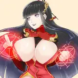
here's the process video for february's MOTM painting, of a flamboyant peacock gryphon. as already mentioned, this piece was a challenge and as promised, here's me whining about it. in fact i'm gonna focus this commentary on how i solved the various problems i encountered along the way.
the first issue was the pose. as usual i make tiny pose doodles in a separate document and transfer my favourite to a new canvas to actually start working on the painting, so the pose doodling phase is not in the process video -- but lemme tell you about it. after doing the concept sketches, i felt like i would be better able to show off the design if i did a solo picture. most of my MOTM paintings depict the monster with a partner, but i was already struggling to think of alluring poses that would show off all the important design elements (primarily his huge tail). so i decided to do myself a favour. it would, quite simply, be easier to come up with a good pose if i didn't also have to factor in the body of a second character that would overlap and interact with him.
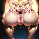
that said, it still proved tricky. at first i figured i could draw this gryphon guy invitingly putting his ass on display, like holding his legs open and showing off the Mess his out-of-frame lover just made in him. but many of the poses i thought of meant that his tail would be seen from behind or from below. naturally, the splendid tail is a focal point of this design and it wouldn't make sense to choose a pose where you couldn't properly see it. in a sense, i had to start with posing the tail so you could see it from the front, and then figure out the rest of the body.
drawing the tail from the front meant that i couldn't show off his hole as explicitly as i had first intended, so i switched gears and went for a somewhat more subtle and alluring kind of sexy -- hips raised, back arched, knees wide apart, that kind of thing. in other words it made sense to have him on his hands and knees, but the initial doodles were a little uninteresting, since he was kind of just ... sitting there. i solved it by having him sink down on his elbows, cupping a glass of wine, face turned towards the viewer, and a relatively discreet puddle of cum dripping out of him. all these things help tell the story of the scene and creates a leisurely sense of luxury. this guy knows that he's gorgeous and irresistible, just casually sipping on his wine while waiting for his partner to recharge -- or perhaps for the next person in line to step up?
the one problem with this pose is that i couldn't add wings without obscuring too much of his body. as seen on the concept sketch he has wings and i would have liked to include them, but decided not to -- i think he reads as a gryphon even without them. also, for the sketch i was able to 1) include wings and 2) draw the more explicit pose idea i had previous scrapped, so the sketch and painting together show off various aspects of the design. (we can just assume that he can shapeshift the wings out of the way if he doesn't want to bother with them, lol.)
i started refining the sketch and initially considered going for an art nouveau approach, with a decoratively stylised lineart and an elegant, watercoloury look. as it so happened, none of that came into being, and that's not the only element that ended up different from my original intentions. i finished the lineart, and started blocking in the character. but you'll notice that at this stage, the tail looks very different from the final painting.
this was the second problem. the concept sketches include an experimental drawing of the tail, but i wasn't completely happy with how it came out and i kept feeling that way while working on the painting. the first iteration of the tail was pretty stylised and almost geometric, but it quickly started looking too stiff and out-of-place compared to the rest of the piece. despite have gotten quite far in colouring it, i decided to re-draw the tail from scratch. i wanted it to look organic and soft, perhaps a bit more like a plume of ostrich feathers than what a peacock's plumage actually looks like. in other words i applied a scoop of artistic liberty -- but to be fair, it still kind of looks like a peacock tail just before it's fully fanned out, or as it's being folded back down.
i was much happier with the redraw, but the challenge of rendering the brilliant tail feathers still remained. i wanted to indicate the texture of the feathers, use vibrant colours, and render the eye-like pattern without making it look cluttered and messy. figuring it out entailed a lot of trial and error, experimenting with layer effects to make the colours pop, and balancing the amount of detail. i used a shitton of layers for the tail, so that i could adjust the transparency of each layer individually and tone things down where needed. in the end i went for a somewhat more painterly rendering of the tail than i had originally planned, because as soon as i tried adding more detail it just looked messy.
the third problem was the background. rather than having him just lay on a blank space i wanted the backdrop to add to the story, and his attitude begged for a luxurious environment to lounge around in. a soft rug, heaps of pillows, and lush plants came to mind, all in rich jewel-like colours. however, the backdrop should complement the character but not steal too much attention away from him. for this reason i didn't do a lineart for the background, the brush strokes are pretty broad, there's not too much detail, and i eventually blur parts of it -- the foreground element is especially out of focus. i wanted to use a rich colour palette that matched the peacock's vibrant hues but without making him blend into the background too much, so i once again experimented with various layer effects to add contrast and tweak the colours. but it was hard to get it just right, especially in terms of adding a balanced amount of texture and contrast.
on that very same note, the fourth problem was deciding how much detail and texture i wanted to add to his body. the concept sketches have a lot of shiny highlights and some stylised patterns that i thought about incorporating. but doing a concept sketch is different than rendering a painting. as we have seen before, i sometimes tweak and adjust things as i have new ideas for how to improve the design or for aesthetic reasons. in this case the inclusion of a background meant the composition was a bit more 'zoomed out' than i had originally planned. i soon realised that it was easy to add too much detail, especially since there's already a lot going on with the design, in terms of shifting colours and patterns. i used a small brush to polish things up and added some vibrant highlights to his plumage, but once again felt like less is more.
the fifth problem was how the painting looked a bit flat, and i was struggling to bring everything together. i solved it by applying some neat dramatic lighting -- the shadows are on layers set to 'multiply' and the rays of light are on a few different layers set to 'soft light' and 'pin light.' in effect, the rays of light helps direct focus and the deep shadows actually balance out the painting by obscuring parts of it. in other words, the contrast between light and shadow guides the eye of the viewer to the highlights of the design, while the "less important" parts of the picture are pushed into the shadows. plus it just makes it look very shiny and satisfying, and the specks of dust add to the dreamy atmosphere.
with that, the painting was finally finished. it was such a fucking ordeal, but i'm proud of myself for solving one problem after the other! if you have any questions, just comment below, and thanks for reading!
// art + character © me.