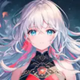
here's the process video of my recent drawing of julian and andreas--download the .mov file below!
as already mentioned, i've long wanted to follow my 'impatience' piece up with a part 2. i even made a rough sketch of what i wanted it to look like (you can actually see it towards the bottom right of this sketchdump), with julian having gone all limp from pleasure and andreas really just rutting into him. when jaeger&wick said they wanted to see more of julian and andreas, i figured it was about time to actually make this part 2 happen.
the big challenge about turning a rough doodle into a finished piece is often about preserving the liveliness of the sketch. it's so easy to make the lineart look more stiff, to lose some of the movement and action and expression, to make everything look more rigid or 'artificial' once it's been better defined and coloured and polished and detailed.
but getting better at preserving something of the vivid feeling and expressive movement of my sketches as i turn them into drawings and paintings is something that's very much on my mind right now. i think that's why i've been gravitating towards sketchier linearts and softer colouring methods lately, and why i feel like getting too bogged up in adding details and 'cleaning up' a piece often does it no favours, instead making it look 'over-worked,' if that makes sense.
i think that my weekly art pieces is an excellent opportunity to experiment with linearting and colouring techniques that are simultaneously polished enough to look finished but 'loose' and 'rough' enough to look vivid and animated. doing this drawing certainly felt like an exercise towards that end. the rough sketch captured the energy of a climactic moment and of decisive movement, and i wanted to successfully translate that into a finished piece.
for this reason, i spent a lot of time on the lineart. for me personally, it's during the linearting stage that things usually start looking more stiff than i'd like. it was as important as always to figure out the anatomy and posing of their bodies, but i tried to constantly keep their body language in mind, the energy of the movement and the expressiveness of every part of them. there's a contrast between andreas being all tensed up as he comes (giving a snarl of pleasure, neck straining, back and arms and thighs tensing up as he grabs onto julian's hips and bucks into his ass, knees and feet digging into the ground for purchase) and julian being all limp and boneless from too much pleasure (help up only by andreas hands, panting and trembling, flushed and breathless, barely balancing on his toes).
the way i went about it was by doing layers of layers of successively more detailed sketches, using smaller and smaller brushes. every time i created a new layer i decreased the transparency of the former ones. in the end i had about six layers: the very first super rough sketch/pose idea; another rough sketch where i had started figuring the anatomy out; a third sketch where i began refining the shapes of their bodies; a fourth sketch where i started to clean it all up and add hints of texture; a fifth layer that's technically the 'lineart,' although the lines are still very sketchy; and a sixth layer where i went over some of the more important lines, making them darker and thicker to better outline the 'major' shapes of the characters and define the pose a bit more. by the time i was finished, i had hid or deleted the first three layers, and the fourth layer was only very faintly visible. i lowered the transparency of the fifth and the sixth layers, too, set them all to 'multiply,' and changed the line colour from black to a warm, dark brown.
the lineart defines a lot of the shapes and textures (andreas's musculature, his fur, the creases in julian's clothes, his hair) but thanks to the faint and sketchy lines it still doesn't look too rigidly 'sculpted.' the hint of a rough sketch below the proper lineart layer also helps keeping it from appearing 'too polished,' and i think the difference in line thickness adds something dynamic and energetic.
i realised that the pose may be a bit unbalanced, so i experimented with putting andreas' right hand in front of him instead... but i found that made the picture lose some of it's lustful energy. i wanted to keep his hands on julian's hips, gripping them tightly and holding him right there--in fact, the unbalanced pose may actually add to the sense of movement...?
in any case, i started colouring.
ever since i did the yule goat painting i've been wanting to experiment more with the colour technique i used for that piece. i was talking about how the colouring in that painting is pretty soft, with the colours gently fading into one another and few 'hard edges.' it was coloured with brushes that mimic charcoal, chalk, or pastel, but the look of it also vaguely reminds me of watercolours applied to wet coarse-grain paper, allowed to bleed together into soft gradients. i wanted to see where i could take this digital colouring style--or rather, perhaps, where it could take me.
i used my last painting of julian and andreas for colour reference, and started adding the shifting colours of andreas' fur, using a charcoal brush. i went from light to dark, adding the various hues of ochre and tan and grey, and when i felt like i had a solid 'base' i began refining certain areas--primarily his face. for this i used a brush that mimics a graphite pencil, and i personally love how the graphite details on a charcoal base turned out--it looks a bit like a gouache painting.
but you'll notice that when i say 'adding detail' i'm talking mostly about cleaning up the colouring in a way that defines the shapes of his body. i didn't add much texture or shading at all, and again, there's few hard edges. i selected some areas and used the charcoal brush to define it (see for example the muscles of his thigh), but most of the colouring is very soft and blendy, with only the lineart adding texture and definition. in a way it's the opposite of my lasso select + airbrush method, which generates a lot of hard edges and an almost 'crystalline' or 'faceted' finish.
when colouring julian i used mostly the graphite brush, since it gave his clothes a subtle texture. for the sake of threedimensionality and making the pose easier to read i added some shadow to the area behind andreas' hand and arm, but otherwise kept the colouring 'flat' because i'm still really into that look. i just absolutely love the 'grainy' gradients created by the charcoal brush, it adds so much character to the colouring. the method is relatively quick and simple, yet comes out looking so interesting and aesthetically pleasing--i honestly can't wait to colour something else the same way.
last but not least i added cum, which again proved a good opportunity to add a sense of movement; at first i had it drip straight down, then realised it didn't make sense if they're in the middle of a climactic thrust.
all in all, i'm stupid happy with this piece. i feel like i accomplished what i set out to do both in terms of maintaining the energy of the initial sketch and experimenting with this colouring style. in a sense, this is exactly what i was hoping would happen when i challenged myself to make one piece every week. <3
// art + andreas © me; julian © kubi.