here's the process pack of this painting of weshau and minoru - download the attached .zip to access 15 pngs and 1 gif!
step one, as always, was coming up with a pose, figuring out the anatomy, and refining the sketch until i was ready to do the lineart. as with many of my recent drawings i kept the lineart relatively simple and rough, immediately coloured it a dark blue, set it to "multiply," and lowered the transparency quite a lot. this makes the lineart less in-your-face and allows for more freedom when colouring. i'm still by no means omitting the lineart from my art and the lines are still prominent in my style. but i currently use them more as guidelines when colouring, adding much of the detail as i go and making the linework look more dynamic by either filling in or downplaying different parts of it later on.
as for the colouring--welcome to another episode of fangs' adventures into relying less on the lasso select + airbrush/gradient tool method and more on using regular fucking brushes to paint with! sure, i used the lasso/airbrush style of colouring for filling in the big gradients at the early stages of the process, for adding some minor detail while polishing stuff up (primarily to the tips of Weshau's tendrils), and for adding the pale green overlays (more on which below).
but other than that i mostly used more painterly brushes to give their bodies shape and add 'character' to the colouring. i find that this combination of flat, even gradients all over with painterly texture at select places results in an overall impression that i'm really into right now. it creates a good balance between smoothness and structure and an appealing level/distribution of details. such things are highly subjective, of course, and also changes with time. a few years ago i used to spend 50+ hours painting every single hair on very realistic creatures and back then i would have thought this style was way too simplistic. now i'm more into stylised looks and where i used to over-do the detailing, now i'd rather under-do it.
on that note, you can compare this process pack to last month's (of cian and elena) and see how, on both these paintings, i applied pale overlays to certain parts of the characters. this is a method of creating depth that i've talked about before and it's also been an important part of my experiments with more stylised colouring methods. it's the same effect as when you view a landscape through thick fog (the mist makes things that are further and further away look more and more pale and desaturated) but applied to people's bodies.

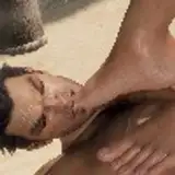
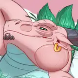
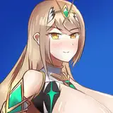
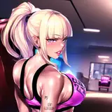
as always, weshau and minoru are a delight to draw. their colour scheme is right up my alley and i find that even my smutty art of them turns out strangely soothing and calm. my favourite part of painting weshau is his furry, prehensile tendrils/tentacles--i like how they overlap and curl in such an organic and lively way, and adding the pale overlays to some of them really helps enhance the sense of threedimensionality. ...also, typing this i realise that i completely forgot to add the starry night effect to his fur. OOPS.
throughout the process i used a few different kinds of photoshop magic to enhance the picture, by adjusting the colours and the brightness/contrast, all of which served to make the painting look more vivid and interesting. that's one thing i really love about digital media--if you accidentally make a drawing too dark, dull, or bland, you can just click a few buttons and correct it. i'm not saying that you should rely too much on photoshop editing and it's definitely possible to over-do it, but it sure is convenient. don't use it as an excuse for being lazy--use it as a tool for raising your art to new levels.
i made a process pack of my last painting of weshau and minoru too and as you may remember i concluded the discussion by saying how the colours of the characters had turned out a bit too bright and colourful, and how i wanted to make some new concept sketches of weshau to consolidate what i really want his colour scheme to look like. well, that didn't happen (or at least it hasn't yet). but i've painted them a couple of times since and i've kept it more in mind to try to stay true to their colours as they should look. there's still some minor colour distortion happening, for the sake of the readability of the image--if i'd made the characters too dark it would be more difficult to discern details and make out what's going on. minoru is still supposed to have much darker fur, but weshau looks much more like himself, so... partly a success, but i still have stuff to work on.
on a closing note i can also admit that the pose didn't quite turn out as i had planned. as you can see on the rough sketch, minoru has his right leg bent with the knee on the ground, which makes it seems more like he's leaning on the rocks or in the middle of changing his position. (the original idea was also to make a kind of closely cropped picture where part of the characters were out of frame, making it feel more 'intimate' and possibly looking like it could be a panel from a comic?) however, in the final drawing weshau's thigh completely obscures minoru's right leg, which makes it look more like he's just squatting in front of him. not quite what i intended, but hey, that's just how life be sometimes.
// art + weshau © me; minoru © kubi.