download the attached .zip below to access the process pack for my recent painting of cian and elena--the pack contains 12 pngs and 1 gif.
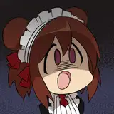
this was another drawing that began with a random pose idea; i didn't have any particular pairing in mind, i was just doodling a bunch of nice nsfw poses. in the case of this pose, the bottom had digitigrade paw feet, which narrowed the options down a bit (i tried sketching them with plantigrade legs as well, but it didn't look as good). with kubi's help i settled on cian and elena, and so i went on to refine the rough draft to actually look like them. the sketch then turned into a lineart, and before adding the basic flats i changed the lines to a dark brown, set the layer to 'multiply,' and lowered the transparency quite a bit.
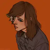
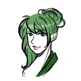
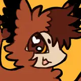
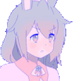
elena's face and torso is the colour of human skin, but their limbs gradually fade into the colours of a red fox, matching their tail and hair. i used the lasso tool to select one limb at a time, and added smooth gradients with a big airbrush, starting with orange and then adding darker and darker hues towards their feet and hands. for cian's fur, on the other hand, i again used the lasso tool but i kept the edges of my selected area more sharp, rough and 'jagged,' following the shapes of his musculature and indicating the texture of his fur. i added both darker and paler hues to the base colour (in a typical wolflike pattern--his colouration is essentially that of a grey wolf, only with warm autumn colours) and then i started blending the edges.
i wanted the colouring of this picture to be a mixture of soft and... chunky, in lack of a better word? different colouring styles have different feels to them; some are super smooth and airbrushy, others are more angular and polygony, others are painterly and textured, and so on. it depends a lot on the media you use--oils will produce a different feel than watercolours, and graphite pencils won't look the same as pastels. in the case of digital art, it's all about the brush and brush properties--i find that the shape, texture, and 'blendability' of a brush makes a huge difference. some digital brushes mimic the properties of traditional media, others go beyond that. people sometimes ask me about the brushes i use, and i wish i could tell you where to find them exactly but the problem is i've gathered a bunch of brushes across the course of several years, to the point where i can't remember the source of individual brushes... sorry! my best tips is to google your way to brushpacks shared by concept artists--just make sure they're free for personal and commercial use.
ANYWAY, the 'chunky' look is best visible in the fur of cian's arm, thigh, and tail. i used a square brush that sort of imitates chalk pastels, and used both darker and paler hues to blend the 'edges' between each colour--but without blending too much. the angular shape of the brush makes the colouring look more 'plaster-like' than if i had used a round brush, especially since it has a subtly rough texture. where his fur is longer (for example his tail) i emphasized the furry texture of it; where it's shorter (for example his hand and lower arm) i went for a more blended and smooth-ish look. i added a bit of extra fur detail to his face, since it's an important part of the image, and his neck fluff is also more defined than the rest of his fur; it comes off as more sharp and refined in a way that matches elena's hair, putting it into focus. it's a subtle way to tell the viewer where to look, since the eye is drawn to crisp and detailed areas of a picture.

elena is more peachy soft, all over; i used gentle gradients for most of their body, adding only hints of texture on their limbs. i used smaller brushes to create the texture of their tail, and together with the round, unbroken outline i think it makes it look more soft and 'gentle' than the rougher look of cian's wolf fur. similarly, the square/angular colouring of cian's body makes him look more muscular and tough, while elena is all soft and smooth in their shapes and colouring. when the characters in a picture have very similar colours, you can always use texture and shape (of both lines and colouring) to create a bit of contrast between them and give the picture more personality. i went over some lines again, emphasizing them where it felt like it enhanced the readability and clarity of the picture (see for example the outline of cian's arm), added more details, and polished the whole thing.
cian and elena have a fantastic colour scheme, but step 10 did feel a bit 'flat' to me, or like the colours were a bit too similar all over the image, if that makes sense? i started experimenting and eventually settled on adding a green-blue overlay to certain parts of the picture that are the furthest away from the viewer. i've used that trick before; it helps 'push' those parts into the background, creating more depth, and also adds interesting variations in hue, especially to a picture like this where both characters have similar colours. if you squint at step 10 it looks like a rather confusing mass of orange, brown, and tan; if you squint at 11 it's much easier to tell what's what. the green hue also looks gorgeous together with the characters' colour schemes, and last-minute changing the background to white makes the picture look so crisp, doesn't it?
i feel like this colouring style was a bit different from that shown in some of my other recent process packs and i hope you enjoyed seeing it! if you have any questions, just ask below. <3
// art + elena © me; cian © kubi.