download the attached .zip below to get access to the process pack for this painting; it contains 19 pngs and 1 gif.
this drawing was an exercise in coming up with (and refining) a design on the fly. when i design roleplaying characters i usually do a lot of concept sketches, because it's a way for me to not only figure out their appearance but also to get to know the character better. i find it difficult to roleplay them before i know what they look like--plus i love drawing character design concept art. also, those of you who are 5$+ patrons already know that for my monster of the month art i always begin with drawing some concept art of each month's new monster design, working out what they look like.
but i don't always do concept art. sometimes when i'm drawing an entirely new monster for a random art piece, i just wing it and come up with their design on the fly. this is especially true for when i don't have any further plans for the character beyond including them in that one drawing--when they're one-offs that i don't plan to roleplay or necessarily draw again. (of course, sometimes i get so fond of them that they actually turn into proper characters that i both roleplay and draw...)
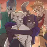
in this case, i needed a demon lady to join my creepy unicorn and her witch girlfriend for some fun, and i did not do any preparatory concept sketches before i started sketching. i already had an idea for the pose so first of all i did a rough pose sketch, and then i started experimenting with different looks for her.
on the rough sketch she had a tentacly tail, blindfolded eyes, a headfull of bony outgrowths, and impressive neck fluff. but this design didn't fully do it for me--i felt like it was a bit all over the place. one of the main pros of taking the time to do even a quick and sloppy concept sketch is that you gotta put at least some thought into it, while if you just wing it the design might lack a clear red thread. on the other hand, i don't want to feel like i always have to do concept art--sometimes it's fun and relaxing to just make it up as i go, and it might lead to interesting and unexpected results.
for example, as i was re-drawing her head i was experimenting with different ways to pose her neck, and then i realised i didn't have to pick just one option--she could have several heads. i kept one of them blindfolded and wrapped the ears and mouth of the other two, in the classic see no evil, hear no evil, speak no evil way. to mirror her three heads i gave her three tails too; they were long and fluffy on the revised sketch, but i made them smaller on the lineart to make the composition more balanced.
as i started adding the basic colours i faced the next decision in line; the demon lady's colour scheme. i started with a purple base hue, then changed it to a soft brown, and then started experimenting with various darker and lighter hues to figure out the colouration of her fur. even as i was trying to work out her colour scheme there was something that bothered me about her tails--i thought they looked a bit too ... uninteresting? in fact i thought her design in general was lacking some extra oumph. so i changed the look of her tails, added matching spikes to her neck, and scaling to her underside. there, much better.

back to her colour scheme; i changed the temperature of the basic beige of her body into a warmer hue, and had the idea to give her a piebald sort of pattern. for the darker patches i simply went with a different shade of brown, at first, but i thought it looked a bit bland so i added a colder gradient to the darker patches and gave her entire colour scheme a sort of purplish undertone. from thence sprung the idea to add a starry pattern to the (by now) dark purple patches, because i was already getting some kind of galaxy vibes from her colouration.
at this point i was well pleased with her look, so i moved on to work on the unicorn and witch for a bit. next i used the lasso select + airbrush method to add some shading to all three characters; i set the shadow layers to 'multiply' and lowered the transparency until it looked just right.
there's a lot of 'overlapping parts' in this picture, not just in terms of the characters overlapping one another but also what with the demon's three heads and tails. i wanted to create a sense of depth so i made the parts of the characters that are the furthest away look more 'faded.' i also added a warm, yellow-ish hue to the parts of the characters that are closer to the viewer and set that layer to 'overlay,' which makes things pop a bit (and makes the picture look more vivid).
last but not least, the final stage of this process consisted of using a tiny brush to add details, polish the linework, and clean up the outlines. i kept at it for a bit and then before i knew it, i was done.
// art + characters © me.