download the attached .zip to access the process pack for january's lantern bearer MOTM painting - it contains 21 pngs and 1 gif.
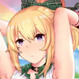
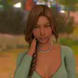
it took me a while to figure out the posing here, as reflected by the messiness of the sketch. i think that standing sex poses are difficult to draw to begin with because they need to look balanced and like the characters aren't going to fall over any second, but i was determined to draw a pose that i haven't already drawn a dozen times. even as i had their bodies figured out i was left struggling with the human's face--i actually hate drawing human faces in profile, for some reason i find it so tricky. i solved it by hiding half his face behind the lantern bearer's hand-like pedipalp...
the lineart is the same as usual and immediately after finishing it i set the lineart layer to 'multiply' and lowered the transparency quite drastically. i didn't want the lines to be too stark against the semi-transparent layers of cloth, and anyway i was planning to underline the 'important' parts of the lineart later on. i added the basic flat colours and gradients, though i needed to experiment a bit before i managed to decide exactly which colours i wanted to use--if they should be warm or cold, pale and dusty or dark and shadowy. i used several different layers to add the basic flats to the see-through pieces of fabric, and used the lasso select + airbrush method to add gradients to the lantern bearer's limbs in a way that makes them look segmented in that insectoid, exoskeleton-y way.
the main things i wanted to focus on or get across with this painting was the light cast by the lantern, the wing-like texture of the lantern bearer's clothing, and the semi-transparency of the overlapping layers of fabric. i used a few different textured brush to render the soft 'scaling' of the winglike fabrics, including a 'toothbrush splatter' brush and an irregular brush with a soft, almost paper-like texture to it. i based the patterning on moth wings, just as his whole colour scheme is inspired by grey-beige moths. i moved from using bigger brushes to establish the basic pattern, to using smaller and smaller brushes to add smaller and smaller details.
i shaded the lantern bearer's neck fluff and the human's hair in a similar manner, using the lasso select + airbrush technique to add both highlights and shadows. i added some more shadows and highlights to the human's skin, using both the lasso select + airbrush method and a square-ish brush. the next step made a huge difference; i used the lasso tool to select the parts of the characters that would be reached by the light of the lantern, filled the selection with a pale yellow, and set it to 'overlay,' effectively adding a 'border' of light. i then inverted my selection and added a big ol' shadow to the rest of the characters, enhancing the dramatic effect of the lighting.
from then on i used the irregular, patterned brush and the square, chunky brush to add details and texture and to underline parts of the lineart--or rather to 'overline' it, since by now i was working on top of the lineart layer. for the lines i picked hues that matched the surrounding colours but a bit darker or lighter, making the linework look more lively than if i had used black or some other dark colour for all of it. i also used the lasso select + gradient method to add shadows to the transparent fabric, as well as to enhance the overlapping parts where the cloth would look a bit more opaque. for this i used both the soft airbrush and the toothbrush splatter brush, adding more texture.

i kept polishing the whole picture, and also added soft overlays of both warm yellow/orange and cold blues, subtly differentiating various parts of the picture from one another and making it look more vivid. towards the last stages of the process i merged all the layers and increased the brightness by changing the values of the 'levels' slider. i also added some gaussian blur to the outer edges of the picture, while still making sure the important focal points were in sharp focus. adding a bit of blur to the 'less important' parts of an image is a good way to make it look more atmospheric, especially if it has a dreamy or ethereal vibe--which in this case is also further enhanced by the firefly-like specks of light floating about.
i finally brightened the whole thing up a bit more and ended up experimenting with colour balance and hue, producing the alternate purple and green versions you've already seen. i'm personally torn between the brown and purple versions, but everyone else (so far) has said that the brown version is their favourite, so that's the 'official' version lol.
and that's it! i think my favourite part of this picture is the balance between textured and smooth areas, between fluttery see-through materials and solid mass. i'm also very pleased with how it ended up very atmospheric and conveying a dreamy, otherwordly mood through relatively simple means--aka utilising various photoshop effects. there were a few moments in this process where i felt a bit lost and like i didn't have a proper plan for what i wanted to do with it, but i winged it and experimented and tried different solutions until it worked out!
if you have any questions about this process, i'd love to answer them in the comment section below!
// art + characters © me.