alright, let's look at the process pack for this painting of a gargoyle and their lover! you can download the .zip below, it contains 25 pngs and 1 gif.
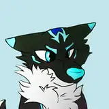
the sketch and lineart established the basic forms of the characters, especially in the case of our gargoyle friend. they're made of stone, some of which is carved in imitation of fur, feathers, and scales. already at the sketch and lineart stages i made sure to outline the carved shapes across their body, with thin lines that would later on blend into the colouring and shading; see for example the thick wavy 'fur' on their thigh and shoulder.
the idea for their colour scheme is that they're made of a greyish stone that's partially covered with thin layers of green-yellow moss. i also knew that i wanted the background to depict a warm, peachy sunset, which would also shine a rosy light upon the characters. for my base colours, then, i picked a relatively warm green-ish grey for the gargoyle, and a kind of neutral pale hue for their lover, since i was planning to add darker gradients to his skin later on.
when colouring stone or stone-like materials, i like to start with the texture. the next few steps illustrate how i used different brushes and different hues to achieve it; i worked on several layers, some of them being set to just 'normal,' while others were set to 'overlay' or 'multiply,' at various percentages of transparency. i started with big, 'splotchy' brushes to add various hues (both darker and lighter) on top of the base colour, and then moved on to smaller brushes with a sort of toothbrush splatter texture. i added some gradients to the gargoyle, to give them more form and differentiate their overlapping bodyparts from one another, and i also used the lasso select + airbrush technique to add a gradient to some of the carved parts of their body (such as the row of feathers on their wing, the fur on their thigh, and the crest along their spine).
the next step really served to emphasized the carved stone nature of the gargoyle; adding relatively deep and sharp shadows, in a way that i think makes him loss less soft and organic and more carved and rough. i basically went over the character from the upper left corner to the lower left--from head to tail--and added both small and big shadows.
as you probably now by now, part of my standard MO is going over the picture towards the end of the process and clean up the lines, adding details and tiny highlights to make it look more polished and crisp. however, with this picture--or at least for the gargoyle's body--i found that when i added too many small highlights and cleaned up the lines too much, their stone body actually started looking more stiff and stale and flat, rather than the lively and in-the-round vibe it had possessed up until then. thankfully i had done the highlighting and polishing on a separate layer, so i could easily make that particular layer visible or hidden and compare which i liked best. i decided to delete the layer, which goes to show that adding excessive details and polishing the rough edges a lot isn't always the right option--sometimes less is more. it's possible to overdo it, and when you overwork a picture it can end up looking less lifelike and organic. as you can see i did some amount of polishing and detail-adding, but not as much as on many of my other pictures.

to balance the picture and avoid making it look too busy, i used a fairly minimal amount of detail and texture for the redhead. i had already added the basic gradients to his skin (actually very soft, peachy fur) and simply added some freckles and little details to his hair and flower wreath. towards the final stages of the process i realised his colour scheme looked a bit dull compared to the rest of the image, so i added a warm tone to all of him. i created a new layer, covered his whole body with a warm rosy red, set the layer to 'overlay' and adjusted the transparency.
i used various cloud brushes for the sky, and painted the wall on a different layer. for the wall i focused on shadows and form rather than detail and texture, knowing i was going to apply a gaussian blur effect to it so details wouldn't really show up anyway. the row of gargoyles were painted in even less detail and then made even more blurry. the layers of blurry background elements vs the sharp characters creates field of depth and pushes the characters into the foreground. the sharpness attracts the viewer's attention, while the blurry background elements provide a backdrop and setting for the characters without stealing attention away from them.
finally, step 24 illustrates a trick that changed the vibe of the whole picture, in a way i'm very fond of; i created a new layer, airbrushed a pale rose-gold colour onto where the light hits the characters, set the layer to 'overlay,' and adjusted the transparency. on a different new layer (set to 'multiply' and with the transparency lowered) i added shadows with a dark green hue, especially to the areas that are the furthest away (the wing and back leg) or where the shadows would be the deepest. these two moves help create form and shape, differentiating between bodyparts where they overlap, pulling the highlighted areas into the foreground and pushing the shaded ones further back. it's a great way to add some extra punch to a picture if you feel like it's looking a bit flat; the characters immediately look more three-dimensional and lively.
and there we go! feel free to comment with questions and thoughts <3
// art + grey © me; freckly boy © kubi.