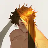
here's the process pack for this drawing of vaska and amato; download the attached .zip below, containing 17 pngs and 1 gif.
this process (or rather, the method used to draw and colour this picture) is relatively simplistic; the colour scheme is very limited and the colouring technique entails quite a minimal amount of details and texture. but it's a good example of how small things go a long way and can make a big difference for the overall look of a picture. there's not always a huge change between one process picture and the next, but i figured i'd include them all anyway, to really show you every step along the way (and better show too many steps than too few, no?).
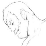
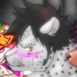
first of all, the pose. you know me, i draw a lot of poses where you get a good, unobscured view of the sexy stuff--but sometimes i like to draw positions that leaves things to the imagination, too. not that there's anything subtle about this pose, you clearly get what's going on, but y'know what i mean?
the lineart is relatively detailed, with a fair bit of attention paid to vaska's fur especially. when i drew the lineart i had already decided to colour this picture in a relatively simple style, so i wanted the lineart itself to get a lot of the job done by having character and containing some detail and texture. a good example of this are the short little strokes on vaska's back and limbs; adding little strokes and dots like that is a somewhat stylized way to convey the idea of texture (and they can later be coloured in a more subtle hue - or even in a lighter colour, often to great effect). as with many of my linearts i also 'outlined' certain anatomical features--in this case, most notably the phalanxes of their fingers, amato's knees, the muscles on vaska's back. this is another style choice of mine; i often colour these lines in a more subtle hue later on, making them blend into the colouring below a bit more, but i like the stylized look of it.
the flat colours are pretty straightforward. truth be told i'm still working on figuring out _exactly_ what vaska's colouring looks like, and this painting was part of experimenting with that. i know for sure that his fur is mostly dark grey, medium grey, and black, but i'm still debating whether there's parts of him that might be a paler grey. either way, i added the basic flats as well as darker gradients, trying to make his fur look sort of layered without going overboard with it, since that might have obscured the general readability of his anatomy and the pose.
at 09 i coloured parts of the lineart--it's a subtle change, but i think it makes quite a difference. from then on i started properly painting, adding form, details, and texture, and blending out the edges of the gradients/flats. i used smaller and smaller brushes, and painted with both darker and lighter hues than the flats. since the lineart was already so clean, i painted almost exclusively below the lineart layer this time.

at one point i made the picture darker (13) but then immediately changed my mind because it looked too dark, so i brightened it back up again (14). i also added a final few details, a simple background, and somewhat increased the saturation of the colours, making them look a bit more lively than the more muted original colours. as already mentioned, the character's actual colours are dark grey and black; in these process pictures, he looks pinkish grey. at the very last step of the process i ended up turning the temperature down, making the colours more cool, with the grey hues leaning more towards a cold purple or blue, simply because it suited these two characters better. but honestly, most of the time i am absolutely fine with distorting (to an extent) the "true" colours of a character for the sake of the overall colour scheme of a picture. changing the undertone or temperature of a colour to better go along with the other hues of an image is a good way to make sure the colours look like they belong together--and it's also way more fun to not have to blindly stick to a set of exact hex codes, if that makes sense? it's partly up to subjective taste, sure, but i think that this image would have looked less interesting and less pleasing if the colours had been less saturated and more, well, grey.
and that's that! like i said, fairly simplistic; if you look at the final product, you'll see that there's large areas that consist of just the flat colours, perhaps with a bit of a gradient, but without many details painted on top. but since these areas are surrounded by hints of texture, the overall image still reads as fairly detailed and textured, with the eye sort of filling in the "gaps between the details." it's a quick and enjoyable technique, it works really well with an almost monochromatic colour scheme such as this, and i look forward to experimenting more with it.
// art + vaska © me; amato © kubi.